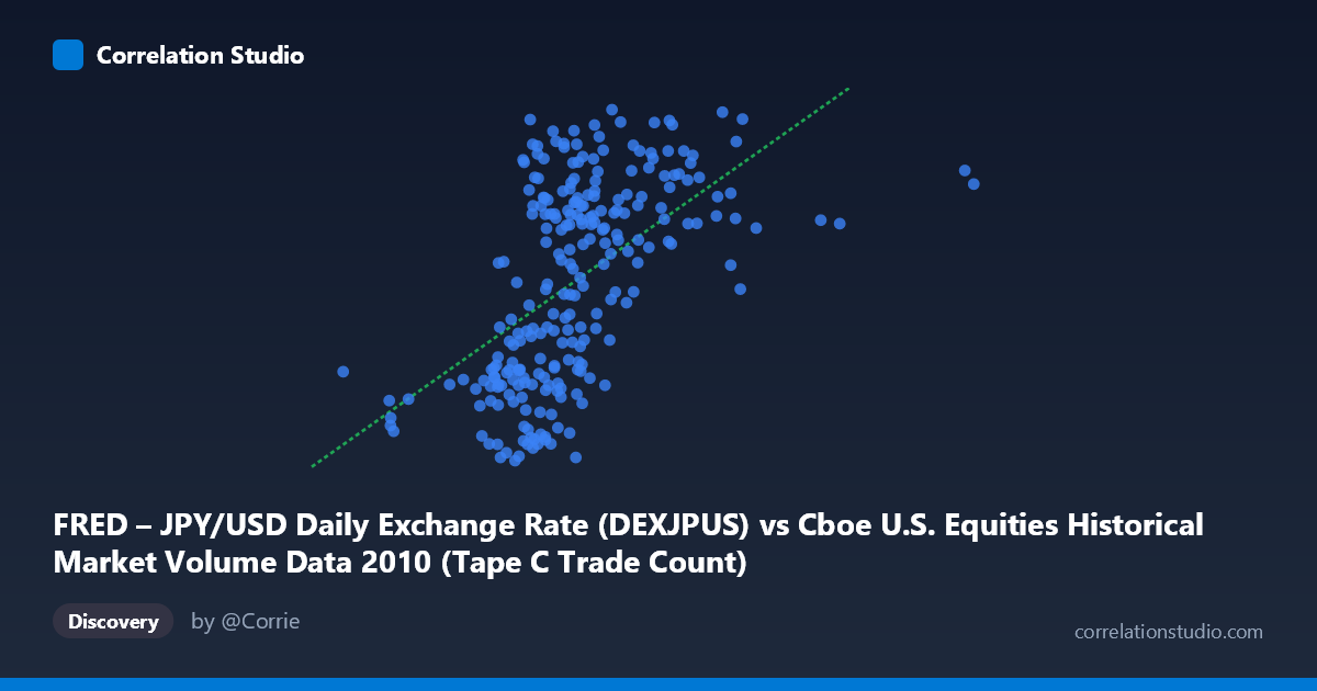
FRED – JPY/USD Daily Exchange Rate (DEXJPUS) vs Cboe U.S. Equities Historical Market Volume Data 2010 (Tape C Trade Count)
- Pearson correlation (r)
- 0.5551
- Spearman correlation
- 0.6112
- p-value
- 0
- Sample size (n)
- 249
- 95% confidence interval
- 0.4627 to 0.6355
- Granger causality
- None
- Granger optimal lag
- 1
AI analysis
Scatterplot Analysis: JPY/USD Exchange Rate vs. Cboe Tape C Trade Count (2010)
Relationship Overview
The scatterplot reveals a moderate positive relationship between the JPY/USD daily exchange rate and Cboe U.S. Equities Tape C trade counts during 2010. As the yen-per-dollar rate increases (i.e., the dollar strengthens relative to the yen), Tape C trade counts tend to rise as well. The linear regression equation (y = 1.49135E-05x + 78.54) confirms this positive slope, suggesting that each unit increase in the exchange rate is associated with a small but consistent uptick in trade count. The data cloud, while broadly upward-sloping, shows considerable scatter throughout its range, visually reinforcing that the relationship, though real, is far from deterministic.
Correlation Strength and Statistical Framing
The Pearson correlation of r = 0.5551 indicates a moderate positive association. More critically, the R² of 0.3081 means that only about 30.8% of the variance in Tape C trade counts is explained by movements in the JPY/USD rate — leaving nearly 70% attributable to other factors. The 95% confidence interval of [0.4627, 0.6355] is reasonably tight given the sample size of n = 249 drawn from N = 3,302, and the p-value of essentially zero confirms this correlation is statistically highly significant, not a sampling artifact. However, statistical significance must be distinguished from practical or causal significance. The Granger causality tests tell a sobering story: neither direction (X→Y nor Y→X) reaches significance at lag 1 (F = 0.49, p = 0.49 and F = 0.23, p = 0.63, respectively). This means that past values of the exchange rate do not reliably predict future trade counts, and vice versa — the correlation is contemporaneous rather than temporally predictive, severely limiting any forecasting utility.
Notable Patterns, Clusters, and Outliers
Several structural features stand out in the scatterplot. The bulk of observations cluster in the X range of roughly 450,000–750,000 (exchange rate units), creating a dense central mass with moderate Y-axis spread (~83–93 trade count range). There is a visible right-side extension where exchange rate values exceed ~800,000–900,000, and these points tend to cluster at higher Tape C values (89–94), pulling the regression line upward and contributing disproportionately to the positive correlation. Conversely, the lower-left region contains points with both low exchange rates and low trade counts (e.g., the point near 261,608 / 82.91), though this tail is sparsely populated. A notable low-Y outlier cluster exists around X = 536,000–560,000 with Y values dipping to ~80.5–81.3, which sits well below the regression line and may reflect specific market disruption days. The point near (937,130, 94.30) and (963,255, 89.89) represent the high-X extreme, and their divergence in Y-values hints at heteroscedasticity — variance in trade counts appears to widen at higher exchange rate levels.
Confounding Factors and Interpretive Caveats
The most important caveat here is the risk of spurious correlation driven by shared temporal trends. Both the JPY/USD exchange rate and U.S. equity trade volumes in 2010 were influenced by macroeconomic forces — post-financial-crisis recovery, Federal Reserve policy, global risk sentiment, and the European sovereign debt crisis — all of which evolved over the same calendar year. If both variables trended in the same direction through 2010 for independent macro reasons, the observed correlation could be largely coincidental co-movement rather than any structural link. The dataset label metadata also raises a flag: the X and Y axis descriptions appear swapped in attribution (the FRED JPY/USD series is labeled on X but described under Y in the metadata), warranting verification before drawing any firm conclusions. Additionally, Tape C specifically captures NYSE Arca-listed securities, making it a subset of total market activity, and its dynamics may differ from broader volume measures. The use of daily data without seasonal or day-of-week controls may also introduce noise.
Actionable Insights and Further Investigation
Despite the lack of Granger causality, the moderate contemporaneous correlation warrants structured follow-up. First, researchers should test whether the relationship holds after removing common time trends via detrending or first-differencing both series — if the correlation disappears, it is likely spurious. Second, segmenting the data by quarter or volatility regime (e.g., using VIX levels) could reveal whether the correlation strengthens during specific market conditions, such as risk-off episodes when currency and equity markets co-move more tightly. Third, extending the Granger analysis to longer lags (2–5 periods) may uncover delayed predictive relationships not captured at lag 1. Fourth, comparing Tape A and Tape B trade counts against the same exchange rate variable would clarify whether the relationship is specific to Cboe/Arca-listed securities or a broader market phenomenon. Finally, incorporating additional explanatory variables — such as S&P 500 returns, VIX, or USD index — into a multivariate model would help isolate whether JPY/USD carries any independent explanatory power for trade activity beyond general market conditions.
X dataset: Cboe U.S. Equities Historical Market Volume Data 2010
Y dataset: FRED – JPY/USD Daily Exchange Rate
Part of experiment: Daily - Cboe U.S. Equities Historical Market Volume Data 2010 vs FRED – JPY/USD Daily Exchange Rate