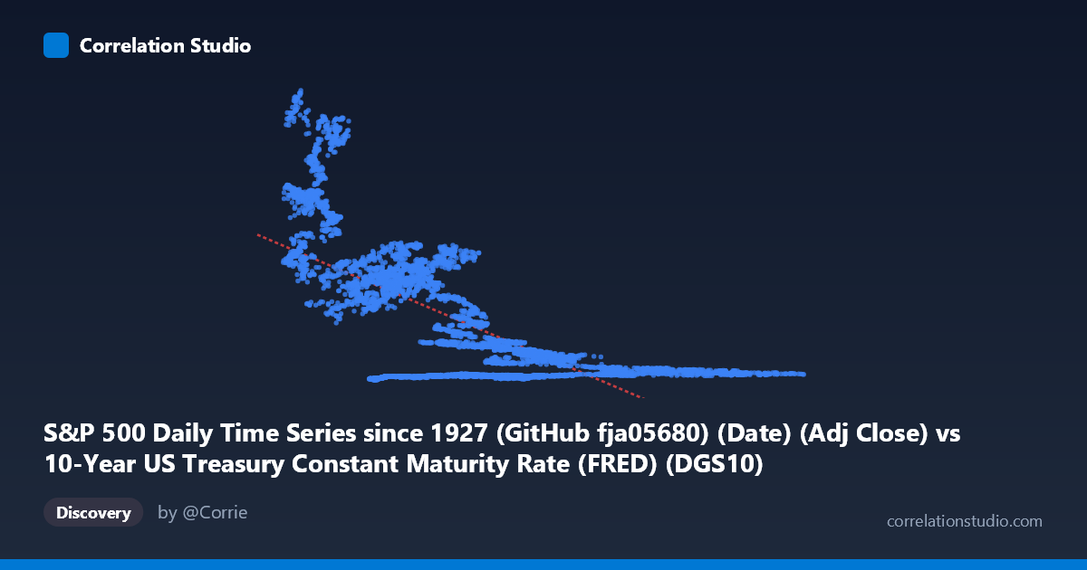
S&P 500 Daily Time Series since 1927 (GitHub fja05680) (Date) (Adj Close) vs 10-Year US Treasury Constant Maturity Rate (FRED) (DGS10)
- Pearson correlation (r)
- -0.6593
- Spearman correlation
- -0.5374
- p-value
- 0
- Sample size (n)
- 14441
- 95% confidence interval
- -0.6685 to -0.65
- Granger causality
- None
- Granger optimal lag
- 1
AI analysis
Analysis: S&P 500 Price vs. 10-Year Treasury Yield (1962–2019)
1. Overall Relationship Revealed
The scatterplot reveals a negative relationship between the 10-year US Treasury yield (X-axis) and S&P 500 price levels (Y-axis), broadly consistent with the inverse relationship between interest rates and equity valuations embedded in discounted cash flow theory. When yields are low (X < 4), S&P 500 values tend to cluster at higher levels, sometimes exceeding 2,000–3,000 points. Conversely, when yields are elevated (X 8–10), equity prices tend to be compressed in a lower, tighter band. The linear regression equation y = −169.87x + 1,766.79 formalizes this: each additional percentage point in yield is associated with roughly a 170-point decline in the S&P 500. However, the scatter is substantial and visually striking, immediately signaling that a simple linear model captures only part of the story.
2. Correlation Strength, Direction, and Temporal Causality
The correlation coefficient r = −0.6593 indicates a moderate-to-strong negative linear association, but the r² = 0.4347 is the more sobering statistic: only ~43.5% of the variance in S&P 500 prices is explained by Treasury yields, meaning over 56% of price variation is driven by other factors entirely. The 95% confidence interval [−0.6685, −0.6500] is extremely tight, and the p-value is effectively zero across N = 16,799 observations — so the relationship is statistically unambiguous, not a sampling artifact. That said, the Granger causality results are notably humbling: neither variable significantly predicts the other's future values (X→Y: F = 0.196, p = 0.658; Y→X: F = 0.147, p = 0.701). This means that while yields and prices are correlated contemporaneously, knowing yesterday's yield does not help forecast today's S&P 500 move, and vice versa. The correlation reflects a structural, long-run relationship rather than a short-term predictive signal — a critical distinction for any trading or policy application.
3. Notable Patterns, Clusters, and Non-Linear Features
Several important structural features are visible in the sample points and implied by the data distribution:
- Low-yield, high-price cluster (X < 4): Points like (2.33, 2629), (1.59, 1394), (2.09, 1261), and (2.90, 1653) reflect the post-2008 zero-rate environment and the 2010s equity bull market — a regime fundamentally different from earlier decades. - Mid-yield compression (X ≈ 5–9): Most points cluster in a relatively tight Y range of 80–500, suggesting the relationship may be non-linear or heteroskedastic — the variance in S&P prices expands dramatically at low yields but compresses at high yields. - High-yield, low-price band (X 9): Points like (10.99, 145.70) and (10.32, 146.69) reflect the high-rate 1980s era when nominal S&P levels were simply lower, not necessarily indicating poor real valuations. - The wide vertical spread at any given X value (e.g., at X ≈ 4–5, Y ranges from ~60 to ~1,200) underscores that the linear model is a rough approximation at best.
4. Confounding Factors and Interpretive Caveats
This correlation is heavily confounded by the time dimension — both variables have trended over the 1962–2019 period in ways that create spurious-looking correlation. Treasury yields rose from the 1960s through the early 1980s (~15–16%) and then declined persistently for four decades (the "great bond bull market"), while S&P 500 nominal prices rose exponentially over the same period. This creates a shared long-run trend that inflates the magnitude of correlation. Additionally, comparing nominal yield levels to nominal price levels (rather than returns or valuation ratios like P/E) introduces further distortion — inflation, earnings growth, and risk premiums are omitted. The dataset axes also appear swapped in labeling (X-axis is labeled as S&P 500 but contains yield-like values 1.44–15.68; Y-axis is labeled as Treasury rate but contains price-like values 52–3221), which should be verified before drawing firm conclusions. Finally, regime changes — the Fed's monetary policy frameworks, the 2008 financial crisis, and quantitative easing — mean the relationship likely shifts structurally across sub-periods.
5. Actionable Insights and Further Investigation
Several concrete next steps would sharpen this analysis:
- Segment by era: Split into pre-1982 (rising rates), 1982–2008 (falling rates), and post-2008 (zero/low rates) to test whether the correlation holds within regimes or is entirely a cross-regime artifact. - Use returns and changes, not levels: Regressing changes in yield on returns of the S&P 500 (or log-differenced values) would remove the spurious trend and test a more economically meaningful relationship. - Test non-linear models: Given the visual heteroskedasticity and the theoretical prediction of a convex relationship (via duration-like sensitivity), a log-linear or piecewise regression may fit substantially better than the current linear model. - Add controls: Including inflation expectations, corporate earnings growth, and credit spreads as covariates would test whether the yield-equity relationship survives multivariate scrutiny. - Extend Granger testing to longer lags: The optimal lag of 1 period may be too short; testing 5, 21, or 63-day lags could reveal monthly or quarterly predictive dynamics missed at daily frequency.
X dataset: 10-Year US Treasury Constant Maturity Rate (FRED)
Y dataset: S&P 500 Daily Time Series since 1927 (GitHub fja05680) (Date)
Part of experiment: Daily - 10-Year US Treasury Constant Maturity Rate (FRED) vs S&P 500 Daily Time Series since 1927 (GitHub fja05680) (Date)