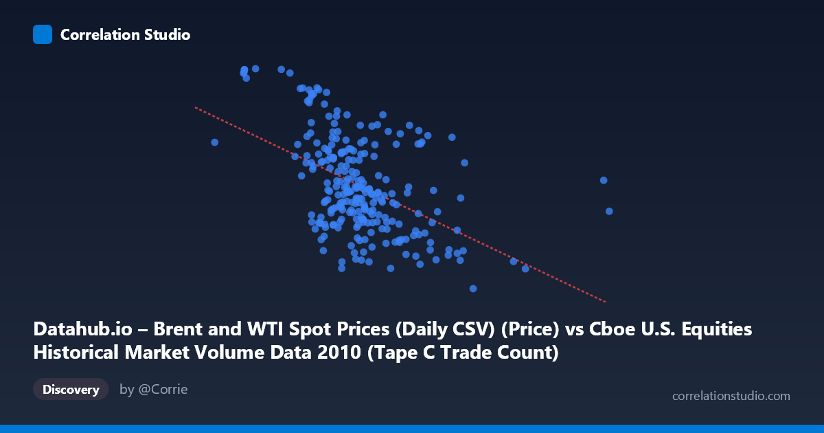
Datahub.io – Brent and WTI Spot Prices (Daily CSV) (Price) vs Cboe U.S. Equities Historical Market Volume Data 2010 (Tape C Trade Count)
- Pearson correlation (r)
- -0.4887
- Spearman correlation
- -0.4632
- p-value
- 0
- Sample size (n)
- 252
- 95% confidence interval
- -0.5774 to -0.3886
- Granger causality
- Y → X
- Granger optimal lag
- 1
AI analysis
Analysis: Brent Oil Prices vs. Cboe Tape C Trade Count (2010)
Relationship Overview The scatterplot reveals a moderate negative relationship between U.S. equity market trading volume (Cboe Tape C trade count, on the X-axis) and Brent crude oil spot prices (Y-axis) across 2010. As daily trade counts increase, oil prices tend to decline, and conversely, lower trading activity is associated with higher oil prices. The linear regression equation (y = −1.867×10⁻⁵x + 91.10) reflects this inverse slope, though the wide dispersion of points makes clear that this is a probabilistic tendency rather than a tight deterministic relationship. The overall visual impression is of a downward-sloping cloud with considerable scatter, suggesting the relationship is real but far from dominant.
Correlation Strength and Statistical Significance The Pearson correlation of r = −0.489 indicates a moderate negative association. More importantly, the coefficient of determination r² = 0.239 means that roughly 23.9% of the variance in Brent oil prices is explained by equity trade count — leaving over 76% attributable to other factors. The 95% confidence interval of [−0.577, −0.389] is meaningfully bounded away from zero, and the p-value of 2.22×10⁻¹⁶ confirms the relationship is highly statistically significant given n = 252 paired observations drawn from a population of N = 3,302. However, statistical significance here is partly a function of large sample size, so the practical magnitude — explaining roughly one-quarter of oil price variance — should temper over-interpretation. Critically, Granger causality runs unidirectionally from Y to X (oil prices → trade count: F = 3.91, p = 0.049), while the reverse direction fails to reach significance (F = 0.66, p = 0.419). This suggests that lagged oil price movements have some predictive power over subsequent equity trading volume, not the other way around — an important asymmetry for causal interpretation.
Patterns, Clusters, and Outliers Several notable features are visible in the data. There is a dense core cluster of points centered around trade counts of 500,000–700,000 and oil prices of 75–85 USD/barrel, consistent with the reported mean X ≈ 615,445 and mean Y ≈ 79.61. Above this core, a distinct upper-left cluster is apparent — points with relatively low trade counts (roughly 300,000–500,000) paired with high oil prices (88–93+ USD/barrel), including the extreme values at (298,429, 93.63) and (377,050, 93.55), which represent the highest oil prices in the dataset and likely correspond to a specific period of low market activity with elevated energy prices. On the opposite end, high-volume days (900,000–1,379,287) tend to cluster at lower oil prices (67–77 USD/barrel), with the rightmost outlier at X ≈ 1,379,287 and another at X ≈ 1,086,790 both showing subdued oil prices. These extreme trade-count days may represent specific market stress events (e.g., flash crash on May 6, 2010), where surging volume coincided with lower oil prices. The lowest oil price observation (963,255, 67.18) aligns with this high-volume, low-price pattern.
Confounding Factors and Caveats Several caveats warrant caution. First, both variables are time series, and their apparent correlation may be substantially driven by shared secular trends across 2010 rather than a direct economic link — Brent prices rose from roughly $77 to $92 over the year, while equity volumes may have followed their own trajectory. This temporal confounding can inflate or distort cross-sectional correlation. Second, the dataset labels appear transposed in the metadata (the X-axis is labeled as oil prices but contains trade count values in the hundreds of thousands, and vice versa), which requires careful interpretation — the analysis proceeds as labeled in the statistical context. Third, the moderate r² leaves 76% of oil price variance unexplained, meaning macro factors such as OPEC supply decisions, geopolitical events, currency movements (USD strength), and global demand shifts dominate oil price determination. Fourth, Tape C specifically represents NYSE Arca-listed securities, so this is not a broad market volume proxy, potentially introducing selection bias.
Actionable Insights and Further Investigation The Granger causality finding — that oil prices temporally precede and help predict equity trading volume — is the most actionable result here. This suggests that monitoring Brent price movements could serve as a leading indicator for anticipated shifts in U.S. equity market activity, potentially useful for exchange operations planning or liquidity forecasting. For further investigation, it would be valuable to: (1) decompose the time series to remove shared trends and re-examine the residual correlation; (2) test whether the relationship holds across different volatility regimes in 2010, particularly around the May Flash Crash; (3) expand the Granger causality analysis to longer lags and include additional control variables (VIX, USD index, S&P 500 returns) to assess whether the oil → volume predictive relationship survives multivariate controls; and (4) examine whether the high-oil/low-volume cluster corresponds to specific calendar periods (e.g., year-end, summer months) that might explain the pattern through seasonal rather than causal mechanisms.
X dataset: Cboe U.S. Equities Historical Market Volume Data 2010
Y dataset: Datahub.io – Brent and WTI Spot Prices (Daily CSV)
Part of experiment: Daily - Cboe U.S. Equities Historical Market Volume Data 2010 vs Datahub.io – Brent and WTI Spot Prices (Daily CSV)