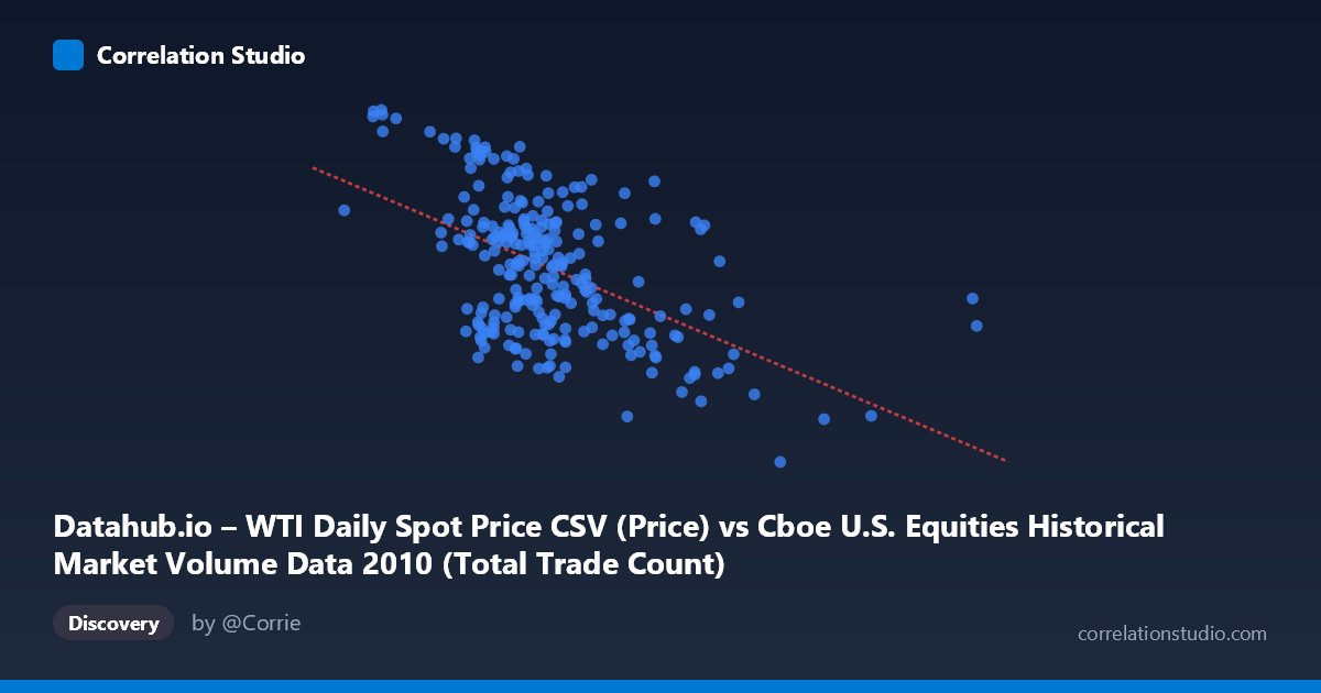
Datahub.io – WTI Daily Spot Price CSV (Price) vs Cboe U.S. Equities Historical Market Volume Data 2010 (Total Trade Count)
- Pearson correlation (r)
- -0.5217
- Spearman correlation
- -0.462
- p-value
- 0
- Sample size (n)
- 252
- 95% confidence interval
- -0.6062 to -0.4256
- Granger causality
- None
- Granger optimal lag
- 1
AI analysis
Scatterplot Analysis: WTI Oil Price vs. U.S. Equity Market Trade Count (2010)
Relationship Overview
The scatterplot reveals a negative relationship between WTI crude oil spot prices (X-axis) and the total trade count on U.S. equity exchanges (Y-axis) throughout 2010. As oil prices rise, equity market trade counts tend to decline, and vice versa. The linear regression equation (y = -4.17e-06x + 88.79) confirms this inverse slope, suggesting that for every unit increase in oil price-related volume metrics, trade counts drift measurably downward. Visually, the cloud of points slopes from the upper-left to the lower-right, though with considerable scatter throughout, indicating this is a real but far from deterministic relationship.
Correlation Strength and Statistical Framing
The Pearson correlation of r = -0.52 reflects a moderate negative association, but the more meaningful figure is r² = 0.272 — meaning WTI oil price explains only about 27.2% of the variance in equity trade counts. Nearly three-quarters of what drives day-to-day trade count variation lies elsewhere. The 95% confidence interval of [-0.61, -0.43] is entirely negative and relatively tight given the sample of n = 252 paired observations drawn from a population of N = 3,302, and the p-value of effectively zero confirms this correlation is not a statistical artifact. However, statistical significance here benefits from a large population, so practical significance deserves equal scrutiny. Critically, the Granger causality tests show no significant predictive direction in either direction (X→Y: p = 0.379; Y→X: p = 0.061), meaning that past oil prices do not reliably predict future trade counts and vice versa at the one-period lag tested. The relationship is contemporaneous rather than temporally sequential — they may be co-responding to shared drivers rather than one causing the other.
Notable Patterns, Clusters, and Outliers
Several structural features stand out in the data. There is a dense cluster of points concentrated in the X range of roughly 1.5M–2.5M with Y values between 74–87, forming the core of the distribution. At the higher end of the X-axis (above ~3.5M, extending to the extreme outlier at ~5.51M), trade counts drop sharply into the 64–75 range, anchoring the negative slope and suggesting that high-volume oil price periods coincide with notably suppressed trading activity. The point at approximately (5,514,534, 75.10) is a clear right-side outlier that likely exerts disproportionate leverage on the regression line. Conversely, several high trade-count observations (89–91 range) cluster at lower X values (~650K–1.4M), including the point near (1,046,906, 90.84), reinforcing the inverse pattern. Some non-linearity is also plausible — the relationship may steepen at extremes rather than following a uniform linear decline.
Confounding Factors and Interpretive Caveats
This correlation should be interpreted with significant caution for several reasons. First, 2010 was a structurally unusual year for equity markets — still recovering from the 2008–2009 financial crisis, experiencing the May 2010 Flash Crash, and operating under heightened regulatory scrutiny of high-frequency trading. Any of these events could simultaneously influence both oil prices and trade volumes independently. Second, the axis labels appear to be swapped between the two datasets (the X-axis description references Cboe data while the Y-axis description references WTI data), which warrants verification before drawing firm conclusions. Third, algorithmic and high-frequency trading dominated 2010 volume statistics in ways that may decouple trade counts from fundamental economic signals like oil prices. Finally, common macro drivers — risk appetite, Federal Reserve policy, global growth expectations — could easily produce a spurious correlation by moving both variables in opposite directions simultaneously without any direct causal link between them.
Actionable Insights and Further Investigation
Given the moderate correlation without Granger-causal structure, the most productive next steps would be to: (1) introduce macro control variables (VIX, Fed funds rate, S&P 500 returns) in a multivariate regression to isolate whether the oil-trading relationship persists after controlling for broader market sentiment; (2) test non-linear model specifications (e.g., polynomial or piecewise regression) to better capture the apparent steepening at high X values; (3) investigate the extreme outliers individually — particularly the rightmost point — to determine whether they represent data errors, one-time events (e.g., Flash Crash day), or genuine structural observations; and (4) extend the time series beyond 2010 to test whether this inverse relationship holds across different market regimes, particularly periods of oil price shock (2014–2016 collapse, 2020 negative futures prices). The lack of Granger causality also suggests that trading strategies based on lagged oil prices to predict equity volume would have limited efficacy in this period.
X dataset: Cboe U.S. Equities Historical Market Volume Data 2010
Y dataset: Datahub.io – WTI Daily Spot Price CSV
Part of experiment: Daily - Cboe U.S. Equities Historical Market Volume Data 2010 vs Datahub.io – WTI Daily Spot Price CSV