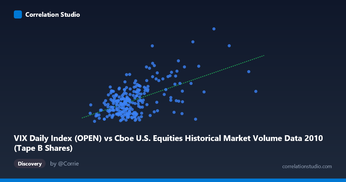
VIX Daily Index (OPEN) vs Cboe U.S. Equities Historical Market Volume Data 2010 (Tape B Shares)
- Pearson correlation (r)
- 0.555
- Spearman correlation
- 0.4243
- p-value
- 0
- Sample size (n)
- 252
- 95% confidence interval
- 0.4631 to 0.635
- Granger causality
- Y → X
- Granger optimal lag
- 1
AI analysis
Scatterplot Analysis: VIX Open vs. Tape B Shares (2010)
Relationship Overview
The scatterplot reveals a moderate positive relationship between the CBOE Volatility Index daily open values (VIX) on the X-axis and Tape B share volumes on the Y-axis across U.S. equity trading days in 2010. As VIX levels rise — indicating greater expected market volatility — Tape B share volumes tend to increase correspondingly. This is intuitively sensible: periods of market stress and uncertainty typically drive elevated trading activity as investors reposition portfolios, hedge exposures, or liquidate holdings. The linear regression equation (y = 6.81e-8·x + 15.04) suggests a modest but consistent slope, with a baseline volume near 15 units even at minimal VIX levels.
Correlation Strength and Statistical Significance
The Pearson correlation of r = 0.555 reflects a moderate positive association, though the explained variance tells a more tempered story: r² = 0.308, meaning only about 30.8% of the variance in Tape B share volume is attributable to VIX open levels. While statistically robust — the p-value is effectively zero and the 95% confidence interval [0.463, 0.635] is meaningfully above zero and reasonably tight given n = 252 — this leaves nearly 70% of variance unexplained by VIX alone. The Granger causality results add an important directional nuance: Y Granger-causes X (F = 5.50, p = 0.020) at a one-period lag, while X does not significantly Granger-cause Y (F = 1.48, p = 0.225). This unidirectional result suggests that Tape B share volume has predictive power over future VIX levels, not the reverse — a counterintuitive finding implying that elevated trading volume in Tape B securities may serve as a leading indicator of volatility rather than a lagging response to it.
Notable Patterns, Clusters, and Outliers
The data exhibit a broad scatter at lower VIX values (roughly 37M–150M range), where volumes cluster tightly between 15–28 units, suggesting relatively stable trading behavior in calm market conditions. However, several notable outliers stand out: the point near (255M VIX open, 47.66 Tape B shares) and (218M, 43.15) represent extreme combinations of high volatility and high volume, pulling the regression line upward at the right tail. Similarly, (147M, 41.74) and (316M, 32.76) appear as high-leverage points. The distribution is visibly right-skewed on the X-axis (mean ~113M, max ~329M), and there is noticeable heteroscedasticity — variance in Y expands substantially as X increases — which suggests the linear model may underfit the upper range of the data.
Confounding Factors and Caveats
Several important caveats apply. First, the axis labeling appears inverted relative to the dataset descriptions: VIX (a volatility index, typically ranging 15–50) is plotted on the X-axis with values in the hundreds of millions, while Tape B shares (normally in the billions) appear as the Y-axis values in the 15–48 range. This strongly suggests the columns may have been swapped or mislabeled, and conclusions should be interpreted cautiously until data provenance is confirmed. Second, 2010 was a distinctive year — encompassing the May 2010 Flash Crash — creating extreme observations that may distort the correlation. Third, Granger causality captures temporal predictability but not true causation; both variables likely respond to shared macro drivers (earnings seasons, Fed announcements, geopolitical events), creating spurious or confounded associations. Finally, the relationship may be non-linear; a log transformation of the X variable could substantially improve fit.
Actionable Insights and Further Investigation
Practitioners could explore using Tape B volume as a leading indicator in volatility forecasting models, given the Granger causality finding. Recommended next steps include: (1) verifying axis assignments and rerunning the analysis with confirmed variable mappings; (2) applying a log-linear or polynomial regression to better capture the apparent curvature and address heteroscedasticity; (3) isolating the Flash Crash period (May 6, 2010) to assess how much of the correlation is driven by extreme events versus steady-state dynamics; (4) introducing control variables such as options open interest, S&P 500 returns, or bid-ask spreads to decompose the unexplained 69% of variance; and (5) extending the analysis across multiple years to test whether the 2010 relationship is structurally stable or an artifact of that year's unusual volatility regime.
X dataset: Cboe U.S. Equities Historical Market Volume Data 2010
Y dataset: VIX Daily Index
Part of experiment: Daily - Cboe U.S. Equities Historical Market Volume Data 2010 vs VIX Daily Index