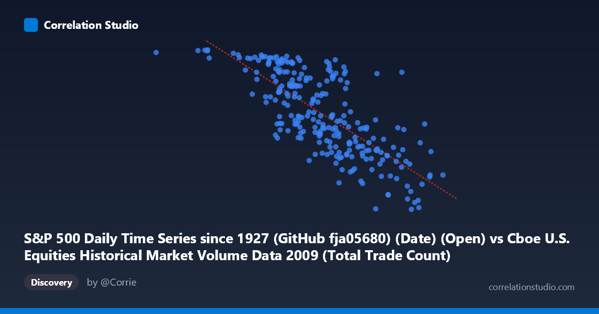
S&P 500 Daily Time Series since 1927 (GitHub fja05680) (Date) (Open) vs Cboe U.S. Equities Historical Market Volume Data 2009 (Total Trade Count)
- Pearson correlation (r)
- -0.7551
- Spearman correlation
- -0.7627
- p-value
- 0
- Sample size (n)
- 252
- 95% confidence interval
- -0.8037 to -0.6965
- Granger causality
- X → Y
- Granger optimal lag
- 10
AI analysis
Analysis: S&P 500 Opening Price vs. U.S. Equities Total Trade Count (2009)
Relationship Overview The scatterplot reveals a moderately strong negative relationship between the S&P 500 daily opening price (X) and the total trade count across U.S. equities exchanges (Y) throughout 2009. As the S&P 500 opened at lower price levels, trading activity — measured by total trade count — was markedly higher, and as prices recovered across the year, trade counts declined. This is visually consistent with the linear regression equation y = −0.000145x + 1,334.9, which captures a clear downward-sloping trend across the full range of observed opening prices (~630 to ~4,134 on the X-axis, likely representing index-level values in raw form). The wide X-range and the clustering of high-Y values at the low end of X strongly suggest the crisis-recovery dynamic of 2009 is the dominant structural feature of this dataset.
Correlation Strength, Direction, and Causality The Pearson correlation of r = −0.755 indicates a strong negative association, and crucially, the R² = 0.570 tells us that approximately 57% of the variance in trade count is explained by the S&P 500 opening price alone — a substantial explanatory share for a single-variable model in financial data. The 95% confidence interval of [−0.804, −0.697] is notably tight and entirely negative, confirming the direction is not a sampling artifact, and the p-value of effectively zero leaves no statistical ambiguity about the reality of this association. The Granger causality results add a meaningful temporal dimension: X Granger-causes Y (F = 2.03, p = 0.031) at a 10-period lag, while the reverse direction fails significance (F = 1.62, p = 0.102). This suggests that S&P 500 price levels have predictive power over future trade counts — lower prices tend to precede elevated trading activity roughly two weeks later — but trade counts do not reliably predict future price levels. Practically, this implies that price-level signals may be leading indicators of market participation intensity.
Notable Patterns, Clusters, and Outliers Several structural features stand out in the sample points. There is a visible high-density cluster at lower X values (roughly 629,000–1,800,000 range in raw units) paired with elevated Y values (1,050–1,128), consistent with the January–March 2009 bear market trough period when panic trading drove both high volume and high trade counts. Conversely, points in the upper X range (3,500,000–4,134,000) cluster near lower Y values (680–830), reflecting the calmer, recovering market of Q3–Q4 2009. The extreme low outlier at approximately (3,749,022, 679.28) and (4,134,002, 775.87) appear to be late-year observations where trade counts dropped substantially as volatility subsided. The point (629,671, 1,121.08) anchors the upper-left extreme, likely representing the most distressed trading days. The relationship appears reasonably linear across the main body of data, though there may be slight heteroscedasticity — variance in Y appears larger at low X values, suggesting that distressed market periods introduce more noise in trading behavior.
Confounding Factors and Interpretive Caveats Several important caveats temper a causal interpretation. First, both variables are jointly driven by the 2009 financial crisis timeline — the year begins in deep recession and ends in recovery, meaning time itself is a powerful lurking confound. The X-axis (S&P 500 open price) and Y-axis (trade count) may both be symptoms of the same underlying macro regime rather than causally linked. Second, the rise of high-frequency trading (HFT) and algorithmic strategies in 2009 means trade count is a noisy proxy for genuine investor activity; fragmentation across exchanges and TRFs adds measurement complexity. Third, the Granger causality result, while statistically significant, is modest (F = 2.03 barely clears the p < 0.05 threshold) and should not be over-interpreted as strong economic causality — it indicates marginal predictive utility at a 10-day lag, not a robust structural mechanism. Finally, the dataset's N = 3,232 population versus n = 252 sample means intraday or multi-observation-per-day structure may exist, and temporal autocorrelation likely inflates the effective sample size, warranting caution in standard significance framing.
Actionable Insights and Further Investigation The 57% explained variance is a strong foundation for a predictive model, but the remaining 43% warrants investigation. Incorporating VIX (implied volatility) as a covariate would likely capture much of the residual variance, as fear — not price level alone — drives abnormal trade counts. Researchers should also test for structural breaks around key 2009 events (March 9 market bottom, Fed interventions, stress test results in May) to determine whether the correlation is stable or regime-dependent. The 10-period Granger lag is practically interesting: a trading desk or exchange operator could monitor S&P 500 price trends to anticipate infrastructure load or liquidity conditions roughly two weeks ahead. Finally, extending the analysis across multiple years (2007–2011) would clarify whether this negative correlation is a persistent feature of equity markets or an artifact of the unique 2009 crisis-recovery arc — a critical distinction before any operational or investment decisions are grounded in this relationship.
X dataset: Cboe U.S. Equities Historical Market Volume Data 2009
Y dataset: S&P 500 Daily Time Series since 1927 (GitHub fja05680) (Date)
Part of experiment: Daily - Cboe U.S. Equities Historical Market Volume Data 2009 vs S&P 500 Daily Time Series since 1927 (GitHub fja05680) (Date)