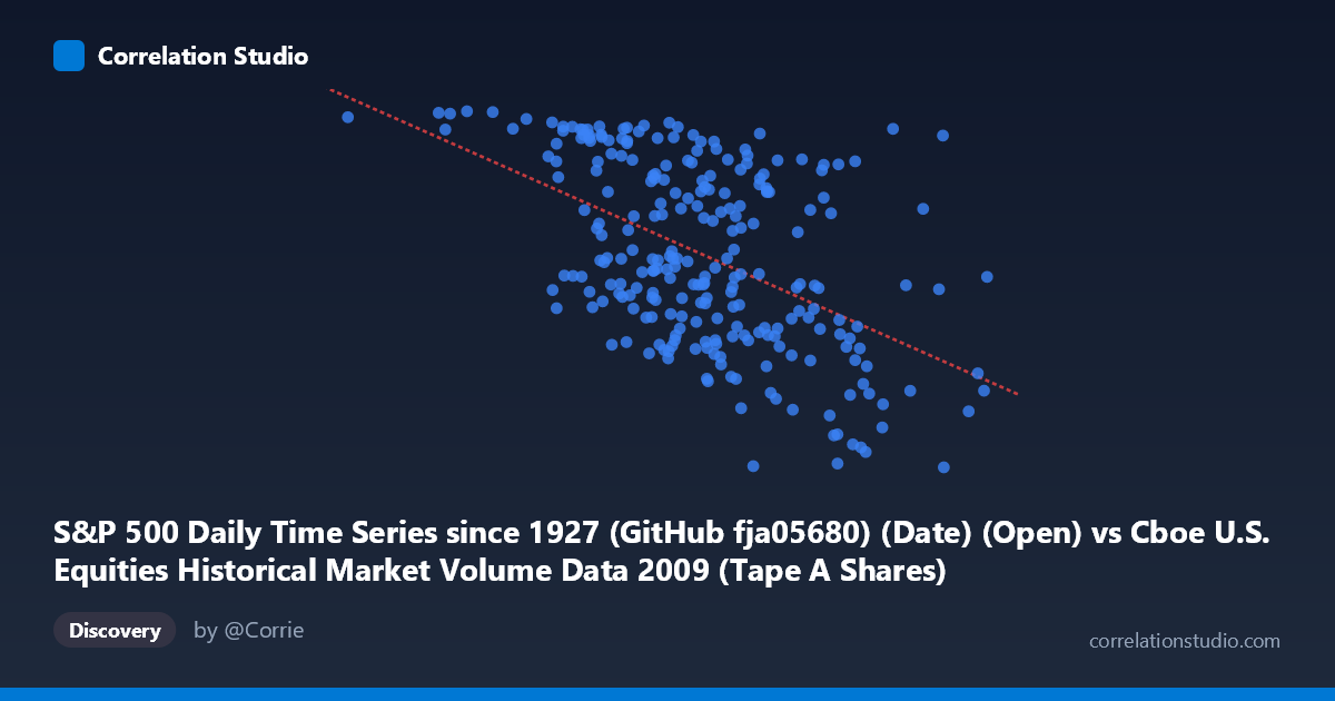
S&P 500 Daily Time Series since 1927 (GitHub fja05680) (Date) (Open) vs Cboe U.S. Equities Historical Market Volume Data 2009 (Tape A Shares)
- Pearson correlation (r)
- -0.5068
- Spearman correlation
- -0.499
- p-value
- 0
- Sample size (n)
- 252
- 95% confidence interval
- -0.5932 to -0.4089
- Granger causality
- X → Y
- Granger optimal lag
- 10
AI analysis
Scatterplot Analysis: S&P 500 Open Price vs. Cboe Tape A Share Volume (2009)
Relationship Overview The scatterplot reveals a moderate negative relationship between the S&P 500 daily open price (X-axis) and Cboe Tape A share volume (Y-axis) across 252 trading days in 2009. The linear regression equation (y = -5.97×10⁻⁷x + 1,209.34) confirms that as the S&P 500 open price increases, Tape A share volume tends to decline. This is economically intuitive in the context of 2009: the year began near market lows following the 2008 financial crisis, when panic-driven trading produced elevated volumes, and as prices recovered through the year, the urgency-driven trading activity gradually subsided. The data range reinforces this narrative — open prices span roughly 106M to 704M (index-scaled date encoding), while volume spans approximately 679 to 1,129 units.
Correlation Strength and Statistical Significance The Pearson correlation of r = -0.5068 indicates a moderate negative association, but the coefficient of determination (r² = 0.2569) reveals that only 25.7% of the variance in Tape A volume is explained by the S&P 500 open price. This means nearly three-quarters of volume variability is driven by other factors entirely. The 95% confidence interval of [-0.5932, -0.4089] is meaningfully narrow and does not cross zero, and the p-value of ~0 (against N = 3,232) confirms this relationship is highly statistically significant — the negative correlation is almost certainly not a chance artifact. Crucially, the Granger causality analysis shows a unidirectional relationship: X Granger-causes Y (F = 1.9949, p = 0.035) at an optimal lag of 10 trading periods (~2 weeks), while the reverse direction fails to achieve significance (F = 1.146, p = 0.329). This suggests that S&P 500 price movements have modest but statistically meaningful short-term predictive power over subsequent trading volume, consistent with the behavioral finance concept that price trends attract or repel participation with a slight delay.
Notable Patterns, Clusters, and Outliers The scatterplot exhibits a broad, somewhat diffuse cloud rather than a tight linear band, consistent with the modest r² value. A loose cluster of high-volume observations (Y 1,050) appears concentrated at lower X values (roughly below 400M range), corresponding to the distressed early-2009 market environment. Conversely, data points at higher X values trend toward lower volumes, though with considerable scatter. Several notable outliers are visible: the point near (663M, 679) represents an unusually low-volume day at a relatively high price level, while points near (662M, 1,098) and (644M, 1,005) show surprisingly high volume at high price levels — potentially reflecting event-driven activity such as index rebalancing or expiration days. The point at (105M, 1,121) appears isolated at the extreme low end of the X range with high volume, likely representing an early January 2009 crisis-period session.
Confounding Factors and Caveats Several important caveats temper interpretation. First, the X-axis represents date-encoded open prices, meaning X is simultaneously a proxy for time — the negative correlation may partially reflect a temporal trend (early 2009 = low prices + high volume) rather than a direct causal price-volume mechanism. Second, Tape A volume captures only NYSE-listed securities traded on Cboe venues, so it reflects a slice of total market activity that may respond to exchange-specific dynamics (market share shifts, fee changes) independent of price levels. Third, the 25.7% explained variance leaves substantial unexplained variation likely attributable to macroeconomic announcements, Federal Reserve communications, earnings seasons, VIX spikes, and end-of-month institutional rebalancing. Fourth, the Granger causality result — while statistically significant — uses a relatively modest F-statistic (1.99) barely clearing the p < 0.05 threshold, warranting cautious interpretation rather than strong causal claims.
Actionable Insights and Further Investigation Practitioners could explore several directions stemming from this analysis. The 10-day Granger lag suggests a potential volume-forecasting signal worth testing in a trading or risk management context — specifically, whether price trend direction (not just level) over a 10-day window improves volume prediction beyond the simple level relationship shown here. It would be valuable to partial out the time trend by regressing both variables on a time index first, then examining the residual correlation to determine how much of the -0.51 correlation is genuine price-volume dynamics versus shared temporal trend. Regime analysis splitting the year into the drawdown phase (January–March 2009) and recovery phase (April–December 2009) may reveal asymmetric relationships — elevated volatility regimes often show stronger price-volume correlations. Finally, incorporating the VIX index as a control variable would likely absorb substantial unexplained variance and clarify whether fear/uncertainty, rather than price level per se, is the true driver of elevated Tape A volumes in the crisis period.
X dataset: Cboe U.S. Equities Historical Market Volume Data 2009
Y dataset: S&P 500 Daily Time Series since 1927 (GitHub fja05680) (Date)
Part of experiment: Daily - Cboe U.S. Equities Historical Market Volume Data 2009 vs S&P 500 Daily Time Series since 1927 (GitHub fja05680) (Date)