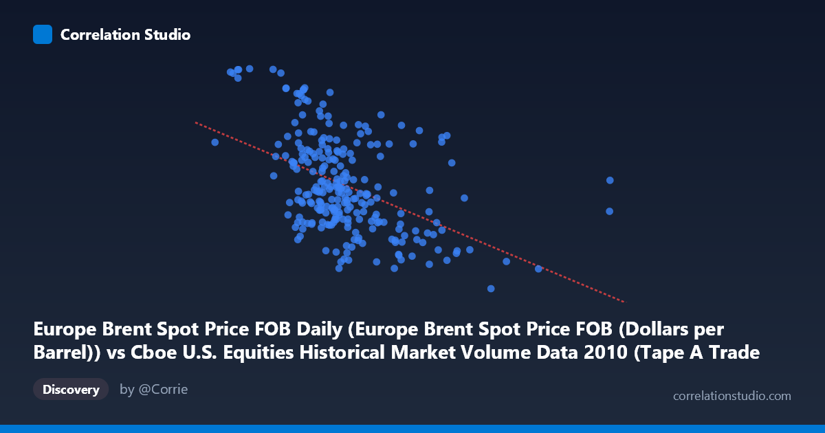
Europe Brent Spot Price FOB Daily (Europe Brent Spot Price FOB (Dollars per Barrel)) vs Cboe U.S. Equities Historical Market Volume Data 2010 (Tape A Trade Count)
- Pearson correlation (r)
- -0.468
- Spearman correlation
- -0.4619
- p-value
- 0
- Sample size (n)
- 252
- 95% confidence interval
- -0.5592 to -0.3655
- Granger causality
- None
- Granger optimal lag
- 1
AI analysis
Scatterplot Analysis: Europe Brent Spot Price vs. Cboe Tape A Trade Count (2010)
Relationship Overview The scatterplot reveals a moderate negative relationship between Europe Brent crude oil spot prices (x-axis, in dollars per barrel) and Cboe U.S. equities Tape A trade counts (y-axis). As oil prices increase, equity trade counts tend to decline. The linear regression equation (y = −7.00×10⁻⁶x + 88.83) reflects this downward slope, suggesting that for every $1 increase in Brent crude prices, Tape A trade counts decrease by roughly 7×10⁻⁶ units. The data spans the full 2010 calendar year (252 trading days sampled from a population of 3,302 observations), and the broad horizontal spread — oil prices ranging from ~$67 to ~$94/barrel — captures meaningful variation across a year that saw Brent recovering from post-financial-crisis lows toward a renewed upswing.
Correlation Strength, Direction, and Causality The Pearson correlation of r = −0.468 indicates a moderate inverse relationship, but the explained variance of r² = 0.219 means that oil prices account for only about 21.9% of the variance in Tape A trade counts — leaving roughly 78% explained by other factors. The 95% confidence interval of [−0.559, −0.366] is entirely negative and does not cross zero, and the p-value of ~4×10⁻¹⁵ confirms this relationship is highly statistically significant and very unlikely to be a chance artifact given the sample of 252 paired observations. However, the Granger causality results complicate any causal narrative: neither direction shows significance at conventional thresholds (X→Y: F = 0.63, p = 0.43; Y→X: F = 3.70, p = 0.056). This means oil prices do not reliably predict next-period trade counts, and vice versa — the correlation is associative in contemporaneous time rather than temporally predictive, urging caution against interpreting this as a directional or mechanistic relationship.
Notable Patterns, Clusters, and Outliers The scatterplot shows considerable vertical dispersion across the entire x-range, reinforcing the relatively modest r². Several distinct features are visible in the sample points. At lower oil prices (~$627K–$900K range on the x-axis), trade counts cluster near the upper end of the y-range, with notable high-count observations around 91–93 Tape A units (e.g., points at approximately (627K, 93.63) and (796K, 93.55)), suggesting elevated trading activity during lower-price periods. Conversely, at higher oil prices (above ~$2M on x-axis), trade counts tend to congregate in the lower 67–76 range. There also appears to be a non-linear or heteroscedastic structure: the variance in trade counts seems wider at moderate price levels and compresses at extremes, hinting that a simple linear model may not fully capture the relationship. The point near (2,364K, 67.18) stands out as a potential lower outlier in trade counts.
Confounding Factors and Interpretive Caveats Several important caveats apply. First, both variables are likely driven by common macroeconomic forces in 2010 — notably the post-2008 recovery, risk-on/risk-off sentiment shifts, and the Eurozone sovereign debt crisis — meaning the observed correlation may be largely spurious co-movement rather than a direct functional relationship. Second, oil price levels and equity trade volumes both exhibit strong autocorrelation and trending behavior over calendar time, which can artificially inflate correlation coefficients between two independently trending series. Third, the x-axis label references "Europe Brent Spot Price FOB Daily" in dollars per barrel, yet the x-axis values range into the millions — this unit inconsistency (possibly notional value or a scaled/aggregated variable) warrants verification before drawing firm conclusions. Finally, Tape A trade counts reflect activity on NYSE-listed securities specifically, introducing venue-specific dynamics unrelated to crude oil fundamentals.
Actionable Insights and Further Investigation Given the statistically significant but causally ambiguous relationship, several follow-up steps are warranted. Partial correlation analysis controlling for date/time trends would help isolate whether the association persists after removing shared temporal drift. Incorporating additional variables — VIX (volatility index), S&P 500 returns, USD/EUR exchange rates, and broader market volume — would help disentangle direct oil-market effects from macro confounders. It would also be valuable to test non-linear models (e.g., polynomial or spline regression) to capture the apparent heteroscedasticity. Given the near-significant Y→X Granger result (p = 0.056), extending the lag structure beyond one period or using vector autoregression (VAR) could reveal whether trade count surges have any delayed predictive value for oil price movements. Finally, replicating this analysis across multiple years would clarify whether 2010's specific macro environment is driving the relationship or whether it reflects a more durable structural pattern.
X dataset: Cboe U.S. Equities Historical Market Volume Data 2010
Y dataset: Europe Brent Spot Price FOB Daily
Part of experiment: Daily - Cboe U.S. Equities Historical Market Volume Data 2010 vs Europe Brent Spot Price FOB Daily