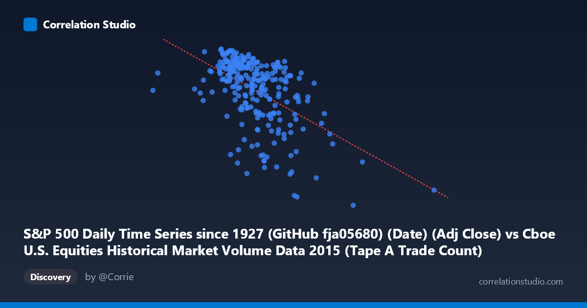
S&P 500 Daily Time Series since 1927 (GitHub fja05680) (Date) (Adj Close) vs Cboe U.S. Equities Historical Market Volume Data 2015 (Tape A Trade Count)
- Pearson correlation (r)
- -0.5198
- Spearman correlation
- -0.5081
- p-value
- 0
- Sample size (n)
- 252
- 95% confidence interval
- -0.6045 to -0.4234
- Granger causality
- None
- Granger optimal lag
- 1
AI analysis
Analysis: S&P 500 Adjusted Close Price vs. Cboe Tape A Trade Count (2015)
Relationship Overview The scatterplot reveals a moderate negative relationship between the S&P 500 adjusted closing price (X-axis) and the Cboe Tape A trade count (Y-axis) across 252 trading days in 2015. As the S&P 500 price level increases, trade count tends to decline, and conversely, lower price levels coincide with elevated trading activity. This is visually apparent in the downward-sloping regression line (y = −0.000112x + 2221.16), with a notable concentration of points in the 1,200,000–1,600,000 price range paired with trade counts clustering between roughly 2,000 and 2,130. The relationship is real but clearly noisy, with considerable scatter around the trend line.
Correlation Strength and Statistical Significance The Pearson correlation of r = −0.5198 indicates a moderate negative association, but the more informative metric is r² = 0.2701, meaning the S&P 500 price level explains only 27% of the variance in Tape A trade count — leaving 73% attributable to other factors. The 95% confidence interval of [−0.6045, −0.4234] is meaningfully narrow and does not cross zero, and the p-value of effectively 0 (against N = 3,302) confirms this relationship is highly statistically significant and unlikely to be a sampling artifact. However, statistical significance should not be conflated with practical predictive power; the explained variance remains modest. Critically, the Granger causality tests returned no significant result in either direction (X→Y: F = 0.43, p = 0.51; Y→X: F = 0.73, p = 0.39), meaning that past values of the S&P 500 price do not meaningfully predict future trade counts, and vice versa. The correlation is contemporaneous rather than temporally predictive.
Notable Patterns, Clusters, and Outliers Several features stand out in the data. The bulk of observations cluster in the 1.2M–1.6M price range with trade counts between 2,020–2,130, forming a relatively dense core. However, there is a distinct lower-right cluster of points with prices in the 1.5M–2.3M range paired with noticeably depressed trade counts (roughly 1,867–2,000), suggesting a regime shift rather than a smooth linear decline. The point at approximately (2,247,816, 1,867) is a potential outlier at the extreme low end of trade activity and high end of price. Similarly, the point near (576,208, 2,061) is a clear outlier on the low-price extreme, yet its trade count sits near the mean rather than being elevated, which weakens a simple linear narrative. These outliers suggest the relationship may be non-linear or regime-dependent rather than uniformly linear across the full price range.
Confounding Factors and Caveats Several important caveats apply. First, both variables are time-indexed to 2015, so the observed correlation likely reflects shared temporal dynamics — specifically, the mid-2015 market volatility and August 2015 correction — rather than a structural causal link. During market sell-offs, prices fall and volume/trade counts spike, which mechanically produces a negative correlation. Second, market microstructure changes, algorithmic trading patterns, and calendar effects (e.g., options expiration, end-of-quarter rebalancing) can independently drive trade counts regardless of price levels. Third, the X-axis label references "Adj Close" from a long-running S&P 500 series, but the values in the millions suggest these may represent a different scale or transformation (possibly notional value or index points scaled differently), warranting verification of unit consistency. The dataset mismatch in column sourcing (X from Cboe dataset, Y from S&P dataset) also introduces potential alignment and join-key risks.
Actionable Insights and Further Investigation Given these findings, several avenues merit further exploration. First, segment the analysis by market regime — separating calm periods from the August 2015 volatility episode — to test whether the negative correlation is driven primarily by stress periods. Second, introduce VIX or realized volatility as a covariate, since both price declines and elevated trade counts are likely mediated by fear/uncertainty rather than directly linked. Third, the absence of Granger causality at lag 1 suggests testing longer lags (2–5 days) or using intraday data to detect any lead-lag structure. Finally, a non-linear model (e.g., piecewise regression or LOESS smoothing) may better capture the apparent regime-dependent clustering visible in the chart, potentially improving on the 27% variance explained by the current linear fit.
X dataset: Cboe U.S. Equities Historical Market Volume Data 2015
Y dataset: S&P 500 Daily Time Series since 1927 (GitHub fja05680) (Date)
Part of experiment: Daily - Cboe U.S. Equities Historical Market Volume Data 2015 vs S&P 500 Daily Time Series since 1927 (GitHub fja05680) (Date)