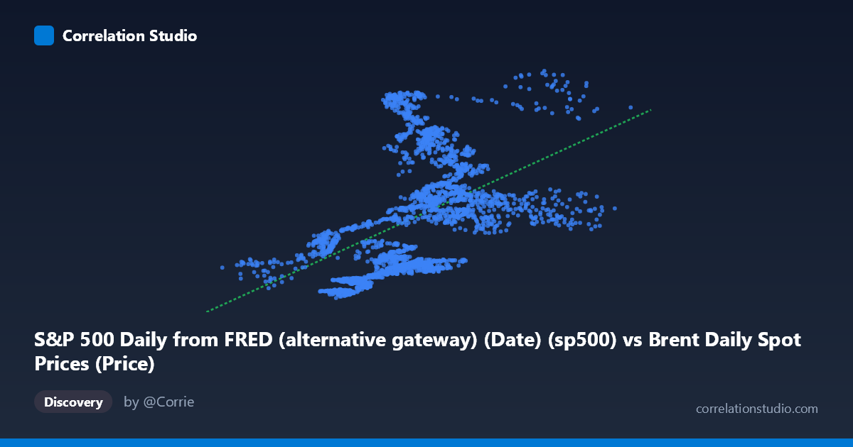
S&P 500 Daily from FRED (alternative gateway) (Date) (sp500) vs Brent Daily Spot Prices (Price)
- Pearson correlation (r)
- 0.4795
- Spearman correlation
- 0.5862
- p-value
- 0
- Sample size (n)
- 2475
- 95% confidence interval
- 0.4485 to 0.5093
- Granger causality
- None
- Granger optimal lag
- 9
AI analysis
Analysis: Brent Crude Oil Prices vs. S&P 500 Index (2016–2026)
1. What the Visualization Reveals
The scatterplot displays a moderate positive relationship between daily Brent crude oil spot prices (X-axis, USD/barrel) and the S&P 500 index (Y-axis). As oil prices rise from roughly $10–$140/barrel, S&P 500 values tend to trend upward from ~$2,000 to ~$7,500. However, the cloud of points is notably wide and diffuse, particularly in the mid-range of oil prices ($50–$90/barrel), where S&P 500 values span nearly the entire observed range. This visual dispersion immediately signals that while a positive tendency exists, the relationship is far from deterministic and substantial independent variation exists in both series.
2. Correlation Strength, Direction, and Predictive Power
The Pearson correlation of r = 0.4795 confirms a moderate positive association, but the more telling statistic is r² = 0.2299 — meaning Brent crude prices explain only 23% of the variance in the S&P 500. The remaining 77% of S&P 500 movement is driven by other factors entirely. The 95% confidence interval of [0.4485, 0.5093] is reassuringly tight given the large sample (n = 2,475), and the p-value of effectively zero confirms this correlation is not a sampling artifact. That said, statistical significance here is almost guaranteed by sample size alone and should not be mistaken for practical or economic significance. Critically, Granger causality tests find no significant predictive direction in either direction — neither does oil price predict future S&P 500 movements (F = 1.56, p = 0.12), nor does the S&P 500 predict future oil prices (F = 0.97, p = 0.46) at the optimal 9-period lag. This is a pivotal finding: even where correlation exists, neither variable reliably leads the other in time, undermining any simple trading or forecasting strategy built on this relationship.
3. Notable Patterns, Clusters, and Non-Linear Features
Several structural features stand out. There is a dense cluster of observations between $40–$90/barrel and $2,500–$5,000 on the S&P 500, representing the bulk of the 2016–2019 and 2021–2023 trading environment. A secondary cluster appears at high S&P 500 values ($5,000–$7,500) with moderate oil prices ($60–$120), likely reflecting the 2024–2026 bull market period when equities surged while oil remained range-bound. Notably, the extreme left tail (oil below $30/barrel, corresponding to the COVID-19 crash of 2020) pairs with relatively low S&P 500 values, consistent with simultaneous risk-off selling across asset classes. The observation that Spearman ρ exceeds Pearson r is telling — it suggests the true relationship is monotonic but non-linear, with a logarithmic or polynomial fit likely capturing the structure better than the linear regression (y = 34.87x + 1,515). The linear model likely underestimates the S&P 500 response at low oil prices and overestimates it at high oil prices.
4. Confounding Factors and Interpretive Caveats
This correlation is almost certainly spurious co-movement driven by shared macroeconomic drivers rather than a direct causal mechanism. Both asset prices respond independently to global growth cycles, U.S. dollar strength, Federal Reserve monetary policy, and risk appetite — creating the appearance of correlation without genuine linkage. The 2020 COVID period is a particularly powerful confounder: both assets crashed simultaneously due to demand destruction, which artificially inflates the positive correlation. Conversely, during supply-shock-driven oil spikes (e.g., 2022 Ukraine conflict), oil rose while equities fell, a counter-relationship that gets averaged away in the aggregate correlation. The decade-long time window (2016–2026) spans multiple distinct macro regimes — low-rate expansion, pandemic shock, inflationary surge, and rate normalization — and pooling these regimes into a single correlation coefficient masks regime-specific behavior that may be more analytically meaningful.
5. Actionable Insights and Further Investigation
Given the weak explanatory power and absent Granger causality, practitioners should not use oil prices as a standalone leading indicator for S&P 500 positioning. More productive next steps would include: (a) regime-segmented analysis — rerunning correlation and causality tests separately for expansion, contraction, and shock periods to identify whether the relationship strengthens in specific macro environments; (b) fitting a logarithmic or polynomial regression to better capture the non-linear monotonic structure flagged by the Spearman/Pearson divergence; (c) controlling for the U.S. dollar index (DXY), which simultaneously depresses oil prices and influences equity valuations, to isolate any residual partial correlation; and (d) examining sector-level data, as energy sector stocks within the S&P 500 will mechanically correlate with oil while other sectors may show zero or negative correlation, with the aggregate masking important heterogeneity. The most defensible conclusion is that this correlation reflects common exposure to global growth sentiment rather than any exploitable predictive relationship between the two assets.
X dataset: Brent Daily Spot Prices
Y dataset: S&P 500 Daily from FRED (alternative gateway) (Date)
Part of experiment: Daily - Brent Daily Spot Prices vs S&P 500 Daily from FRED (alternative gateway) (Date)