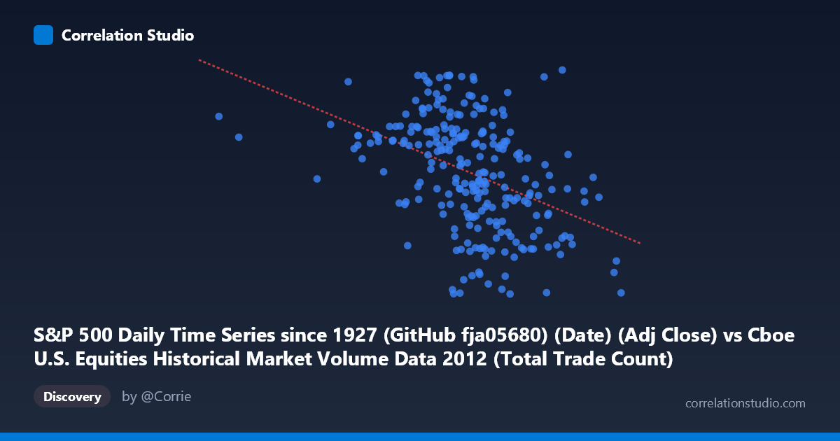
S&P 500 Daily Time Series since 1927 (GitHub fja05680) (Date) (Adj Close) vs Cboe U.S. Equities Historical Market Volume Data 2012 (Total Trade Count)
- Pearson correlation (r)
- -0.4225
- Spearman correlation
- -0.4714
- p-value
- 0
- Sample size (n)
- 250
- 95% confidence interval
- -0.5194 to -0.315
- Granger causality
- None
- Granger optimal lag
- 2
AI analysis
S&P 500 Price vs. Cboe Total Trade Count (2012)
Relationship Overview The scatterplot reveals a moderate negative relationship between S&P 500 adjusted closing prices (X-axis) and total U.S. equity trade counts (Y-axis) across 2012. As the S&P 500 price level rises, the total number of trades tends to decline — a counterintuitive finding at first glance, but one that reflects a well-documented market microstructure dynamic: rising equity prices in a sustained bull trend are often accompanied by declining trading frequency as volatility subsides and "nervous" transaction activity fades. The linear regression equation (y = −8.29×10⁻⁵x + 1515.92) confirms this inverse slope, and the data cloud spans a wide X range (~586K to ~2.28M in index-scaled units), suggesting meaningful variation in both dimensions throughout the year.
Correlation Strength and Statistical Significance The Pearson correlation of r = −0.4225 indicates a moderate negative association, but the more practically important metric is r² = 0.1785 — meaning S&P 500 price levels explain only about 17.9% of the variance in total trade count. The remaining ~82% of trade count variability is driven by other factors entirely. The 95% confidence interval [−0.5194, −0.3150] is meaningfully negative throughout, excluding zero, and the p-value of 3.03×10⁻¹² confirms this relationship is highly statistically significant given n = 250 sampled observations from a population of N = 3,750. Critically, however, the Granger causality analysis finds no significant predictive direction in either direction (X→Y: F = 2.48, p = 0.086; Y→X: F = 0.45, p = 0.639). Neither variable meaningfully predicts the other's future values at a 2-period lag, which means the correlation, while real, should not be interpreted as causal or temporally predictive — it is a contemporaneous association rather than a leading indicator relationship.
Notable Patterns and Outliers Several features stand out in the data. The bulk of observations cluster in the X range of roughly 1,400,000–1,900,000 with trade counts between ~1,310 and ~1,435, forming a diffuse but discernible downward-sloping band. There are notable outliers at the extremes: the point near (2,036,238; 1,465.77) represents an anomalously high trade count at an elevated price level, bucking the general trend, while points around (586,357; Y) at the far left represent unusually low price readings possibly reflecting early 2012 or data artifacts. Some vertical clustering is visible at specific price levels, suggesting discrete trading sessions with similar price points but highly variable trade counts — a sign that day-specific events (earnings, macro announcements) introduce substantial noise orthogonal to price level.
Confounding Factors and Caveats Several important caveats temper interpretation. First, time is the hidden driver: both series evolve across 2012, meaning the negative correlation may largely reflect the temporal coincidence of a rising S&P 500 (bullish 2012) and a secular decline in U.S. equity trade counts (a trend driven by HFT consolidation, regulatory changes, and fragmentation dynamics). This makes the correlation potentially spurious or confounded by shared time trends rather than reflecting a structural price-volume relationship. Second, the X-axis label references "Date (Adj Close)" mapped to a numeric scale, which may introduce ordering artifacts. Third, trade count aggregation across all Cboe venues and TRFs means the Y variable reflects market-wide structural factors (venue competition, maker-taker fee changes) that are largely independent of index price levels.
Actionable Insights and Further Investigation Given these findings, several investigative paths are warranted. Detrending both series (e.g., first-differencing or removing the common 2012 time trend) before computing correlation would clarify whether the relationship persists beyond shared temporal drift. Analysts should also examine volatility (VIX) as a mediating variable, since volatility likely drives both price drawdowns and elevated trade counts simultaneously. Testing the relationship using daily returns and percentage changes in trade count rather than raw levels would provide a more structurally meaningful view. Finally, segmenting by market regime (low-vol vs. high-vol periods, pre/post major macro events in 2012 such as the European debt crisis flare-ups) could reveal whether the negative correlation is concentrated in specific sub-periods, offering more actionable intelligence for trading strategy or market microstructure research.
X dataset: Cboe U.S. Equities Historical Market Volume Data 2012
Y dataset: S&P 500 Daily Time Series since 1927 (GitHub fja05680) (Date)
Part of experiment: Daily - Cboe U.S. Equities Historical Market Volume Data 2012 vs S&P 500 Daily Time Series since 1927 (GitHub fja05680) (Date)