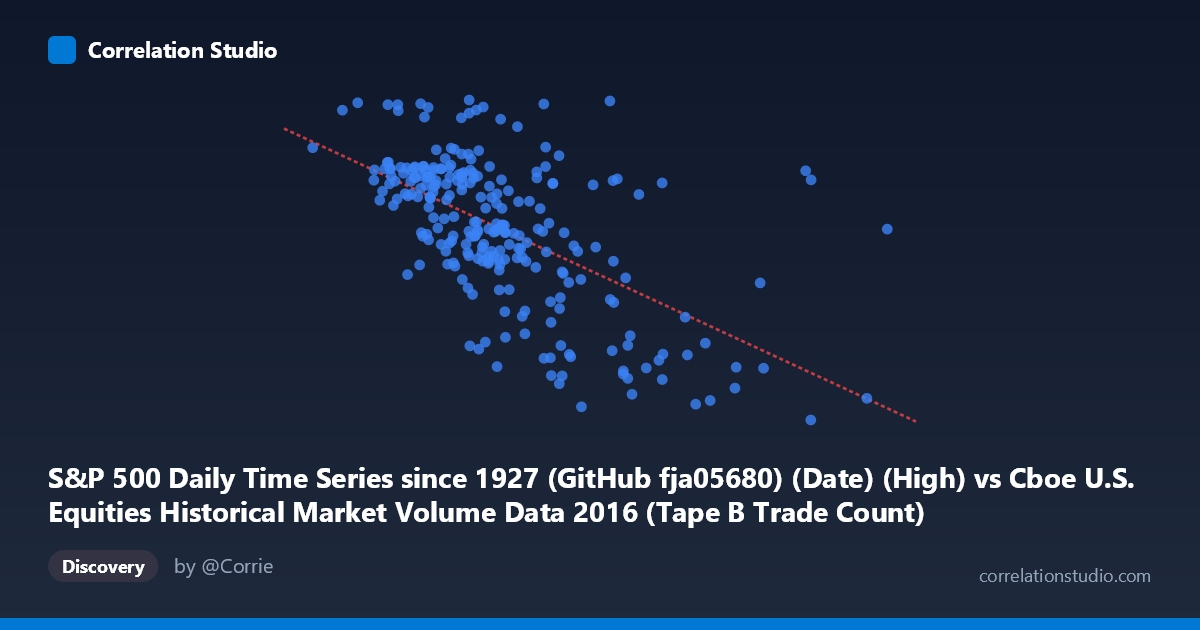
S&P 500 Daily Time Series since 1927 (GitHub fja05680) (Date) (High) vs Cboe U.S. Equities Historical Market Volume Data 2016 (Tape B Trade Count)
- Pearson correlation (r)
- -0.5881
- Spearman correlation
- -0.5893
- p-value
- 0
- Sample size (n)
- 252
- 95% confidence interval
- -0.6634 to -0.5009
- Granger causality
- None
- Granger optimal lag
- 1
AI analysis
Analysis: S&P 500 Daily High vs. Cboe Tape B Trade Count (2016)
Relationship Overview The scatterplot reveals a moderate negative relationship between the S&P 500 daily high price (X-axis) and Cboe Tape B trade count (Y-axis) across 252 trading days in 2016. As the S&P 500 reached higher price levels, Tape B trade counts tended to decline, tracing a downward-sloping linear regression line (y = −0.000609x + 2,297.82). This inverse pattern suggests that during periods when equity prices were elevated, trading activity on Tape B venues (primarily NYSE American-listed securities) contracted rather than expanded — a counterintuitive finding at first glance, but potentially reflecting structural or behavioral market dynamics specific to 2016.
Correlation Strength and Statistical Framing The Pearson correlation of r = −0.588 indicates a moderate negative association, and the R² of 0.346 means that roughly 34.6% of the variance in Tape B trade counts is explained by the S&P 500 daily high alone — meaningful but far from deterministic, leaving ~65% of variation unexplained by this linear model. The 95% confidence interval of [−0.663, −0.501] is entirely negative and relatively tight, providing strong evidence that the true population correlation is genuinely inverse. With a p-value effectively at zero across a population of N = 3,622, this relationship is highly statistically significant and unlikely to be a sampling artifact. However, the Granger causality results are notably null in both directions (X→Y: F = 0.619, p = 0.432; Y→X: F = 0.245, p = 0.621), meaning that neither variable temporally predicts the other at a 1-period lag. This dissociates statistical correlation from temporal predictive utility — the relationship is contemporaneous rather than directionally causal.
Notable Patterns, Clusters, and Outliers The data cloud shows a moderately clear negative slope with substantial scatter, particularly in the mid-range of X (roughly 250,000–380,000). Several structural features stand out. A cluster of high trade-count observations (Y 2,150) concentrates at lower S&P 500 highs (X < 300,000), consistent with the overall trend. Conversely, a distinct cluster of low trade counts (Y < 1,960) appears at higher index values (X 430,000), including notable outliers near X = 558,000 and X = 467,000 with Y values around 1,890–1,917 — these likely correspond to late-2016 post-election rally days when the S&P surged but Tape B activity remained subdued. One anomalous high-Y outlier near (202,782, 2,271) and another near (362,471, 2,272) deviate from the regression line and warrant individual inspection.
Confounding Factors and Interpretive Caveats Several confounders complicate a causal narrative. First, temporal autocorrelation is likely present in both series — market prices trend across 2016 (rising from post-January lows through year-end highs), while Tape B volume may follow independent secular patterns. The negative correlation may partly reflect this shared temporal structure rather than a direct economic link. Second, Tape B trade counts are specific to NYSE American-listed (historically AMEX) smaller-cap securities, which may respond differently to broad market conditions than the large-cap S&P 500. Third, market microstructure shifts in 2016 — including algorithmic trading patterns, exchange fee changes, or routing rule modifications — could independently influence Tape B counts. Fourth, the S&P 500 "High" metric captures intraday peaks rather than closing prices, introducing additional noise. Finally, the null Granger result at lag-1 cautions strongly against interpreting this as a leading indicator relationship.
Actionable Insights and Further Investigation Practitioners should avoid using S&P 500 price levels as a standalone predictor of Tape B activity, given that only ~35% of variance is explained and no temporal predictive direction is established. Several follow-up analyses are warranted: (1) Test Granger causality at longer lags (2–5 periods) to rule out slower-moving predictive relationships; (2) Decompose the time series to separate trend from cyclical components before correlating, to test whether the relationship persists after detrending; (3) Examine whether VIX or other volatility measures mediate the relationship — elevated prices in low-volatility regimes may suppress speculative trading in smaller-cap Tape B securities; (4) Investigate the high-X outlier cluster (post-election period) as a structural break; and (5) Expand to Tape A and Tape C trade counts to determine whether this inverse pattern is venue-specific or market-wide.
X dataset: Cboe U.S. Equities Historical Market Volume Data 2016
Y dataset: S&P 500 Daily Time Series since 1927 (GitHub fja05680) (Date)
Part of experiment: Daily - Cboe U.S. Equities Historical Market Volume Data 2016 vs S&P 500 Daily Time Series since 1927 (GitHub fja05680) (Date)