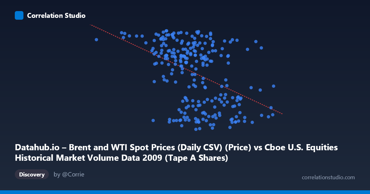
Datahub.io – Brent and WTI Spot Prices (Daily CSV) (Price) vs Cboe U.S. Equities Historical Market Volume Data 2009 (Tape A Shares)
- Pearson correlation (r)
- -0.4352
- Spearman correlation
- -0.4117
- p-value
- 0
- Sample size (n)
- 252
- 95% confidence interval
- -0.5303 to -0.3294
- Granger causality
- None
- Granger optimal lag
- 1
AI analysis
Analysis: Brent Crude Oil Prices vs. U.S. Equity Market Volume (2009)
Relationship Overview The scatterplot reveals a moderate negative relationship between U.S. equity market trading volume (X-axis, measured in shares) and Brent crude oil spot prices (Y-axis, measured in USD per barrel) across trading days in 2009. The linear regression equation (y = -5.49×10⁻⁸x + 85.84) indicates that as equity market volume increases, oil prices tend to decline. This inverse relationship is visually apparent in the scatter, though considerable dispersion surrounds the trend line, signaling that the relationship is real but far from deterministic. The year 2009 provides a particularly interesting backdrop — markets were recovering from the 2008 financial crisis, with oil prices rebounding from historic lows while equity volumes remained elevated due to heightened volatility and institutional repositioning.
Correlation Strength and Statistical Significance The Pearson correlation of r = -0.4352 reflects a moderate negative association, but the explanatory power is modest: R² = 0.1894, meaning only about 19% of the variance in Brent crude prices is explained by equity trading volume. The remaining ~81% is attributable to other factors entirely. The result is nonetheless highly statistically significant (p = 4.53×10⁻¹³), which, given the reasonably large paired sample (n = 252 trading days from a population of N = 3,232), confirms this is not a chance finding. The 95% confidence interval for r of [-0.53, -0.33] is usefully narrow and sits entirely in negative territory, reinforcing confidence that the true correlation is genuinely inverse. However, statistical significance should not be mistaken for practical magnitude — a 19% explained variance leaves the vast majority of oil price movement unexplained by volume alone. Critically, the Granger causality tests are entirely non-significant in both directions (X→Y: F = 0.14, p = 0.71; Y→X: F = 0.0006, p = 0.98), meaning neither variable temporally predicts the other at a one-period lag. This effectively rules out a straightforward lead-lag or predictive causal mechanism between the two series.
Notable Patterns, Clusters, and Outliers Several structural features stand out in the data. There appear to be two loose clusters: one grouping of observations with higher oil prices (~65–78 USD/barrel) spanning a wide range of volumes, and another cluster with lower oil prices (~39–55 USD/barrel) concentrated more at higher volume levels. This bimodal-like distribution in Y may reflect the distinct phases of 2009 — the depressed early-year environment versus the mid-to-late year recovery — rather than a smooth linear relationship. Notable outliers include the point at (105,713,299, 75.15), representing unusually low volume paired with elevated oil price, and (704,192,148, 56.63), the highest-volume observation with a mid-range oil price. Points such as (501,606,233, 41.27) and (632,246,951, 42.19) anchor the high-volume, low-price cluster. The spread at mid-range volume values (~400–550M shares) is particularly wide, suggesting the linear model fits poorly in this central region.
Confounding Factors and Interpretive Caveats Several important caveats apply. First, the axis labeling appears to contain a metadata inversion — the X-axis is attributed to oil price data while the Y-axis is attributed to equity volume data, yet the axis ranges (X: ~105M–704M; Y: ~39–78) strongly suggest X represents share volume and Y represents oil price in USD/barrel. This should be verified before drawing firm conclusions. Second, 2009 was a highly anomalous year dominated by crisis-recovery dynamics, fiscal stimulus, and extreme risk sentiment shifts, all of which could independently drive both variables and create spurious correlation. Third, the negative correlation likely reflects a common driver — risk appetite or macroeconomic sentiment — rather than any direct mechanism between equity volume and oil prices. High trading volumes in early 2009 coincided with panic selling when oil was cheap; lower volumes later in the year coincided with calmer, higher-priced markets. Fourth, the daily lag of 1 period tested in Granger analysis may be too short or long to capture relevant dynamics, and the non-significance may simply reflect the noisy daily frequency.
Actionable Insights and Further Investigation Given the modest explanatory power and absence of Granger causality, practitioners should avoid using equity market volume as a standalone predictor of oil prices or vice versa. However, the correlation may be a useful risk sentiment indicator worth incorporating into a broader multivariate model. Recommended next steps include: (1) decomposing the data by sub-period (Q1 crisis phase vs. Q2–Q4 recovery) to test whether the correlation is driven by a specific market regime; (2) introducing mediating variables such as VIX (volatility index), USD index, or S&P 500 returns, which likely explain much of the remaining 81% variance; (3) testing longer Granger lags (5–10 trading days) to capture slower-moving relationships between sentiment-driven volume and commodity repricing; and (4) applying regime-switching or non-linear models given the apparent clustering in the data that a simple linear fit does not fully capture.
X dataset: Cboe U.S. Equities Historical Market Volume Data 2009
Y dataset: Datahub.io – Brent and WTI Spot Prices (Daily CSV)
Part of experiment: Daily - Cboe U.S. Equities Historical Market Volume Data 2009 vs Datahub.io – Brent and WTI Spot Prices (Daily CSV)