Google Mobility – US Sub-Region Level Mobility CSV (residential_percent_change_from_baseline) vs 10-Year US Treasury Constant Maturity Rate (FRED) (DGS10)
- Pearson correlation (r)
- -0.4197
- Spearman correlation
- -0.5134
- p-value
- 0
- Sample size (n)
- 251
- 95% confidence interval
- -0.5167 to -0.3122
- Granger causality
- None
- Granger optimal lag
- 1
- Time coverage
- 2021-01-04 to 2021-12-31
- Recomputed on refreshed data
- 2026-10-22 (r was -0.4197)
AI analysis
Analysis: Residential Mobility vs. 10-Year Treasury Yield (2021)
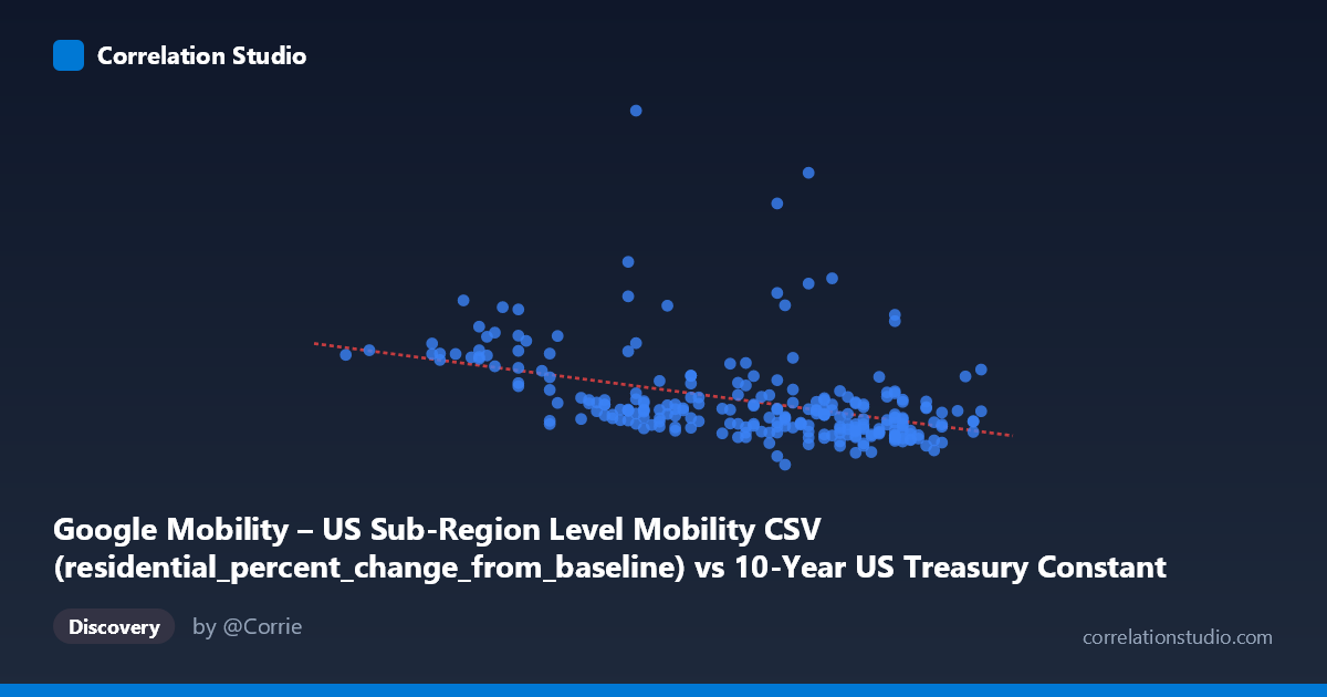
Relationship Overview The scatterplot reveals a moderate negative relationship between US residential mobility (percent change from baseline) and the 10-year Treasury yield across 2021. As residential mobility increases — meaning people are spending more time at home — Treasury yields tend to be lower, and conversely, as yields rise, residential mobility tends to decline. This pattern is contextually intuitive: higher residential mobility was associated with COVID-era restrictions and economic uncertainty, periods that also coincided with suppressed interest rates, while declining residential mobility (people returning to workplaces and normal routines) tracked alongside rising yields as economic recovery progressed through 2021.
Correlation Strength and Statistical Framing The correlation coefficient of r = -0.42 indicates a moderate negative association, but the explanatory power is notably limited: R² = 0.176, meaning residential mobility accounts for only about 17.6% of the variance in Treasury yields. The remaining ~82% is driven by factors entirely outside this relationship. The 95% confidence interval of [-0.52, -0.31] is meaningfully negative throughout, and the p-value of 3.9×10⁻¹² confirms the correlation is highly statistically significant — a result bolstered by the large population size of N = 16,799. However, statistical significance here should not be conflated with practical or causal significance. Critically, Granger causality tests show no significant predictive direction in either direction (X→Y: p = 0.707; Y→X: p = 0.897), meaning neither variable reliably forecasts the other temporally. The relationship appears to be coincident rather than directionally predictive.
Patterns, Clusters, and Outliers The data cloud shows considerable vertical dispersion across all X values, reinforcing the low R². Several notable outliers are visible: points such as (1.30, 21.04), (1.48, 15.88), and (1.07, 7.50) sit well above the regression line (y = -5.76x + 13.21), suggesting episodes where high residential mobility coexisted with yields that deviate sharply from the trend. There appears to be a mild clustering of observations in the X = 1.50–1.65 range with Y values concentrated between 2–6%, reflecting the more "normalized" late-2021 period. The lower X values (below ~1.20) show higher and more dispersed Y values, consistent with early-2021 when yields were low and pandemic-related mobility restrictions were still substantial. No strong non-linear structure is visually apparent, though the high scatter suggests the linear model is a rough approximation at best.
Confounding Factors and Caveats This correlation almost certainly reflects a shared temporal driver — the COVID-19 pandemic trajectory throughout 2021 — rather than any direct economic mechanism linking residential mobility to bond yields. Both variables were simultaneously influenced by vaccine rollout progress, variant waves (Delta, Omicron), fiscal stimulus, and Federal Reserve forward guidance. The dataset merges a county-level mobility metric with a national Treasury yield, creating an ecological mismatch; aggregation across heterogeneous counties may obscure or distort the true relationship. Additionally, the residential mobility measure is a percent change from a 2020 baseline that was itself abnormal, introducing baseline bias. The lack of Granger causality strongly cautions against any structural interpretation.
Actionable Insights and Further Investigation Given the modest explanatory power and absent Granger causality, this correlation should not be used for forecasting purposes in isolation. Worthwhile next steps include: (1) introducing explicit COVID case rates or vaccination rates as covariates to test whether the correlation is fully mediated by pandemic dynamics; (2) segmenting the analysis by region or time subperiod (Q1 vs. Q4 2021) to detect whether the relationship strengthens during specific pandemic phases; (3) examining workplace or retail mobility categories instead of residential, as these may have a more direct theoretical link to economic activity and yield expectations; and (4) testing against other macroeconomic controls (unemployment claims, CPI releases) to properly attribute variance. The relationship is statistically real but likely epiphenomenal — a reflection of 2021's unique macro-pandemic environment rather than a durable structural link.
X dataset: 10-Year US Treasury Constant Maturity Rate (FRED)
Y dataset: Google Mobility – US Sub-Region Level Mobility CSV
Part of experiment: Daily - 10-Year US Treasury Constant Maturity Rate (FRED) vs Google Mobility – US Sub-Region Level Mobility CSV