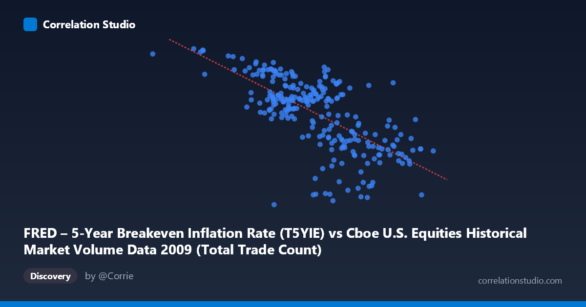
FRED – 5-Year Breakeven Inflation Rate (T5YIE) vs Cboe U.S. Equities Historical Market Volume Data 2009 (Total Trade Count)
- Pearson correlation (r)
- -0.6792
- Spearman correlation
- -0.6878
- p-value
- 0
- Sample size (n)
- 250
- 95% confidence interval
- -0.7409 to -0.6063
- Granger causality
- None
- Granger optimal lag
- 1
AI analysis
Analysis: 5-Year Breakeven Inflation Rate vs. U.S. Equity Market Trade Count (2009)
Relationship Overview
The scatterplot reveals a moderately strong negative relationship between U.S. equity market trade counts (X-axis) and the 5-Year Breakeven Inflation Rate (Y-axis) across 2009. As daily trade counts increase, inflation expectations tend to decline — and conversely, periods of lower trading volume correspond with higher breakeven inflation rates. The linear regression equation (y = -6.17×10⁻⁷x + 2.79) reflects this inverse pattern, with the negative slope indicating that each additional unit of trading activity is associated with a measurable downward shift in the breakeven rate. Visually, the data points form a downward-sloping cloud, broadly consistent with the fitted line, though with meaningful scatter around it.
Correlation Strength and Statistical Interpretation
The Pearson correlation of r = -0.6792 indicates a moderate-to-strong negative association, and the R² of 0.4614 means that approximately 46.1% of the variance in the breakeven inflation rate is explained by trade count alone — a non-trivial explanatory share, but also a clear reminder that over half the variance remains unexplained. The 95% confidence interval of [-0.7409, -0.6063] is relatively narrow and does not include zero, and the p-value of effectively 0 (against N = 3,232) confirms the relationship is highly statistically significant and unlikely to be a sampling artifact. However, the Granger causality tests tell a more cautious story: neither direction (X→Y nor Y→X) reaches significance (F = 0.038, p = 0.845 and F = 0.394, p = 0.531, respectively), meaning that past values of trade count do not meaningfully predict future inflation expectations, and vice versa. This is a critical distinction — there is a robust contemporaneous correlation, but no evidence of temporal predictive directionality, which significantly limits any causal interpretation.
Patterns, Clusters, and Outliers
Several notable features stand out in the data. There is a visible cluster of points in the mid-range of X (~2.0M–3.0M trade counts) where the breakeven rate spans a wide range (roughly 0.5–2.0), suggesting that at moderate trading volumes, inflation expectations were quite variable — possibly reflecting the volatile macroeconomic backdrop of 2009's recovery period. At the lower end of trade counts (below ~1.5M), breakeven rates are consistently high (1.7–2.1+), forming a tight upper-left cluster. At the high end of trade counts (above ~3.5M), breakeven rates compress toward the lower range (0.3–0.8), suggesting that peak-volume days were associated with more pessimistic or suppressed inflation expectations. A few potential outliers are visible — including one point near (629,671, 2.05) at extremely low volume and very high inflation expectations, and points near (2,786,599, -0.08) and (3,067,782, -0.03) where breakeven rates dip slightly negative, an unusual condition reflecting deflationary fears during the financial crisis aftermath.
Confounding Factors and Caveats
Several important caveats warrant caution. 2009 was an extraordinary year — the global financial crisis was in its acute resolution phase, with the S&P 500 bottoming in March before recovering dramatically. This means the correlation may largely be capturing a temporal artifact: early 2009 saw heightened volatility and high trading volumes amid deflationary fears (low breakeven rates), while later 2009 saw calmer markets with recovering inflation expectations as stimulus measures took hold. In other words, time itself may be the underlying confounder, with both variables trending along a shared recovery narrative rather than one driving the other. Additionally, the axes appear to be mislabeled relative to intuition — trade count is on the X-axis but originates from the FRED dataset label, and the breakeven rate is on the Y-axis from the Cboe dataset label, suggesting a possible column-assignment swap that analysts should verify before drawing conclusions. Liquidity conditions, Federal Reserve policy actions (QE1 launched in March 2009), and risk sentiment shifts could all simultaneously drive both variables, making any direct causal inference hazardous.
Actionable Insights and Further Investigation
Given these findings, several investigative steps are warranted. First, re-examine the data with a time dimension overlay — color-coding or sequencing points by date would reveal whether the correlation largely tracks the 2009 recovery arc, which would reframe it as a spurious time-trend correlation rather than a structural relationship. Second, analysts should test this correlation across multiple years to assess whether it persists outside of the 2009 crisis context; a relationship driven purely by crisis dynamics may not generalize. Third, incorporating additional control variables — such as VIX (market volatility), Fed balance sheet size, or credit spreads — would help isolate whether trade count or inflation expectations retain independent explanatory power in a multivariate framework. Finally, given the Granger causality null results, forecasting applications should be approached skeptically: this correlation, however statistically robust, does not support using trade volume to predict inflation expectations (or vice versa) at the next-day horizon with the current data structure.
X dataset: Cboe U.S. Equities Historical Market Volume Data 2009
Y dataset: FRED – 5-Year Breakeven Inflation Rate
Part of experiment: Daily - Cboe U.S. Equities Historical Market Volume Data 2009 vs FRED – 5-Year Breakeven Inflation Rate