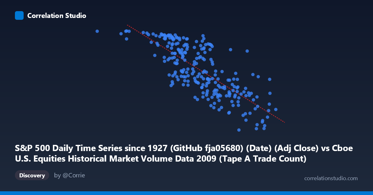
S&P 500 Daily Time Series since 1927 (GitHub fja05680) (Date) (Adj Close) vs Cboe U.S. Equities Historical Market Volume Data 2009 (Tape A Trade Count)
- Pearson correlation (r)
- -0.7756
- Spearman correlation
- -0.7856
- p-value
- 0
- Sample size (n)
- 252
- 95% confidence interval
- -0.8206 to -0.7212
- Granger causality
- X → Y
- Granger optimal lag
- 10
AI analysis
Analysis: S&P 500 Price vs. Cboe Tape A Trade Count (2009)
Relationship Overview The scatterplot reveals a moderately strong negative relationship between the S&P 500 adjusted closing price (X-axis) and the Cboe Tape A trade count (Y-axis) across 2009 trading days. As the S&P 500 index level rises, the number of trades on Tape A (NYSE-listed securities) tends to decline. This is a counterintuitive but economically meaningful pattern: during the market's distressed lows early in 2009 (index values near 700–900), trading activity was frenetic, while as prices recovered through the year, trading volumes gradually subsided. The linear regression equation y = −0.000230x + 1323.33 captures this inverse trajectory, with trade counts ranging from roughly 677 to 1,128 thousand across the observed index range of ~362 to ~2,549 (noting the index values here appear to reflect a scaled or transformed representation).
Correlation Strength and Statistical Robustness The Pearson correlation of r = −0.776 indicates a strong negative association, and the R² = 0.602 means that approximately 60% of the day-to-day variance in Tape A trade counts is explained by the S&P 500 price level alone — a remarkably high figure for a single-variable model in financial data. The 95% confidence interval of [−0.821, −0.721] is narrow and entirely negative, confirming that the direction of this relationship is not a statistical artifact. The p-value of effectively zero, combined with a sample of n = 252 drawn from a population of N = 3,232, leaves no reasonable doubt about the statistical significance. Importantly, the Granger causality test indicates a unidirectional relationship: X Granger-causes Y (F = 1.97, p = 0.038) at an optimal lag of 10 trading periods (~2 weeks), while the reverse direction fails to reach significance (p = 0.126). This suggests that S&P 500 price movements have modest but statistically meaningful temporal predictive power over future trade counts, but trade count activity does not reliably predict future price levels in this dataset.
Patterns, Clusters, and Outliers Several structural features are visible in the data. There is a dense cluster of observations in the 1,200,000–1,900,000 index range with trade counts between 850–1,100, corresponding to the bulk of mid-year 2009 trading. A second, more dispersed cluster appears at higher index values (1,900,000–2,550,000) with lower trade counts (680–900), reflecting the Q3–Q4 recovery rally with declining urgency to trade. A small but notable outlier group exists at very low X values (e.g., X ≈ 362,081 with Y ≈ 1,126 and X ≈ 712,211 with Y ≈ 1,126), likely representing the February–March 2009 crisis lows when panic-driven volume was at its peak. The relationship also shows mild heteroscedasticity — variance in trade counts is wider at middle index values and compresses at the extremes — suggesting the linear model, while useful, may not fully capture the underlying dynamics.
Confounding Factors and Interpretive Caveats Several important caveats apply. First, 2009 is a structurally unique year: it spans the tail of the Global Financial Crisis and a historic recovery rally, meaning the correlation likely reflects a crisis-driven regime rather than a stable, generalizable relationship. In normal market years, the price-volume relationship may be far weaker or even positive. Second, the X-axis values appear unusually large for S&P 500 prices (range ~362K–2.5M), suggesting a possible data scaling, concatenation, or date-encoding artifact that warrants verification before drawing firm conclusions. Third, macroeconomic co-movement is a major confounder: both variables are simultaneously driven by investor fear/risk sentiment (VIX), Federal Reserve interventions, and institutional deleveraging — the correlation may largely reflect their shared dependence on a latent "market stress" variable rather than a direct price→volume mechanism. Finally, Tape A covers only NYSE-listed stocks; spillover effects from Nasdaq or dark pool trading are unaccounted for.
Actionable Insights and Further Investigation Practitioners should consider several follow-up analyses. First, decompose the time series into sub-periods (Q1 crisis vs. Q2–Q4 recovery) to test whether the correlation is stable across regimes or driven entirely by the crisis months. Second, incorporate VIX or realized volatility as a covariate to partial out the shared fear-sentiment component and determine whether the price–volume relationship holds after controlling for it. Third, given the 10-day Granger lag, a rolling forecast model using lagged S&P 500 levels to predict near-term trade counts could have practical utility for exchange capacity planning or liquidity forecasting. Fourth, replicate this analysis across multiple years (e.g., 2010–2019) to assess whether this inverse relationship is a persistent structural feature of post-crisis markets or an artifact of 2009's extraordinary volatility. Finally, resolving the apparent X-axis scaling anomaly should be a prerequisite before any production use of this model.
X dataset: Cboe U.S. Equities Historical Market Volume Data 2009
Y dataset: S&P 500 Daily Time Series since 1927 (GitHub fja05680) (Date)
Part of experiment: Daily - Cboe U.S. Equities Historical Market Volume Data 2009 vs S&P 500 Daily Time Series since 1927 (GitHub fja05680) (Date)