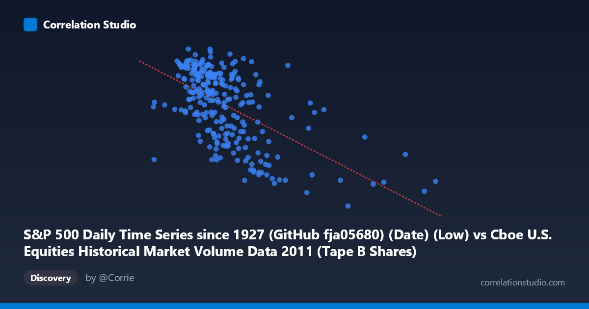
S&P 500 Daily Time Series since 1927 (GitHub fja05680) (Date) (Low) vs Cboe U.S. Equities Historical Market Volume Data 2011 (Tape B Shares)
- Pearson correlation (r)
- -0.5836
- Spearman correlation
- -0.5533
- p-value
- 0
- Sample size (n)
- 252
- 95% confidence interval
- -0.6596 to -0.4957
- Granger causality
- None
- Granger optimal lag
- 1
AI analysis
Scatterplot Analysis: S&P 500 Daily Low vs. Cboe Tape B Shares (2011)
1. Overall Relationship The scatterplot reveals a moderate negative relationship between the S&P 500 daily low price (X-axis) and Cboe Tape B share volume (Y-axis) across 252 trading days in 2011. As the S&P 500's daily low increases — indicating higher price levels — Tape B share volume tends to decline. This inverse pattern is visually apparent as a downward-sloping cloud of points, consistent with the fitted regression line y = -1.171×10⁻⁶x + 1372.12. The relationship suggests that during periods when equity prices were relatively depressed, trading activity on Tape B venues was elevated, a pattern consistent with heightened volatility-driven volume during market stress.
2. Correlation Strength and Statistical Significance The Pearson correlation of r = -0.584 indicates a moderate negative association. However, r² = 0.341 is the more practically informative figure: only 34.1% of the variance in Tape B shares is explained by the S&P 500 daily low, meaning roughly two-thirds of volume variation is driven by other factors entirely. The 95% confidence interval of [-0.660, -0.496] is reasonably tight and does not cross zero, and the p-value of effectively zero (against N = 3,780) confirms the correlation is highly statistically significant — this is not a chance finding. That said, the Granger causality results are striking in their null outcome: neither direction (X→Y: F = 0.0014, p = 0.970; Y→X: F = 0.0154, p = 0.901) shows any temporal predictive power at a one-period lag. This means that while the two variables move together contemporaneously, knowing yesterday's S&P low does not help predict today's Tape B volume, and vice versa. The correlation is associative, not directionally predictive in a time-series sense.
3. Notable Patterns, Clusters, and Outliers Several structural features stand out in the data. There is a visible concentration of points in the 60M–130M range on the X-axis, reflecting the bulk of 2011 trading conditions, with volume clustering between roughly 1,200 and 1,350 shares. A meaningful cluster of high-volume, low-price observations (X below ~80M, Y above 1,280) reinforces the inverse narrative — likely corresponding to the August–October 2011 market selloff driven by the U.S. debt ceiling crisis and European sovereign debt fears. Conversely, several outlier points appear at the far right of the X-axis (X 160M, including one near 190M), where Tape B volume drops to the 1,100–1,250 range, suggesting quieter trading at elevated price levels. Notably, the scatter is fairly wide throughout, and there is a hint of non-linearity: the relationship may steepen at lower price levels and flatten at higher ones, suggesting a potential threshold or regime effect rather than a purely linear dynamic.
4. Confounding Factors and Caveats Several important caveats temper interpretation. First, 2011 was an unusually volatile year — the S&P 500 fell ~20% intraday peak-to-trough mid-year — meaning this correlation may partly reflect a single regime of stress rather than a generalizable structural relationship. Second, Tape B specifically covers NYSE American (AMEX) and regional exchange listings, which may have different liquidity and investor composition than broader market indices, introducing a mismatch between the index price level and the specific venue's volume. Third, the correlation could be spuriously driven by a common third variable — most plausibly market-wide volatility (e.g., VIX), which simultaneously depresses prices and elevates trading volume across all venues. Finally, using the daily low (rather than close or open) as the price variable introduces a subtle bias, as lows are naturally more extreme on high-volume, high-volatility days, which may artificially inflate the negative correlation.
5. Actionable Insights and Further Investigation Given that only 34% of variance is explained and Granger causality is absent, this correlation should not be used for predictive trading signals in any straightforward way. A natural next step would be to introduce VIX or realized volatility as a control variable to test whether the price-volume relationship persists once volatility is accounted for — if the correlation disappears, it confirms the confounding hypothesis. Researchers should also test across multiple years to determine whether this relationship is specific to 2011's stress environment or is stable across different market regimes. Extending the Granger analysis to longer lags (2–5 periods) could uncover delayed predictive dynamics that the one-period lag misses. Finally, comparing Tape B results against Tape A and Tape C volumes would clarify whether this is a venue-specific phenomenon or a market-wide pattern, which has implications for understanding fragmented U.S. equity market structure.
X dataset: Cboe U.S. Equities Historical Market Volume Data 2011
Y dataset: S&P 500 Daily Time Series since 1927 (GitHub fja05680) (Date)
Part of experiment: Daily - Cboe U.S. Equities Historical Market Volume Data 2011 vs S&P 500 Daily Time Series since 1927 (GitHub fja05680) (Date)