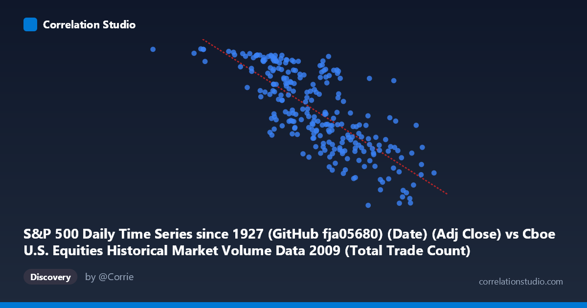
S&P 500 Daily Time Series since 1927 (GitHub fja05680) (Date) (Adj Close) vs Cboe U.S. Equities Historical Market Volume Data 2009 (Total Trade Count)
- Pearson correlation (r)
- -0.7592
- Spearman correlation
- -0.7697
- p-value
- 0
- Sample size (n)
- 252
- 95% confidence interval
- -0.8071 to -0.7014
- Granger causality
- X → Y
- Granger optimal lag
- 10
AI analysis
Analysis: S&P 500 Price vs. U.S. Equities Total Trade Count (2009)
1. Overall Relationship The scatterplot reveals a clear negative relationship between the S&P 500 adjusted closing price (X-axis) and the total trade count in U.S. equities markets (Y-axis) throughout 2009. As the S&P 500 index level rises, the number of daily trades tends to fall — a counterintuitive finding at first glance, but one that makes strong economic sense in the specific context of 2009, a year that began in the depths of the Global Financial Crisis and gradually recovered. The linear regression equation (y = −0.000146508x + 1338.79) confirms the negative slope, and the downward trend is visually apparent across the point cloud.
2. Correlation Strength, Direction, and Causality The Pearson correlation of r = −0.7592 indicates a strong negative association, and critically, the R² of 0.5764 means that S&P 500 price level explains approximately 57.6% of the variance in daily trade counts — a substantial proportion for financial market data, though it also means roughly 42% of variation remains unexplained by price alone. The 95% confidence interval of [−0.8071, −0.7014] is relatively tight and does not cross zero, and the p-value is effectively 0, making this relationship statistically unambiguous across the 252-day sample. The Granger causality analysis adds an important directional dimension: X Granger-causes Y (F = 2.0153, p = 0.0329) at an optimal lag of 10 trading periods (approximately two calendar weeks), while the reverse direction fails to reach significance (p = 0.1022). This suggests that S&P 500 price movements carry statistically meaningful predictive information about future trade counts, but trade counts do not similarly predict future prices — implying an asymmetric, forward-looking relationship where market sentiment reflected in prices leads trading activity.
3. Notable Patterns, Clusters, and Outliers Several structural features stand out in the point cloud. There is a visible high-trade-count cluster at lower S&P 500 values (roughly 629,000–1,800,000 on the x-axis scale, corresponding to early 2009 crisis-period prices), where trade counts frequently exceed 1,050–1,127 units. Conversely, points at higher index levels tend to cluster around 700–900 trade counts. A few notable outliers are visible: the extreme left point near x ≈ 629,671 with y ≈ 1,126 represents a very low price/high volatility day, consistent with early 2009 panic trading, while points at x 3,800,000 with y values dipping below 720 suggest that as the market recovered to late-year highs, algorithmic and retail trading activity consolidated. The scatter also shows moderate heteroscedasticity — variance in trade counts is wider at lower price levels and narrows as prices rise — suggesting the relationship may not be perfectly linear throughout the year.
4. Confounding Factors and Interpretive Caveats The most significant confounding factor is time itself. Both variables are evolving together across 2009: the S&P 500 was at its crisis nadir in March 2009 (~666 points) and recovered to ~1,115 by year-end, while trade counts likely reflect panic-driven volume early in the year and calmer, more orderly markets later. This means the correlation may be largely capturing a shared time trend — a spurious or at least partially confounded relationship driven by the crisis-to-recovery arc rather than a direct causal mechanism between price level and trade frequency. Additionally, the rise of high-frequency trading (HFT) in this period, regulatory changes, and shifts in exchange competition (Cboe-specific dynamics) could independently drive trade count changes. The Granger lag of 10 periods also warrants caution — at that lag length, many macroeconomic and institutional factors could intervene, weakening causal interpretation.
5. Actionable Insights and Further Investigation The finding that S&P 500 price Granger-causes trade count with a ~10-day lag is practically relevant for market microstructure research and liquidity forecasting: traders and risk managers could potentially use index-level trends as a leading indicator of aggregate trading activity roughly two weeks ahead. However, to isolate this relationship from the dominant time trend, detrending both series (e.g., using first differences or residuals from a time trend regression) before computing correlation would be a critical next step. Extending the analysis across multiple years — particularly comparing 2009 to non-crisis years — would determine whether this negative relationship is a structural feature of market microstructure or an artifact of the unique 2009 crisis-recovery dynamic. Finally, segmenting the data by market regime (pre/post March 2009 bottom) and incorporating volatility measures like the VIX as a control variable would substantially sharpen causal inference.
X dataset: Cboe U.S. Equities Historical Market Volume Data 2009
Y dataset: S&P 500 Daily Time Series since 1927 (GitHub fja05680) (Date)
Part of experiment: Daily - Cboe U.S. Equities Historical Market Volume Data 2009 vs S&P 500 Daily Time Series since 1927 (GitHub fja05680) (Date)