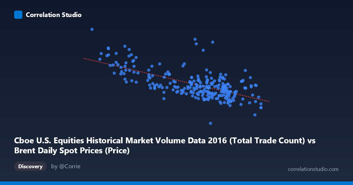
Cboe U.S. Equities Historical Market Volume Data 2016 (Total Trade Count) vs Brent Daily Spot Prices (Price)
- Pearson correlation (r)
- -0.6558
- Spearman correlation
- -0.5839
- p-value
- 0
- Sample size (n)
- 251
- 95% confidence interval
- -0.7211 to -0.579
- Granger causality
- None
- Granger optimal lag
- 10
AI analysis
Analysis: Brent Crude Oil Prices vs. U.S. Equity Trade Count (2016)
Relationship Overview The scatterplot reveals a moderate negative relationship between Cboe U.S. equity trade counts (X) and Brent crude oil spot prices (Y) across 2016. The linear regression equation (y = -51,695x + 4,682,900) indicates that for each additional unit increase in trade count, Brent prices decrease by approximately $51,695 on average. Visually, the data forms a downward-sloping cloud, with lower trade counts clustering around higher oil prices (roughly $30–45/barrel range translating to 2.5M–4.5M trade counts) and higher trade counts associated with lower oil prices. This inverse pattern is coherent with the broader 2016 market narrative: early-year oil price weakness coincided with elevated market volatility and trading activity, while oil's recovery later in the year corresponded with calmer, lower-volume equity markets.
Correlation Strength and Statistical Significance The Pearson correlation of r = -0.6558 indicates a moderate-to-strong negative association, and with r² = 0.4301, approximately 43% of the variance in Brent prices is statistically explained by equity trade volume — a meaningful but far from complete explanatory relationship. The 95% confidence interval of [-0.7211, -0.5790] is relatively tight given the sample size of n = 251, and the p-value of effectively 0 confirms this correlation is highly unlikely to be a chance artifact. However, Granger causality tests tell a more cautionary tale: neither direction (X→Y nor Y→X) achieves significance at the optimal 10-period lag (F = 0.65, p = 0.77 and F = 0.69, p = 0.73, respectively). This means that while the two series co-move statistically, neither variable temporally predicts the other — the correlation likely reflects shared exposure to common macroeconomic drivers rather than any direct causal mechanism between equity trade activity and oil prices.
Notable Patterns, Clusters, and Outliers Several structural features stand out. There is a dense cluster in the moderate-to-high trade count range (47–51 units) with oil prices concentrated between roughly $1.9M–$2.5M (in the Y-axis units), suggesting this was the dominant regime for much of mid-to-late 2016. At the lower end of trade counts (26–34), a small but visually distinct cluster of high oil price observations appears — these likely correspond to early 2016 or year-end periods when equity markets were less active but oil was either at trough or recovering. Three points are particularly notable outliers: (26.01, 4,513,854), (27.59, 3,594,822), and (31.83, 3,241,034), all exhibiting very low trade counts paired with the highest oil prices in the dataset, pulling the regression line considerably. These leverage points may exert disproportionate influence on the r value and deserve scrutiny. There is also visible heteroscedasticity — variance in Y is substantially wider at low X values than at high X values, which violates linear regression assumptions and suggests the relationship is not uniformly linear across the full range.
Confounding Factors and Interpretive Caveats The most important caveat here is a dataset labeling irregularity: the X-axis is described as coming from the "Brent Daily Spot Prices" dataset while representing Cboe trade count data, and vice versa for Y — suggesting the columns may have been swapped between datasets during merging. This warrants verification before any substantive conclusions are drawn. Beyond this, the correlation almost certainly reflects shared temporal structure rather than a direct economic link: both series are driven by the 2016 macro calendar (China growth fears in Q1, OPEC negotiations, U.S. election volatility), meaning the correlation is largely a product of confounding by time. Additionally, the Granger non-causality result reinforces that any predictive signal implied by r = -0.66 dissolves when temporal ordering is properly accounted for. The aggregation of data to daily frequency across fundamentally different market mechanisms (commodity spot vs. equity volume) also introduces ecological fallacy risk.
Actionable Insights and Further Investigation Given the absence of Granger causality and the likely temporal confounding, practitioners should resist using equity trade count as a predictive signal for oil prices (or vice versa) in any trading or hedging model. Instead, the analysis suggests several productive next steps: (1) Investigate shorter lag structures (1–3 days) for Granger causality rather than relying solely on the optimal 10-period lag, as microstructure relationships may operate faster; (2) Partial out the time trend by regressing both series on calendar time and testing the residuals — if the correlation disappears, it is purely spurious; (3) Examine whether the outlier cluster at low trade counts corresponds to specific calendar events (e.g., January 2016 market turmoil or holiday periods) and assess whether their removal substantially changes r²; and (4) Consider non-linear modeling (e.g., piecewise regression or LOESS) given the apparent heteroscedasticity and possible regime-switching behavior visible in the scatterplot. The 43% explained variance is intriguing enough to warrant deeper investigation, but the Granger results strongly suggest the relationship is coincidental co-movement driven by 2016's specific macroeconomic environment rather than a structurally reliable connection.
X dataset: Brent Daily Spot Prices
Y dataset: Cboe U.S. Equities Historical Market Volume Data 2016
Part of experiment: Daily - Brent Daily Spot Prices vs Cboe U.S. Equities Historical Market Volume Data 2016