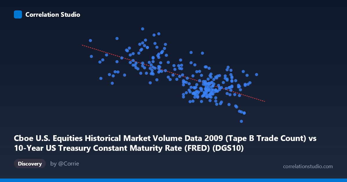
Cboe U.S. Equities Historical Market Volume Data 2009 (Tape B Trade Count) vs 10-Year US Treasury Constant Maturity Rate (FRED) (DGS10)
- Pearson correlation (r)
- -0.6783
- Spearman correlation
- -0.6375
- p-value
- 0
- Sample size (n)
- 250
- 95% confidence interval
- -0.7401 to -0.6052
- Granger causality
- None
- Granger optimal lag
- 10
AI analysis
Analysis: 10-Year Treasury Yield vs. Cboe Equity Trade Count (2009)
Relationship Overview
The scatterplot reveals a moderate-to-strong negative relationship between the 10-year US Treasury constant maturity rate (X-axis) and Cboe equity trade counts (Y-axis) across 2009. As Treasury yields rise, equity trade volume tends to decline, and this inverse pattern is visually apparent across the data cloud. The linear regression equation (y = −217,203x + 1,111,970) quantifies this: each one-percentage-point increase in the 10-year yield is associated with approximately 217,000 fewer trades. Given that X ranges from roughly 2.23% to 3.98% — a span of about 175 basis points — this implies a predicted swing of roughly 380,000 trades across the yield range, which is economically substantial relative to the mean trade count of ~403,000.
Correlation Strength and Statistical Significance
The Pearson correlation of r = −0.678 indicates a meaningful negative association, and with R² = 0.46, approximately 46% of the variance in trade counts is explained by the Treasury yield level — a notably high figure for a single macroeconomic variable in financial markets. The 95% confidence interval [−0.740, −0.605] is relatively tight and lies entirely in negative territory, reinforcing confidence in the direction and approximate magnitude of the relationship. The p-value of essentially zero, drawn from a population of N = 3,232 observations, confirms this is not a chance finding. However, Granger causality tests complicate the narrative significantly: neither direction (X→Y nor Y→X) achieves statistical significance at conventional thresholds (X→Y: F = 1.07, p = 0.39; Y→X: F = 1.85, p = 0.054). This means that while a strong contemporaneous correlation exists, neither variable reliably predicts the other's future values in a temporal sense, urging caution against causal interpretation.
Patterns, Clusters, and Outliers
Several features stand out beyond the central trend. There is a notable cluster of high trade counts (500,000–766,000) concentrated at lower yield levels (2.47%–2.95%), consistent with early-to-mid 2009 when yields were historically depressed amid the financial crisis and market volatility was elevated. Conversely, higher yield observations (3.5%–3.98%) cluster toward lower trade counts (150,000–475,000), consistent with a calmer, recovering market later in the year. A handful of clear outliers are visible: the point near (2.78, 766,764) represents an extreme high-volume, low-yield day, and (3.82, 81,703) is the minimum trade count at one of the highest yields — both sitting well outside the central data mass. There is also visible heteroscedasticity: variance in trade counts is considerably wider at lower yield levels, suggesting the relationship may not be uniformly linear across the full yield range.
Confounding Factors and Caveats
This correlation almost certainly reflects shared time-series dynamics rather than a direct causal mechanism. In 2009, yields were on a broad upward trajectory from post-crisis lows (rising from ~2.2% in January to ~3.8% by year-end), while equity market volatility — and associated trading activity — was highest during the crisis trough early in the year and moderated as markets stabilized. This means time itself is a major confound: both variables are trending in opposite directions over the same calendar period, which mechanically produces a negative correlation even if the two have no direct economic relationship. Additionally, the dataset labels appear to have an axis labeling inconsistency (the X-axis column is attributed to the Cboe dataset while the Y-axis column is attributed to the FRED dataset), which should be verified before drawing firm conclusions. Seasonal effects, Federal Reserve policy announcements, and broader risk-on/risk-off sentiment shifts are also likely driving both variables simultaneously.
Actionable Insights and Further Investigation
Given the absence of Granger causality, practitioners should resist using yield levels as a short-term trading signal for volume prediction, as the temporal predictive relationship is statistically absent. Instead, this correlation is better interpreted as a regime indicator: low-yield environments in 2009 corresponded to high-stress, high-activity market conditions. Further investigation should include: (1) detrending both series to remove the shared time trend before re-estimating correlation; (2) testing non-linear models (e.g., polynomial or piecewise regression) to capture the apparent heteroscedasticity at low yield levels; (3) introducing VIX or credit spread data as covariates to disentangle volatility-driven volume from yield-driven effects; and (4) extending the analysis to multiple years to test whether this inverse relationship is specific to the 2009 crisis period or holds more generally.
X dataset: 10-Year US Treasury Constant Maturity Rate (FRED)
Y dataset: Cboe U.S. Equities Historical Market Volume Data 2009
Part of experiment: Daily - 10-Year US Treasury Constant Maturity Rate (FRED) vs Cboe U.S. Equities Historical Market Volume Data 2009