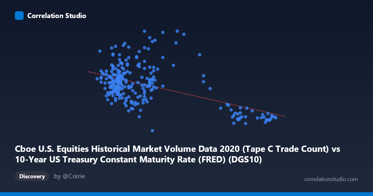
Cboe U.S. Equities Historical Market Volume Data 2020 (Tape C Trade Count) vs 10-Year US Treasury Constant Maturity Rate (FRED) (DGS10)
- Pearson correlation (r)
- -0.5274
- Spearman correlation
- -0.3289
- p-value
- 0
- Sample size (n)
- 251
- 95% confidence interval
- -0.6113 to -0.4318
- Granger causality
- None
- Granger optimal lag
- 10
AI analysis
Analysis: 10-Year Treasury Yield vs. Cboe Equity Trade Count (2020)
Relationship Overview The scatterplot reveals a moderate negative relationship between the 10-year US Treasury constant maturity rate (X-axis) and Cboe equity trade counts (Y-axis) across 2020. As Treasury yields rise, equity trade counts tend to decline, and vice versa. The linear regression equation (y = -421,074x + 1,744,800) quantifies this inverse slope: each one-unit increase in the 10-year yield is associated with a decrease of approximately 421,000 trades. Visually, the data shows a downward-trending cloud, though with considerable scatter, suggesting the relationship is real but far from deterministic. The clustering of many points in the low-yield, moderate-to-high trade count region reflects 2020's historically suppressed interest rate environment during the COVID-19 pandemic.
Correlation Strength and Statistical Significance The Pearson correlation of r = -0.527 indicates a moderate negative association. However, the more telling metric is r² = 0.278, meaning Treasury yields explain only about 27.8% of the variance in equity trade counts — leaving roughly 72% attributable to other factors. The 95% confidence interval of [-0.611, -0.432] is entirely negative and does not cross zero, confirming directional confidence. With a p-value effectively at zero across a population of N = 4,254, the correlation is statistically robust and unlikely to be a sampling artifact. That said, statistical significance should not be conflated with practical or causal significance, particularly given the modest r² value.
Patterns, Clusters, and Outliers The data separates into two loosely distinct clusters: a dense grouping at low yields (roughly 0.52–0.80) with trade counts spanning a wide range from ~1.1M to ~2.1M, and a sparser grouping at higher yields (1.3–1.88) where trade counts are more consistently lower, ranging from approximately 840,000 to 1.4M. Several notable outliers appear — the point near (1.13, 2,126,010) stands out as having an unusually high trade count for its yield level, possibly corresponding to a specific high-volatility trading session. Similarly, points at very high yields (~1.82–1.88) cluster tightly at low trade counts (~850,000–960,000), consistent with early 2020 pre-pandemic conditions when market activity was more subdued.
Confounding Factors and Caveats Several important caveats apply. First, 2020 was a structurally anomalous year: the COVID-19 pandemic triggered unprecedented market volatility in Q1, a historic yield collapse, and a surge in retail trading activity — all of which confound any clean yield-volume relationship. The temporal sequence matters enormously here: the Granger causality analysis finds no significant predictive directionality in either direction (X→Y: F = 0.170, p = 0.998; Y→X: F = 1.101, p = 0.362), meaning neither variable reliably predicts the other in a time-lagged framework. This strongly argues against interpreting the correlation as causal. Additionally, both variables are likely co-driven by third factors — particularly market stress indices, Fed policy announcements, and macroeconomic shocks — rather than causally linked to each other.
Actionable Insights and Further Investigation Given the lack of Granger causality and the modest explanatory power, practitioners should treat this correlation as descriptively informative but not predictively useful in isolation. Further investigation should include: (1) incorporating VIX or realized volatility as a control variable to disentangle pandemic-driven panic trading from yield-driven behavior; (2) segmenting the data by quarter to test whether the negative relationship holds uniformly or is concentrated in the March 2020 crash period; (3) testing non-linear models (e.g., polynomial or spline regression), as the scatter suggests the relationship may not be strictly linear across the full yield range; and (4) expanding the time horizon beyond 2020 to assess whether this inverse relationship persists under more normal market conditions or is specific to zero-lower-bound environments.
X dataset: 10-Year US Treasury Constant Maturity Rate (FRED)
Y dataset: Cboe U.S. Equities Historical Market Volume Data 2020
Part of experiment: Daily - 10-Year US Treasury Constant Maturity Rate (FRED) vs Cboe U.S. Equities Historical Market Volume Data 2020