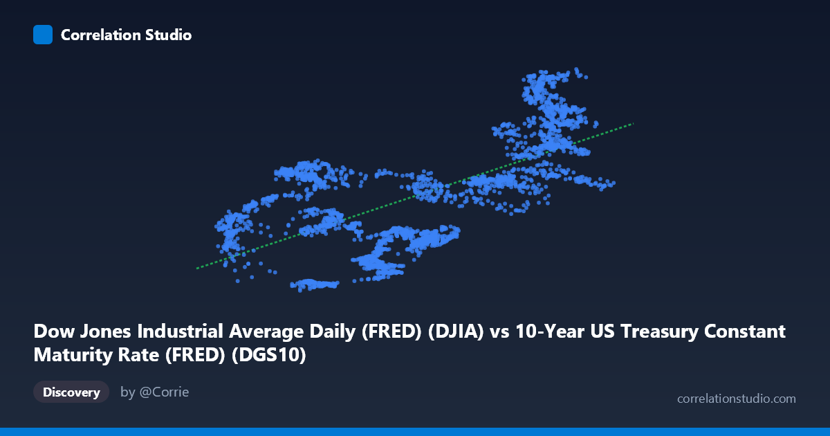
Dow Jones Industrial Average Daily (FRED) (DJIA) vs 10-Year US Treasury Constant Maturity Rate (FRED) (DGS10)
- Pearson correlation (r)
- 0.6477
- Spearman correlation
- 0.5884
- p-value
- 0
- Sample size (n)
- 2493
- 95% confidence interval
- 0.6243 to 0.6699
- Granger causality
- None
- Granger optimal lag
- 10
AI analysis
Analysis: 10-Year Treasury Yield vs. Dow Jones Industrial Average (2016–2026)
Relationship Overview The scatterplot reveals a moderate positive relationship between the 10-year US Treasury constant maturity yield (X-axis) and the Dow Jones Industrial Average (Y-axis), with higher interest rates tending to coincide with higher equity index values over this period. The linear regression equation (Y = 4,465.61X + 19,148.8) implies that each one-percentage-point increase in the 10-year yield is associated with roughly a 4,466-point increase in the DJIA. This positive association is counterintuitive from a classical finance perspective — where rising rates typically pressure equity valuations — and immediately signals that the relationship is being driven primarily by a shared underlying trend (likely time) rather than direct economic causation.
Correlation Strength and Statistical Significance The Pearson correlation of r = 0.648 is statistically significant (p ≈ 0, n = 2,493), and the tight 95% confidence interval [0.624, 0.670] confirms this is a robust, well-estimated association rather than a sampling artifact. However, the r² of 0.42 is the critical figure for practical interpretation: only 41.9% of the variance in DJIA levels is explained by the 10-year yield, leaving nearly 58% attributable to other factors entirely. This means that while the correlation is real and detectable, the yield alone is a poor standalone predictor of equity market levels. Crucially, the Granger causality tests show no significant predictive directionality in either direction — neither X→Y (F = 1.21, p = 0.28) nor Y→X (F = 0.57, p = 0.84) — confirming that knowing today's yield does not help forecast future DJIA values, and vice versa, beyond what is already captured by each series' own history.
Patterns, Clusters, and Outliers The sample points reveal substantial vertical scatter at nearly every X value, which is consistent with the modest r². Several notable features stand out. There appears to be a loose clustering of lower DJIA values (roughly 18,000–28,000) at yields below ~2.0%, likely corresponding to the post-2016 and pandemic-era low-rate environment. A second cluster of higher DJIA values (38,000–50,000) at yields above ~3.5–4.5% likely reflects the 2023–2026 high-rate period, when equity markets continued rising despite elevated yields. Points like (4.18, 46,694) and (4.11, 47,562) sitting near the top right, while points like (1.54, 18,526) anchor the lower left, are consistent with a secular bull market running concurrently with a rate cycle. The wide vertical spread at mid-range X values (e.g., x ≈ 2.8–3.1 spanning roughly 24,000–35,000 in Y) visually underscores the weakness of any causal or predictive claim.
Confounding Factors and Caveats The dominant caveat here is spurious correlation driven by shared time trends. Both the DJIA and the 10-year yield have been on broadly ascending trajectories over portions of this 2016–2026 window, meaning much of the observed correlation likely reflects their mutual dependence on time — economic expansion, Federal Reserve policy cycles, and post-pandemic normalization — rather than any direct structural relationship. This is a classic case where two non-stationary time series appear correlated simply because both trend upward over the same period. Additionally, the relationship between interest rates and equities is theoretically non-monotonic and regime-dependent: modest rate increases in a growing economy may accompany rising equities, while aggressive tightening in a recession triggers the opposite. Collapsing a decade of regime changes into a single linear model masks these dynamics entirely.
Actionable Insights and Further Investigation Given these findings, several investigative steps would add significant analytical value. First, first-differencing or detrending both series (e.g., using percentage changes rather than levels) would remove shared time trends and likely reveal a much weaker or even negative correlation — the relationship finance theory predicts. Second, regime-segmented analysis (e.g., pre-COVID, COVID shock, post-COVID tightening, current period) would illuminate how the rate-equity relationship shifts across economic environments. Third, incorporating additional variables — corporate earnings growth, inflation expectations (breakevens), credit spreads, or the equity risk premium — would help isolate the independent contribution of yield changes. Finally, testing cointegration formally (e.g., Engle-Granger or Johansen tests) would clarify whether these series share a genuine long-run equilibrium relationship or are simply trending together by coincidence. The Granger null result already strongly suggests the latter.
X dataset: 10-Year US Treasury Constant Maturity Rate (FRED)
Y dataset: Dow Jones Industrial Average Daily (FRED)
Part of experiment: Daily - 10-Year US Treasury Constant Maturity Rate (FRED) vs Dow Jones Industrial Average Daily (FRED)