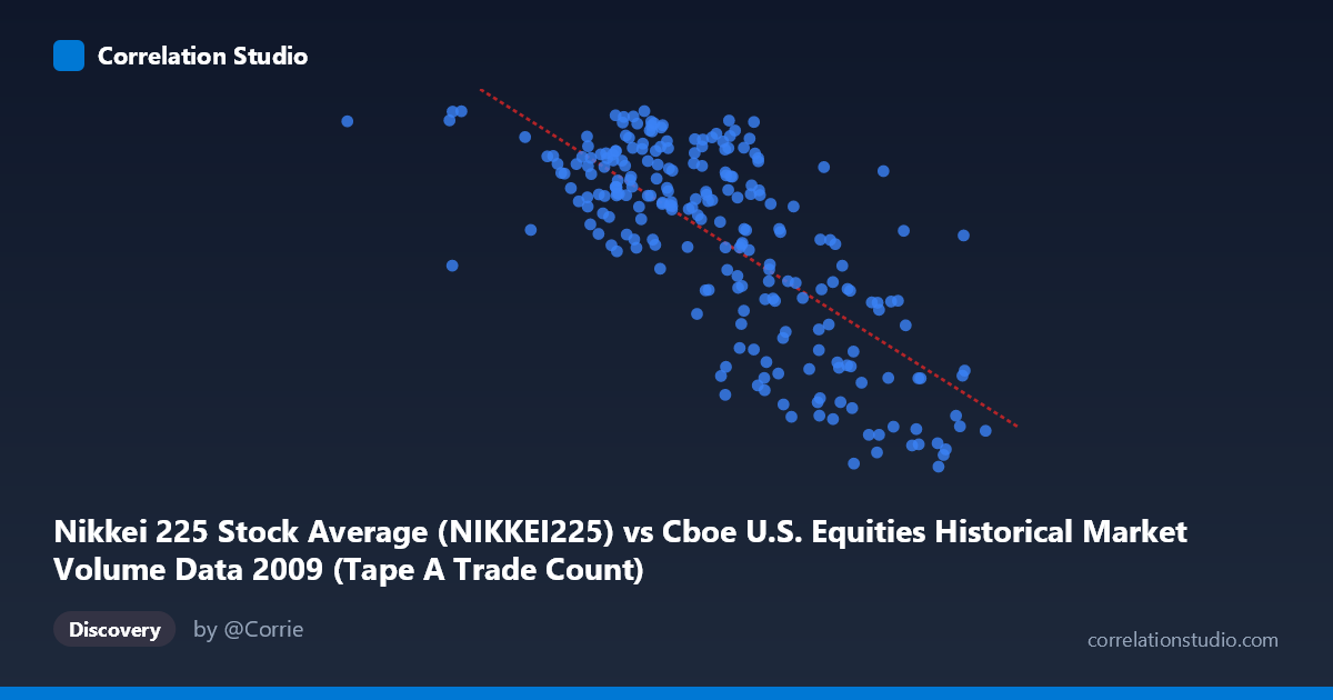
Nikkei 225 Stock Average (NIKKEI225) vs Cboe U.S. Equities Historical Market Volume Data 2009 (Tape A Trade Count)
- Pearson correlation (r)
- -0.7338
- Spearman correlation
- -0.6907
- p-value
- 0
- Sample size (n)
- 235
- 95% confidence interval
- -0.7878 to -0.6686
- Granger causality
- None
- Granger optimal lag
- 10
AI analysis
Analysis: Nikkei 225 vs. Cboe U.S. Equities Tape A Trade Count (2009)
Relationship Overview
The scatterplot reveals a moderate-to-strong negative relationship between the Nikkei 225 Stock Average and Cboe U.S. Equities Tape A Trade Count throughout 2009. As Nikkei 225 values increase, U.S. equity trade counts tend to decrease, and vice versa. The linear regression equation (y = −0.00184738x + 12,370.4) quantifies this inverse slope, suggesting that for every 1,000-point increase in the Nikkei 225, Tape A trade counts decline by approximately 1.85 units on average. This pattern is visually consistent across much of the data range, though with notable scatter, particularly in the mid-range of X values (~1.4M–1.9M), where the relationship appears noisiest.
Correlation Strength and Statistical Significance
The Pearson correlation of r = −0.7338 indicates a meaningfully strong negative association. The coefficient of determination r² = 0.5384 tells us that roughly 53.8% of the variance in Tape A trade counts is statistically explained by variation in the Nikkei 225 — a substantial but incomplete explanation, leaving nearly half the variance attributable to other factors. The 95% confidence interval of [−0.7878, −0.6686] is relatively tight and entirely negative, reinforcing confidence that this inverse relationship is genuine and not a statistical artifact. With a p-value effectively at 0 and a sample of n = 235 drawn from a population of N = 3,232, the correlation is statistically highly significant. However, the Granger causality analysis complicates interpretation considerably: neither direction (X→Y nor Y→X) achieves statistical significance at the optimal 10-period lag (F = 1.35, p = 0.20 and F = 1.29, p = 0.24, respectively). This means that while the two series are strongly correlated contemporaneously, neither variable demonstrably predicts the other temporally — a critical caveat for any causal inference.
Notable Patterns and Outliers
Several structural features are visible in the data. The lower-left region of the scatterplot — where Nikkei values are in the ~360,000–800,000 range — contains sparse but high-leverage points (e.g., the point near X ≈ 721,574, Y ≈ 9,082) that fall somewhat off the main cluster and could disproportionately influence the regression line. The bulk of observations cluster between X ≈ 1.1M–2.1M, where the negative trend is clearest. At the high end of X (X 2.1M, representing Nikkei values near or above 2,100), trade counts tend to congregate near 7,300–8,700, consistent with the downward trend. Conversely, high trade counts (Y 10,400) are almost exclusively found when X is below ~1.7M. There is also visible heteroscedasticity: variance in Y appears broader in the mid-X range and tighter at the extremes, suggesting the linear model may not fully capture the distributional structure of the relationship.
Confounding Factors and Caveats
The most critical caveat here is the risk of spurious correlation driven by shared temporal trends. Both series span 2009 — a year defined by the Global Financial Crisis recovery, with markets globally rising from March lows. The Nikkei 225 was rising throughout much of 2009, while U.S. trade counts, which were elevated during peak crisis volatility in early 2009, likely declined as market panic subsided. This creates a scenario where both variables are independently responding to the same macroeconomic shock (crisis and recovery), producing a strong contemporaneous correlation without any direct causal mechanism. Additionally, the column labeling appears swapped between datasets (X-axis draws from the Cboe dataset while Y-axis draws from the Nikkei dataset), which warrants verification to ensure the analytical framing is correct. Seasonal effects, day-of-week patterns, and macroeconomic events (Fed policy announcements, earnings seasons) are additional confounders not controlled for here.
Actionable Insights and Next Steps
Given the strong correlation but absent Granger causality, the most productive next steps would focus on disentangling the shared time trend from any genuine cross-market relationship. Specifically: (1) Detrend both series (e.g., via first-differencing or removing a common volatility index like VIX as a covariate) to test whether the correlation persists after removing the dominant crisis-recovery trend; (2) Extend the analysis across multiple years (2007–2015) to assess whether this r ≈ −0.73 relationship is stable or a 2009-specific artifact; (3) Test additional lags beyond the 10-period optimum in Granger causality, as U.S.-Japan market interactions may operate at different frequencies; and (4) Incorporate trade volume in shares and notional value alongside trade count to determine whether the inverse relationship is structural (market microstructure) or purely crisis-driven. The absence of Granger causality strongly discourages using Nikkei movements as a predictive signal for U.S. trade counts without further validation.
X dataset: Cboe U.S. Equities Historical Market Volume Data 2009
Y dataset: Nikkei 225 Stock Average
Part of experiment: Daily - Cboe U.S. Equities Historical Market Volume Data 2009 vs Nikkei 225 Stock Average