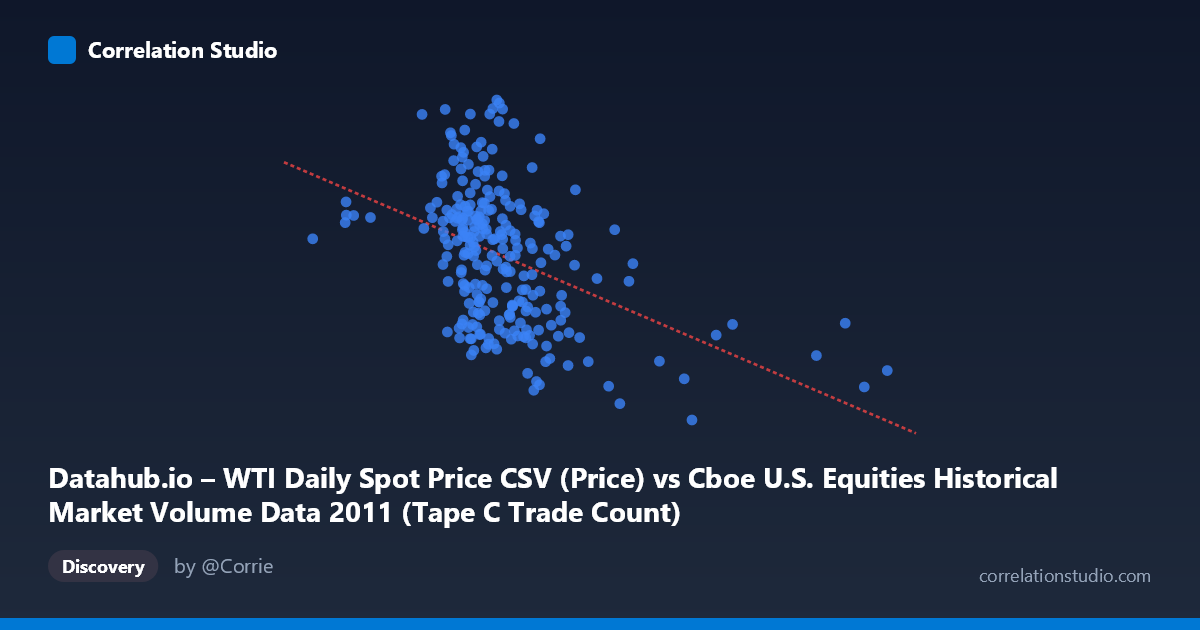
Datahub.io – WTI Daily Spot Price CSV (Price) vs Cboe U.S. Equities Historical Market Volume Data 2011 (Tape C Trade Count)
- Pearson correlation (r)
- -0.4374
- Spearman correlation
- -0.4402
- p-value
- 0
- Sample size (n)
- 252
- 95% confidence interval
- -0.5322 to -0.3318
- Granger causality
- None
- Granger optimal lag
- 1
AI analysis
Analysis: WTI Crude Oil Price vs. Cboe Tape C Trade Count (2011)
Relationship Overview The scatterplot reveals a moderate negative relationship between WTI daily spot prices (X-axis) and Cboe Tape C trade counts (Y-axis) across 252 trading days in 2011. As oil prices increase, the number of equity trades on Tape C venues tends to decline. The linear regression equation (y = -2.915×10⁻⁵x + 110.85) reflects this downward slope, though the data cloud exhibits considerable scatter around the fitted line, signaling that this relationship is real but far from deterministic. Visually, the bulk of observations cluster between roughly $450,000–$650,000 in oil price units and 85–108 trade count units, with the negative trend most discernible when comparing the lower-price and higher-price extremes of the distribution.
Correlation Strength and Statistical Significance The Pearson correlation of r = -0.4374 indicates a moderate negative association, but the more informative metric is r² = 0.1913, meaning WTI prices explain only about 19% of the variance in Tape C trade counts — leaving roughly 81% of variation attributable to other factors entirely. The 95% confidence interval of [-0.5322, -0.3318] is meaningfully bounded away from zero and reasonably narrow given the sample size, lending confidence that the true population correlation is genuinely negative. The p-value of 3.35×10⁻¹³ confirms the association is highly statistically significant and extremely unlikely to reflect sampling noise. However, Granger causality analysis undermines any directional causal claim: neither direction (X→Y: F=0.0108, p=0.917; Y→X: F=3.477, p=0.063) reaches the conventional significance threshold, meaning WTI prices do not demonstrably predict future trade counts, nor vice versa. The marginally suggestive Y→X direction (p≈0.06) is intriguing but insufficient to assert that trade activity precedes price movements.
Notable Patterns, Clusters, and Outliers The data display a visible horizontal banding tendency, with trade counts concentrated in two loose clusters — a lower band around 85–92 and an upper band around 98–110 — suggesting possible regime-like behavior (e.g., high-volatility vs. low-volatility trading periods). Several notable outliers are apparent: one point near X≈921,000 with a trade count around 85.5 sits far to the right of the main cluster, likely representing an anomalous high-price day. Similarly, points near X≈275,000 and X≈317,000 (very low oil prices) appear in the upper-left region with relatively high trade counts, consistent with the negative trend but isolated from the main distribution. The point at approximately (407,000, 111.7) represents the highest observed trade count and anchors the upper-left extreme of the regression line, giving it substantial leverage on the fit.
Confounding Factors and Interpretive Caveats Multiple confounds complicate a straightforward causal interpretation. 2011 was an unusually turbulent year — marked by the Arab Spring, European sovereign debt fears, the U.S. debt ceiling crisis, and the March Tōhoku earthquake — meaning both oil prices and equity trading volumes were simultaneously driven by overlapping macroeconomic shocks rather than one causing the other. Oil price levels and equity trading volume are both downstream of broader risk appetite: when risk-off sentiment prevailed, investors may have reduced equity trading while commodity prices were simultaneously influenced by geopolitical supply concerns, creating a spurious or confounded correlation. Additionally, the Tape C trade count reflects only a subset of U.S. equity trading (primarily NYSE Arca-listed securities), and its relationship to oil prices may differ from total market volume. The dataset's daily frequency also means autocorrelation within both time series could inflate the apparent significance of the correlation.
Actionable Insights and Further Investigation The modest explanatory power (19%) and absence of Granger causality suggest this correlation is not suitable as a standalone predictive signal for trading or market microstructure modeling. However, it warrants deeper investigation in several directions: (1) Decompose both series into trend, seasonal, and residual components to assess whether the correlation persists after removing shared macro trends; (2) Test additional lags beyond one period in Granger causality analysis, as the suggestive Y→X result (p=0.063) might strengthen with optimal lag selection; (3) Examine the outlier at ~$921K oil price — if this reflects a data error or a structurally distinct market day (e.g., a holiday-adjacent session), its removal could meaningfully alter the regression; (4) Introduce control variables such as VIX (volatility index), S&P 500 returns, or broader market volume to isolate whether the oil–trade count relationship survives multivariate adjustment; and (5) Replicate across other years to determine whether 2011's specific geopolitical environment was responsible for this correlation or whether it represents a more durable structural relationship.
X dataset: Cboe U.S. Equities Historical Market Volume Data 2011
Y dataset: Datahub.io – WTI Daily Spot Price CSV
Part of experiment: Daily - Cboe U.S. Equities Historical Market Volume Data 2011 vs Datahub.io – WTI Daily Spot Price CSV