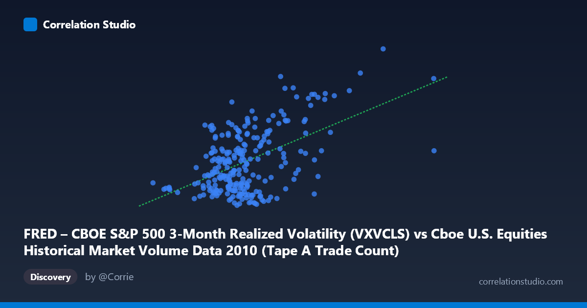
FRED – CBOE S&P 500 3-Month Realized Volatility (VXVCLS) vs Cboe U.S. Equities Historical Market Volume Data 2010 (Tape A Trade Count)
- Pearson correlation (r)
- 0.5134
- Spearman correlation
- 0.3341
- p-value
- 0
- Sample size (n)
- 252
- 95% confidence interval
- 0.4162 to 0.599
- Granger causality
- Y → X
- Granger optimal lag
- 1
AI analysis
Analysis: CBOE S&P 500 3-Month Realized Volatility vs. U.S. Equities Tape A Trade Count (2010)
Relationship Overview
The scatterplot reveals a moderately positive relationship between CBOE S&P 500 3-Month Realized Volatility (VXVCLS) and Tape A Trade Count in U.S. equity markets during 2010. As volatility increases, trade counts tend to rise as well — a directionally intuitive finding, since elevated volatility typically prompts heightened market participation, hedging activity, and repositioning. The linear regression equation (y = 5.885×10⁻⁶x + 17.11) confirms this upward slope, though the relationship is far from deterministic. The data spans a full calendar year (January through December 2010), capturing a period of post-crisis market normalization that likely contributes meaningful variation to both variables.
Correlation Strength, Statistical Significance, and Causal Direction
The Pearson correlation of r = 0.513 indicates a moderate positive association, but the more sobering metric is R² = 0.264 — meaning realized volatility explains only about 26.4% of the variance in Tape A trade counts, leaving nearly three-quarters of variability driven by other factors. The 95% confidence interval for r of [0.416, 0.599] is reasonably tight and does not approach zero, reflecting genuine statistical reliability, and the p-value of effectively 0 confirms this is not a chance finding across the n=252 paired observations drawn from a population of N=3,302. Crucially, the Granger causality analysis points unidirectionally: Y Granger-causes X (F=8.30, p=0.0043), meaning past values of Tape A trade count help predict future realized volatility, but not the reverse (X→Y: F=3.59, p=0.059, falling just outside conventional significance). This is a counter-intuitive but important result — it suggests that trading volume activity may be a leading indicator of volatility materializing, rather than volatility simply driving volume.
Patterns, Clusters, and Outliers
The scatterplot exhibits a discernible but noisy upward trend with several notable structural features. The bulk of observations cluster in the X range of roughly 800,000–1,700,000 (trade count) and Y range of 19–27 (volatility), forming a dense central cloud where the relationship is weakest and most diffuse. Beyond this core, there is a clear upper-right dispersion of points — observations with both high trade counts (above ~1.8M–2.5M) and elevated volatility (30–40+), consistent with episodic stress events in 2010 such as the May 6 Flash Crash, which would simultaneously spike both volume and realized volatility. A handful of extreme outliers are visible near the upper-right boundary (X 3,000,000; Y approaching 37–40), which likely exert disproportionate leverage on the regression slope and may inflate the correlation coefficient somewhat.
Confounding Factors and Interpretive Caveats
Several important caveats apply. First, temporal autocorrelation is almost certainly present in both daily time series, which can inflate apparent correlation and complicate inference even with Granger testing. Second, the axes may be inverted from their natural interpretive roles: the dataset labels suggest VXVCLS values are plotted on the X-axis but derive from one dataset, while Tape A trade counts appear on Y from a separate dataset — readers should verify this mapping against the raw data. Third, secular trends and regime changes within 2010 (e.g., the Flash Crash recovery, European sovereign debt fears in spring/summer) could create spurious correlations by jointly driving both variables over time. Fourth, Tape A covers only NYSE-listed securities, so the relationship may not generalize to the full market structure. Finally, the R² of 26.4% underscores that volume-volatility linkage is real but incomplete — market microstructure, institutional order flow, options expiration cycles, and macroeconomic news events all contribute independent variance.
Actionable Insights and Further Investigation
The Granger causality finding — that trade count leads volatility — warrants serious follow-up. Practitioners could explore whether abnormal spikes in Tape A volume on day T serve as a practical early-warning signal for elevated VXVCLS on day T+1, potentially useful for options positioning or risk management overlays. It would be valuable to extend the analysis across multiple years to test whether this directional relationship is stable or specific to 2010's unusual market environment. Researchers should also investigate non-linear specifications (e.g., log transformations of trade counts, quantile regressions) given the apparent heteroscedasticity — variance in volatility clearly fans out at higher trade counts. Finally, segmenting the data by market regime (pre/post Flash Crash, high vs. low VIX environments) could reveal whether the moderate overall correlation masks a much stronger relationship during stress periods and a near-zero relationship in calm markets.
X dataset: Cboe U.S. Equities Historical Market Volume Data 2010
Y dataset: FRED – CBOE S&P 500 3-Month Realized Volatility
Part of experiment: Daily - Cboe U.S. Equities Historical Market Volume Data 2010 vs FRED – CBOE S&P 500 3-Month Realized Volatility