NASDAQ Composite Index Daily (FRED) (NASDAQCOM) vs Cboe U.S. Equities Historical Market Volume Data 2011 (Tape B Trade Count)
- Pearson correlation (r)
- -0.5865
- Spearman correlation
- -0.5245
- p-value
- 0
- Sample size (n)
- 252
- 95% confidence interval
- -0.6621 to -0.4992
- Granger causality
- X → Y
- Granger optimal lag
- 10
AI analysis
Analysis: NASDAQ Composite Index vs. Cboe Tape B Trade Count (2011)
Relationship Overview
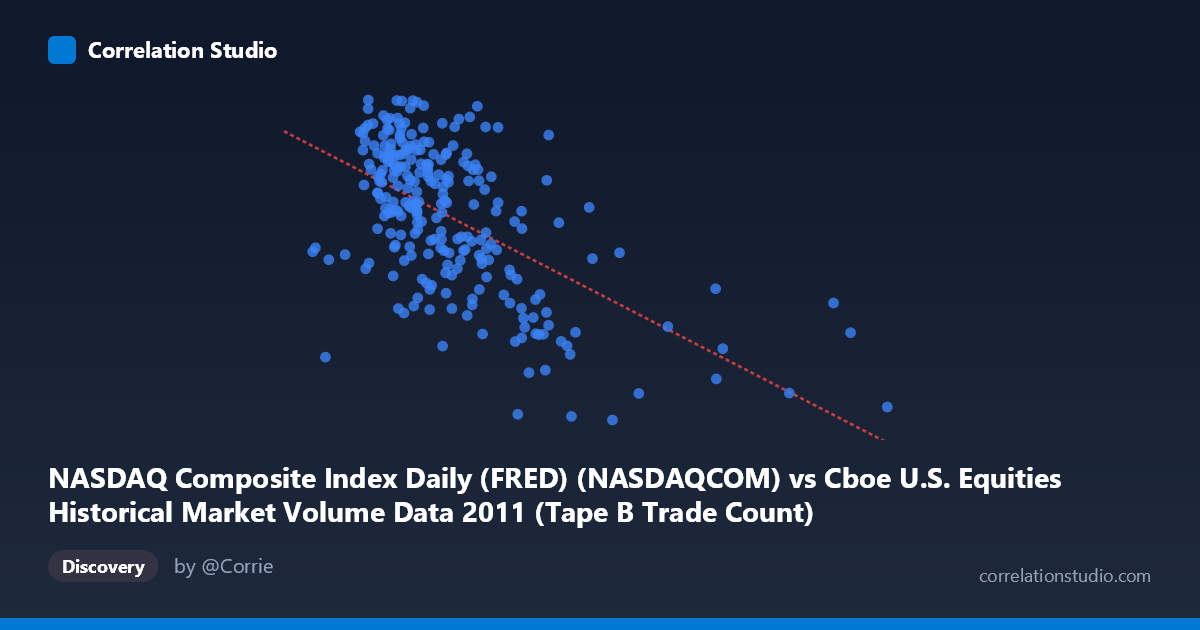
The scatterplot reveals a moderate negative relationship between the NASDAQ Composite Index level and Cboe Tape B trade counts during 2011. As the NASDAQ index rises, Tape B trade counts tend to decline, and vice versa. The linear regression equation (y = -0.000689x + 2871.51) quantifies this inverse slope, suggesting that for every 100,000-unit increase in the NASDAQ index value, Tape B trade counts decrease by approximately 68.9 units. This inverse pattern is intuitively interesting: higher market valuations in 2011 appear associated with reduced trading activity on Tape B venues, potentially reflecting shifts in trader behavior during bullish versus volatile periods.
Correlation Strength and Statistical Significance
The correlation coefficient of r = -0.587 indicates a moderate negative association, but the r² of 0.344 means only 34.4% of the variance in Tape B trade counts is explained by the NASDAQ index level — leaving roughly 65.6% attributable to other factors. The 95% confidence interval of [-0.662, -0.499] is notably tight and does not cross zero, and the p-value is effectively zero across a paired sample of 252 observations drawn from a population of 3,780, confirming the relationship is highly unlikely to be due to chance. Critically, the Granger causality analysis establishes a unidirectional temporal predictive relationship: NASDAQ index values Granger-cause Tape B trade counts at an optimal lag of 10 trading periods (F = 2.09, p = 0.027), while the reverse direction fails to reach significance (F = 0.56, p = 0.848). This suggests the index level has modest but statistically meaningful predictive power over Tape B volume roughly two calendar weeks later, a potentially actionable lead-lag signal.
Patterns, Clusters, and Outliers
Several structural features are visible in the data. The bulk of observations cluster in the X range of roughly 175,000–400,000, with Y values concentrated between 2,600 and 2,850, forming a diffuse but directionally coherent cloud. However, there are notable right-tail outliers — points extending beyond 495,000 and even approaching 832,000 on the X-axis (e.g., the point near 556,197 at Y ≈ 2,493 and implied extreme values in the full dataset) — which correspond to lower trade counts and likely represent periods of unusually elevated market volume or index stress. There also appears to be a non-linear compression at higher X values: trade counts flatten and cluster near the lower Y boundary (≈2,400–2,550) rather than continuing to decline proportionally, suggesting a possible floor effect in Tape B activity. Some high-Y outliers (e.g., 316,530 at 2,863; 326,945 at 2,828) appear at moderate X values, indicating that peak trade counts occur not at the lowest index levels but within a middle band, hinting at a potential inverted-U or threshold dynamic.
Confounding Factors and Interpretive Caveats
Several important caveats apply. First, 2011 was a highly unusual market year, featuring the U.S. debt ceiling crisis, the S&P sovereign downgrade in August, and significant European sovereign debt contagion — all of which caused episodic volatility spikes that could confound a simple index-level-to-volume relationship. Second, Tape B specifically covers NYSE American (AMEX) and regional exchange-listed securities, meaning this is not a broad market volume measure; structural shifts in exchange routing, maker-taker fee changes, or HFT behavior during 2011 could independently drive Tape B counts. Third, the NASDAQ index is a price-weighted capitalization measure, not a direct activity metric, so the correlation may partly reflect risk-off rotation: during market downturns, traders may migrate activity toward smaller-cap or regionally listed securities (Tape B), inflating counts precisely when the index falls. Finally, the 10-period Granger lag, while statistically significant, is modest in F-statistic terms (2.09) and should not be over-interpreted as strong causal evidence.
Actionable Insights and Further Investigation
The 10-period Granger lead from NASDAQ levels to Tape B trade counts warrants further quantitative exploration. Analysts could construct a rolling window Granger test to determine whether this predictive relationship strengthens during high-volatility regimes (e.g., the August 2011 drawdown) versus calm periods. It would also be valuable to decompose the relationship by market condition — separating trending days from mean-reverting days — to assess whether the negative correlation is regime-dependent. Comparing Tape B against Tape A and Tape C trade counts under the same NASDAQ index regressor would clarify whether this is a venue-specific phenomenon or a market-wide pattern. Finally, incorporating VIX or realized volatility as a control variable in a multivariate regression would help isolate how much of the unexplained 65.6% variance is attributable to fear/uncertainty dynamics versus structural market microstructure effects.
X dataset: Cboe U.S. Equities Historical Market Volume Data 2011
Y dataset: NASDAQ Composite Index Daily (FRED)
Part of experiment: Daily - Cboe U.S. Equities Historical Market Volume Data 2011 vs NASDAQ Composite Index Daily (FRED)