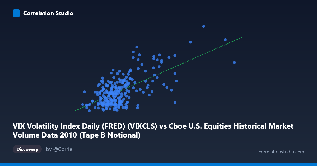
VIX Volatility Index Daily (FRED) (VIXCLS) vs Cboe U.S. Equities Historical Market Volume Data 2010 (Tape B Notional)
- Pearson correlation (r)
- 0.644
- Spearman correlation
- 0.4954
- p-value
- 0
- Sample size (n)
- 252
- 95% confidence interval
- 0.5655 to 0.711
- Granger causality
- Y → X
- Granger optimal lag
- 1
AI analysis
Analysis: VIX Volatility Index vs. Cboe U.S. Equities Market Volume (Tape B Notional) — 2010
1. Overall Relationship
The scatterplot reveals a moderately positive relationship between U.S. equity market trading volume (Tape B Notional, on the X-axis) and the VIX Volatility Index (Y-axis) across 252 trading days in 2010. As daily notional trading volume increases, VIX levels tend to rise correspondingly, which aligns with the intuitive financial narrative that heightened market activity — particularly panic-driven or uncertainty-driven trading — coincides with elevated implied volatility. The linear regression equation (y = 1.676×10⁻⁹x + 13.901) confirms a positive slope, with the intercept suggesting a baseline VIX of roughly 13.9 even at minimal volume levels, which is consistent with low-volatility regimes observed during calm market periods in 2010.
2. Correlation Strength and Statistical Significance
The Pearson correlation of r = 0.644 indicates a moderate-to-strong positive association, and the R² of 0.4148 means that approximately 41.5% of the variance in VIX is explained by trading volume — a meaningful but far from complete relationship, leaving nearly 60% of VIX variation attributable to other factors. The 95% confidence interval of [0.5655, 0.7110] is relatively tight given the sample size of n = 252, and the p-value of effectively zero provides very strong statistical confidence that this correlation is not a chance artifact. Critically, the Granger causality analysis points unidirectionally: Y Granger-causes X (F = 8.06, p = 0.0049), meaning VIX changes statistically precede and help predict trading volume changes with a one-period lag — but not vice versa (X→Y: F = 3.85, p = 0.051, just shy of significance). This suggests that fear and implied volatility expectations drive trading activity, rather than high volume driving volatility — a nuanced and practically important distinction. Traders and risk managers should interpret rising VIX as a leading signal of forthcoming volume surges, rather than the reverse.
3. Patterns, Clusters, and Outliers
The scatterplot likely displays a notable right-skewed cluster of points concentrated in the lower-left region (volume below ~6×10⁹, VIX between 15–25), reflecting the relatively calm, low-volatility market environment that dominated much of 2010 following the recovery from the 2008–2009 crisis. However, several prominent outliers in the upper-right quadrant are visible — points with X values exceeding 10–15×10⁹ and VIX above 35–45 — most plausibly corresponding to the May 2010 Flash Crash and its immediate aftermath, when both implied volatility and trading volumes spiked dramatically. The point near (15.1×10⁹, 40.95) is particularly extreme and may warrant investigation as a Flash Crash data point. There also appears to be a non-linear or heteroscedastic pattern: variance in VIX increases substantially at higher volume levels, suggesting the linear model may underfit the upper tail of the distribution, and a log-linear or power-law model might better capture the relationship across the full range.
4. Confounding Factors and Caveats
Several important caveats temper interpretation. First, 2010 was not a typical year — it included the Flash Crash (May 6), the European sovereign debt crisis escalation, and a post-crisis recovery period, all of which could create spurious correlations between volume and volatility driven by the same underlying macro shock rather than a structural causal mechanism. Second, Tape B Notional specifically captures mid-cap and regional exchange volume, which may not fully represent broader market-wide activity, potentially introducing measurement misalignment with the S&P 500-based VIX. Third, the Granger causality result, while directionally informative, is limited to a one-period lag in a daily dataset — longer-horizon dynamics (weekly, monthly) might reveal different directional relationships. Finally, the large N (3,302 population) versus sampled n (252) warrants caution: if the population spans multiple years, the single-year sample may not generalize to other regimes.
5. Actionable Insights and Further Investigation
Practitioners could use VIX as a leading indicator for position sizing and liquidity planning, given that VIX Granger-causes volume — on days when VIX spikes, market makers and institutional traders should anticipate elevated order flow and adjust execution strategies accordingly. For further investigation, it would be valuable to: (1) re-run the analysis excluding Flash Crash dates to assess whether the relationship holds in "normal" conditions; (2) test non-linear models (e.g., log-log regression) given the apparent heteroscedasticity; (3) extend the time series across multiple years to test whether the Granger causality direction is stable across different volatility regimes; and (4) decompose volume by trade type (institutional vs. retail) to determine whether the VIX-volume link is driven primarily by hedging activity, speculative flow, or forced liquidations. These steps would substantially sharpen the practical utility of this relationship for trading strategy and risk management.
X dataset: Cboe U.S. Equities Historical Market Volume Data 2010
Y dataset: VIX Volatility Index Daily (FRED)
Part of experiment: Daily - Cboe U.S. Equities Historical Market Volume Data 2010 vs VIX Volatility Index Daily (FRED)