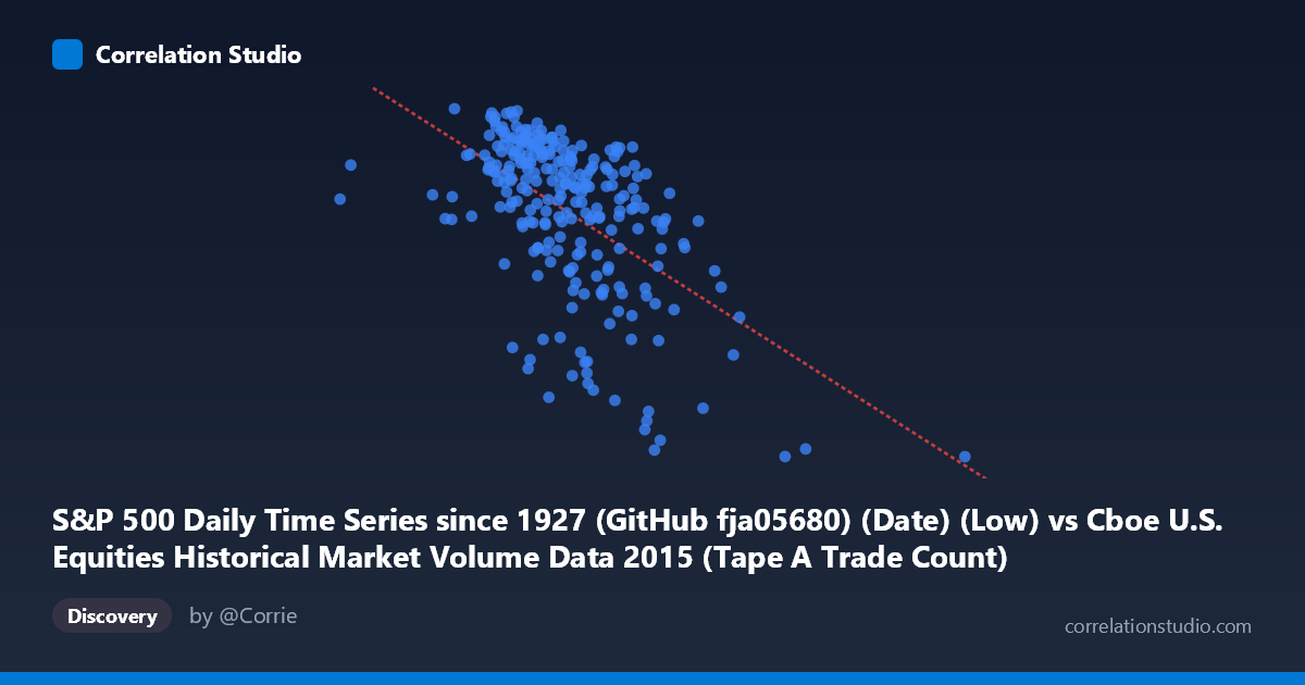
S&P 500 Daily Time Series since 1927 (GitHub fja05680) (Date) (Low) vs Cboe U.S. Equities Historical Market Volume Data 2015 (Tape A Trade Count)
- Pearson correlation (r)
- -0.5549
- Spearman correlation
- -0.5471
- p-value
- 0
- Sample size (n)
- 252
- 95% confidence interval
- -0.6349 to -0.4631
- Granger causality
- None
- Granger optimal lag
- 1
AI analysis
Analysis: S&P 500 Daily Low vs. Cboe Tape A Trade Count (2015)
Relationship Overview The scatterplot reveals a moderate negative relationship between the S&P 500 daily low price (X-axis) and the Cboe Tape A trade count (Y-axis) across 2015. As the S&P 500's daily low increases, the number of trades on Tape A tends to decrease. The linear regression equation (y = −0.000126x + 2,230) describes a gently declining trend, meaning that for every ~7,900-point increase in the daily low, trade count falls by approximately 1 unit (in thousands or normalized units). Visually, the data shows a downward-sloping cloud concentrated predominantly between X values of ~1,100,000–1,600,000, with notable scatter around the trend line.
Correlation Strength and Statistical Significance The Pearson correlation of r = −0.5549 indicates a moderate negative association, and the R² of 0.3079 means that roughly 30.8% of the variance in Tape A trade count is explained by the S&P 500 daily low — leaving nearly 70% of variation attributable to other factors. The 95% confidence interval of [−0.6349, −0.4631] is entirely negative and reasonably tight, affirming the direction and reliability of the association across the full population (N = 3,302). The p-value of effectively zero confirms the correlation is highly statistically significant and not a sampling artifact. However, the Granger causality tests reveal no significant temporal predictive relationship in either direction (X→Y: F = 0.12, p = 0.73; Y→X: F = 0.43, p = 0.51). This is a critical finding: while the variables are correlated contemporaneously, neither one reliably predicts the other on the following trading day, cautioning against any causal or forecasting interpretation.
Patterns, Clusters, and Outliers Several features stand out in the data. The bulk of observations cluster in a diagonal band from the upper-left (lower S&P levels, higher trade counts) to the lower-right (higher S&P levels, lower trade counts), consistent with the negative trend. A distinct outlier cluster appears at very low X values (~576,000–997,000), which likely corresponds to specific high-volatility or low-liquidity dates where the S&P daily low was anomalously depressed — potentially tied to the August 2015 market correction. Conversely, the far right of the distribution (~2,247,000+) shows very low trade counts around 1,867, suggesting quieter, higher-price-level days. There is also noticeable vertical spread at moderate X values (~1,200,000–1,500,000), indicating that trade count is highly variable even when price levels are similar, hinting at strong day-specific influences not captured by price alone.
Confounding Factors and Interpretive Caveats This correlation almost certainly reflects a common driver rather than a direct causal mechanism: market volatility. In 2015, periods of heightened volatility (e.g., the August selloff) simultaneously drove S&P prices down and spiked trading activity. The inverse relationship may therefore be a proxy for the VIX or realized volatility rather than a structural relationship between price levels and trade counts per se. Additionally, the datasets originate from different sources (GitHub S&P series vs. Cboe volume data), introducing potential alignment or timing mismatches. The X-axis label also refers to the daily low rather than open/close/average, which may amplify extreme-day effects. Seasonal patterns in 2015 trading volume (e.g., lower summer volume, year-end effects) could also confound the relationship.
Actionable Insights and Further Investigation Given these findings, analysts should avoid using S&P daily lows as a direct predictor of trade counts — the failed Granger tests are explicit on this point. Instead, the moderate correlation is better understood as a joint symptom of market stress regimes. A more productive next step would be to introduce volatility measures (e.g., VIX, daily range, or realized volatility) as a mediating variable to test whether they explain the observed correlation. A regime-based analysis — splitting data into high- and low-volatility periods — could determine whether the relationship strengthens during stress episodes. Additionally, examining other Tape categories (B, C) or total volume alongside Tape A would clarify whether this pattern is exchange-specific or market-wide, and whether the August 2015 outliers disproportionately drive the overall r value.
X dataset: Cboe U.S. Equities Historical Market Volume Data 2015
Y dataset: S&P 500 Daily Time Series since 1927 (GitHub fja05680) (Date)
Part of experiment: Daily - Cboe U.S. Equities Historical Market Volume Data 2015 vs S&P 500 Daily Time Series since 1927 (GitHub fja05680) (Date)