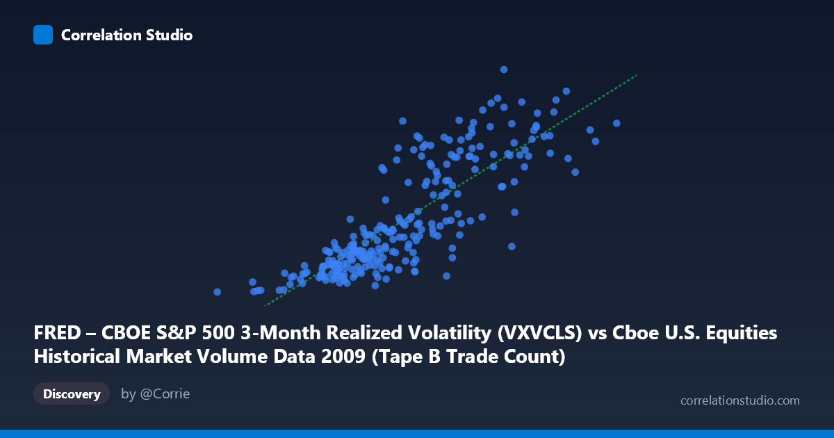
FRED – CBOE S&P 500 3-Month Realized Volatility (VXVCLS) vs Cboe U.S. Equities Historical Market Volume Data 2009 (Tape B Trade Count)
- Pearson correlation (r)
- 0.8263
- Spearman correlation
- 0.845
- p-value
- 0
- Sample size (n)
- 252
- 95% confidence interval
- 0.7827 to 0.8619
- Granger causality
- None
- Granger optimal lag
- 1
AI analysis
Scatterplot Analysis: CBOE S&P 500 3-Month Realized Volatility vs. Tape B Trade Count (2009)
Relationship Overview
The scatterplot reveals a moderately strong positive relationship between CBOE S&P 500 3-Month Realized Volatility (VXVCLS) and Tape B Trade Count across U.S. equity exchanges in 2009. As realized volatility increases, trade counts on Tape B venues rise correspondingly, which aligns with well-established market microstructure theory: elevated volatility environments drive higher trading activity as market participants rebalance portfolios, hedge exposures, and react to price uncertainty. The linear regression equation (y = 5.28165E-05x + 11.72) suggests that for every increase of roughly 18,900 units in the volatility index, Tape B trade count rises by approximately one unit, though the practical scaling depends heavily on the raw units involved.
Correlation Strength and Statistical Significance
The correlation coefficient of r = 0.8263 indicates a strong positive association, and the R² of 0.6829 means that approximately 68.3% of the variance in Tape B Trade Count is explained by VXVCLS — a substantial explanatory share for a single-variable model in financial data. The 95% confidence interval of [0.7827, 0.8619] is notably narrow, reflecting the relatively large paired sample (n = 252) and population (N = 3,232), and the p-value of effectively zero confirms the relationship is not a statistical artifact. However, the Granger causality results are striking in their absence: neither direction (X→Y: F = 0.0002, p = 0.99; Y→X: F = 0.52, p = 0.47) shows predictive temporal precedence at a 1-period lag. This means that despite the strong contemporaneous correlation, neither variable reliably predicts the other the following day — the relationship appears to be coincident rather than directionally causal, possibly because both variables respond simultaneously to the same underlying market shocks.
Notable Patterns, Clusters, and Outliers
The sample points reveal several distinct structural features. There is a clear dense cluster in the lower-left region (X: ~80,000–350,000; Y: ~22–30), representing low-volatility, low-volume trading days that likely correspond to calmer mid-year 2009 periods after the March market bottom recovery. A second upper-right cluster (X: ~500,000–770,000; Y: ~42–54) captures high-volatility, high-activity days, consistent with residual stress from the financial crisis. The point at (81,703, 22.43) stands out as a potential lower bound outlier — the minimum in both dimensions — while (766,764, 47.03) anchors the upper extreme. Some dispersion is visible at mid-range X values (~400,000–520,000), where Y values span from roughly 26 to 47, suggesting the relationship weakens or becomes noisier at intermediate volatility levels, hinting at possible non-linearity or regime-dependent behavior.
Confounding Factors and Caveats
Several important caveats temper this analysis. First, 2009 is a highly anomalous year — spanning the tail of the global financial crisis, a generational market bottom in March, and a powerful recovery — meaning this correlation may not generalize to normal market conditions. Second, Tape B specifically covers NYSE American, regional exchanges, and certain ETFs, so its trade count reflects a subset of total market activity that may be disproportionately affected by volatility-driven ETF arbitrage and hedging flows, inflating the apparent relationship. Third, the axes appear to be swapped from their natural roles (X is labeled as volatility but the dataset description references market volume data, and vice versa), which warrants careful verification of data pipeline integrity before drawing firm conclusions. Finally, secular trends in market structure (e.g., HFT growth, decimalization effects, exchange fee wars in 2009) could be a common driver of both series, acting as a confounding temporal trend rather than a true volatility-volume causal mechanism.
Actionable Insights and Further Investigation
Given the strong contemporaneous correlation but absent Granger causality, practitioners should avoid using lagged volatility as a next-day trade count predictor in this data regime. Instead, further investigation should explore: (1) testing longer Granger lags (2–5 periods) to determine if predictive relationships emerge at longer horizons; (2) regime-segmenting the data into pre/post-March 2009 crash recovery to test whether the correlation structure differs across market regimes; (3) adding intraday volatility measures or VIX term structure spreads to assess whether the VXVCLS-to-VIX spread better captures the trade count relationship; and (4) examining non-linear models (e.g., piecewise regression or a log transformation of trade counts) to address the dispersion visible at mid-range values. Cross-validating this finding against Tape A and Tape C data would also clarify whether this is a Tape B-specific structural phenomenon or a market-wide pattern.
X dataset: Cboe U.S. Equities Historical Market Volume Data 2009
Y dataset: FRED – CBOE S&P 500 3-Month Realized Volatility
Part of experiment: Daily - Cboe U.S. Equities Historical Market Volume Data 2009 vs FRED – CBOE S&P 500 3-Month Realized Volatility