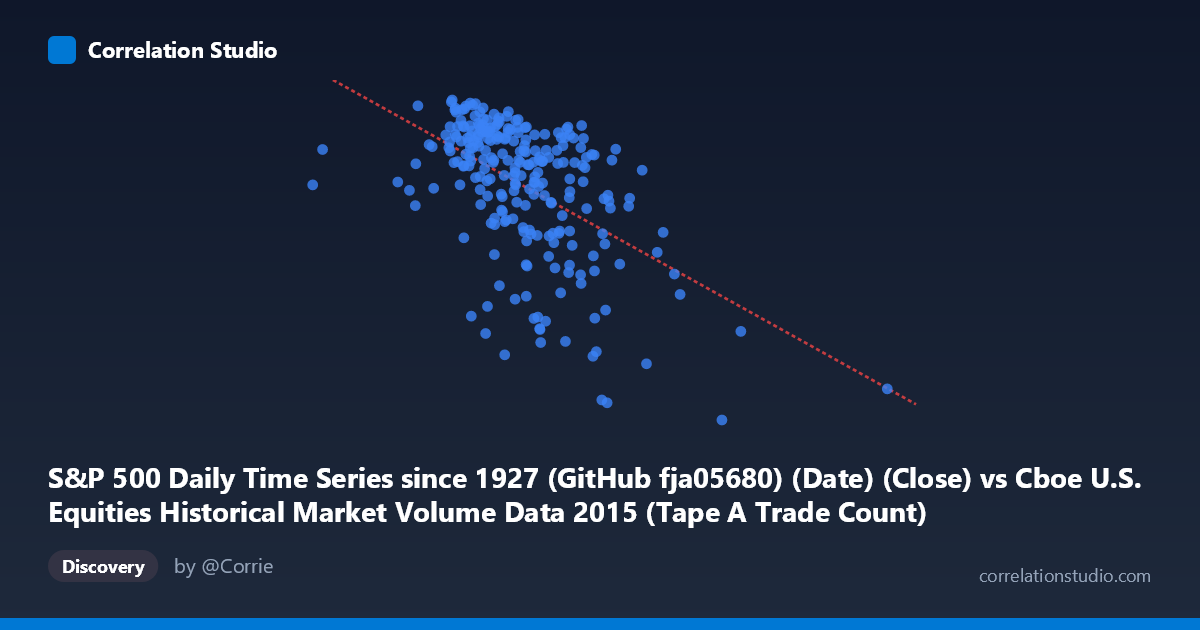
S&P 500 Daily Time Series since 1927 (GitHub fja05680) (Date) (Close) vs Cboe U.S. Equities Historical Market Volume Data 2015 (Tape A Trade Count)
- Pearson correlation (r)
- -0.5198
- Spearman correlation
- -0.5081
- p-value
- 0
- Sample size (n)
- 252
- 95% confidence interval
- -0.6045 to -0.4234
- Granger causality
- None
- Granger optimal lag
- 1
AI analysis
Analysis: S&P 500 Closing Price vs. Cboe Tape A Trade Count (2015)
Relationship Overview The scatterplot reveals a negative relationship between the S&P 500 closing price (X-axis) and Cboe Tape A trade count (Y-axis) across 252 trading days in 2015. As the S&P 500 index level increases, the number of trades on Tape A tends to decrease, and vice versa. The linear regression equation (y = −0.000112x + 2,221.16) confirms this inverse slope, suggesting that higher index valuations are associated with quieter, lower-volume trading activity, while lower index levels coincide with elevated trade counts — consistent with the well-known phenomenon that market stress and selloffs tend to drive heightened trading activity.
Correlation Strength and Statistical Significance The Pearson correlation of r = −0.5198 indicates a moderate negative association, but the explanatory power is notably limited: r² = 0.2701, meaning only about 27% of the variance in Tape A trade counts is explained by the S&P 500 closing price. The remaining 73% is attributable to other factors entirely. The 95% confidence interval of [−0.6045, −0.4234] is reasonably tight and does not cross zero, and the p-value of effectively 0 (against N = 3,302) confirms this correlation is highly statistically significant — this is not a chance finding. However, statistical significance should not be conflated with practical importance, given the modest r². Critically, the Granger causality tests fail in both directions (X→Y: F = 0.43, p = 0.51; Y→X: F = 0.73, p = 0.39), meaning neither variable temporally predicts the other at a one-period lag. This rules out a straightforward lead-lag or predictive relationship and cautions against any causal interpretation.
Notable Patterns and Outliers The data shows a broadly dispersed cloud with a discernible downward trend, but with substantial scatter, reinforcing the modest r². Several notable features stand out. In the lower-right region, points around X ≈ 2,076,907–2,247,816 (higher S&P 500 levels) cluster at distinctly low Y values (~1,868–1,971), consistent with the regression trend. Conversely, the upper-left region contains points at lower index levels (~997,000–1,163,000) with high trade counts (~2,094–2,131). There are a few visible outliers: the point at approximately (2,247,816; 1,867.61) sits at an extreme X value with the lowest observed Y, and the point at (576,208; 2,061) appears as a far-left outlier in X, potentially representing an anomalous data alignment or a specific market event. The upper band of Y values (≈2,110–2,131) appears to concentrate around mid-range X values, hinting at possible non-linearity or clustering rather than a purely linear relationship.
Confounding Factors and Caveats Several important caveats apply. First, the axis labels appear swapped in the source metadata — the X-axis is labeled as the S&P 500 Close but drawn from the Cboe dataset, and the Y-axis is Tape A trade count from the S&P dataset — suggesting a potential data joining artifact worth verifying. Second, day-of-week and seasonal effects are well-documented drivers of equity trading volume and could confound this relationship; Mondays and Fridays, and periods around earnings seasons or holidays, independently affect both variables. Third, market regime shifts in 2015 — particularly the August 2015 Flash Crash and associated volatility spike — likely account for some extreme observations and could artificially strengthen the measured correlation. Fourth, the X variable spans an unusually wide range (576,208 to 2,923,236), which may reflect unit inconsistencies or scaling differences rather than true S&P 500 close prices (which ranged roughly 1,867–2,131 in 2015), further suggesting the X-axis may represent a volume or notional figure rather than a price.
Actionable Insights and Further Investigation Given the moderate correlation and the absence of Granger causality, practitioners should not use S&P 500 levels as a standalone predictor of trade counts. Instead, further investigation should incorporate volatility metrics (e.g., VIX), time-of-year fixed effects, and multi-exchange volume decomposition to better explain the remaining 73% of variance. It would be valuable to test non-linear models (e.g., polynomial or piecewise regression) given the visual clustering at extreme X values. Clarifying the true identity of the X variable — confirming whether it is a price close or a volume/notional figure — is a prerequisite before drawing any market-microstructure conclusions. Finally, extending this analysis across multiple years would help determine whether the 2015 negative correlation is structurally persistent or an artifact of that year's specific volatility events.
X dataset: Cboe U.S. Equities Historical Market Volume Data 2015
Y dataset: S&P 500 Daily Time Series since 1927 (GitHub fja05680) (Date)
Part of experiment: Daily - Cboe U.S. Equities Historical Market Volume Data 2015 vs S&P 500 Daily Time Series since 1927 (GitHub fja05680) (Date)