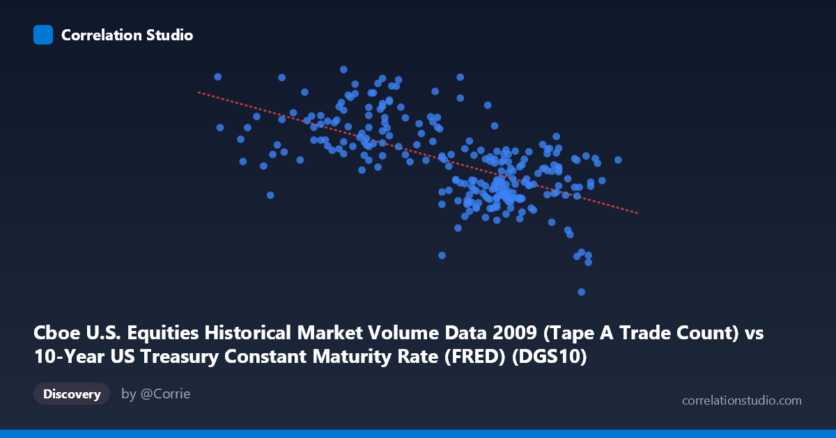
Cboe U.S. Equities Historical Market Volume Data 2009 (Tape A Trade Count) vs 10-Year US Treasury Constant Maturity Rate (FRED) (DGS10)
- Pearson correlation (r)
- -0.6191
- Spearman correlation
- -0.6025
- p-value
- 0
- Sample size (n)
- 250
- 95% confidence interval
- -0.6902 to -0.5362
- Granger causality
- None
- Granger optimal lag
- 10
AI analysis
Analysis: 10-Year Treasury Yield vs. Cboe Equity Trade Count (2009)
Relationship Overview The scatterplot reveals a moderate negative relationship between the 10-year US Treasury constant maturity rate (X-axis) and Cboe U.S. equity trade counts (Y-axis) during 2009. As Treasury yields rise, equity trade volumes tend to decline, and conversely, lower yields correspond with higher trading activity. The linear regression equation (y = -618,433x + 3,651,790) quantifies this inverse slope, meaning each 1-percentage-point increase in the 10-year yield is associated with approximately 618,000 fewer trades. This pattern is visually consistent across the chart, though with considerable scatter around the regression line, suggesting the relationship is real but far from deterministic.
Correlation Strength and Statistical Significance The Pearson correlation of r = -0.619 indicates a moderate-to-strong negative association, and with a p-value effectively at zero across a sample of 250 paired observations drawn from a population of 3,232, this result is highly statistically significant — the probability of observing this by chance is negligible. However, R² = 0.383 is the more sobering metric: Treasury yield movements explain only 38.3% of the variance in trade counts, leaving over 61% attributable to other factors. The 95% confidence interval for r of [-0.690, -0.536] is reasonably tight, reinforcing confidence in the direction and approximate magnitude of the effect. Critically, Granger causality tests find no significant predictive directionality in either direction (X→Y: F = 0.77, p = 0.66; Y→X: F = 1.71, p = 0.08), even at an optimal lag of 10 periods. This means that while the two variables move together contemporaneously, neither reliably predicts the other temporally — the correlation reflects co-movement rather than a causal lead-lag mechanism.
Notable Patterns, Clusters, and Outliers Several structural features stand out in the data. There is a visible cluster of high-yield, low-volume observations in the x = 3.4–3.8 range with trade counts frequently below 1,500,000, consistent with the latter part of 2009 when yields recovered and post-crisis volatility subsided. Conversely, observations in the x = 2.6–3.1 range (early-to-mid 2009, during peak crisis stress) tend to show substantially higher trade counts, often exceeding 1,800,000–2,500,000. At least two prominent outliers deserve attention: the point near (3.82, 362,081) represents an anomalously low trade count despite a moderate yield, and (2.78, 2,549,192) reflects exceptionally high volume at a low yield. The spread around the regression line is heteroscedastic — variance in trade counts appears wider at lower yield values, suggesting the relationship is noisier during high-volatility, low-rate environments.
Confounding Factors and Caveats Interpreting this correlation as a direct yield-to-volume mechanism requires significant caution. 2009 was a structurally unique year — the Global Financial Crisis aftermath dominated market behavior, with the Federal Reserve implementing emergency rate policies (ZIRP beginning late 2008) that simultaneously suppressed yields and drove extraordinary equity trading volumes through panic selling, forced deleveraging, and speculative recovery trading. The true confounding variable is likely broader financial stress or risk sentiment (e.g., VIX, credit spreads), which drove both low Treasury yields (flight-to-safety demand) and elevated equity trade counts (volatility-driven turnover) simultaneously. Additionally, the mislabeled axis metadata (dataset names appear swapped between axes) warrants verification of which variable is truly on which axis before drawing firm conclusions. Seasonal effects, quarter-end rebalancing, and specific event-driven volume spikes (e.g., stress test announcements, Fed statements) could also explain individual high-leverage observations.
Actionable Insights and Further Investigation Given that the relationship explains only ~38% of variance and lacks Granger-causal directionality, yield alone is insufficient as a predictor of equity trade volume. Analysts should incorporate additional covariates — particularly implied volatility (VIX), credit spreads, or Fed announcement indicators — into a multivariate model to substantially improve explanatory power. It would be valuable to replicate this analysis across other years (e.g., 2010–2019) to determine whether the correlation is a persistent structural feature or an artifact of the crisis period. Investigating non-linear specifications (e.g., spline regression or regime-switching models) may better capture the apparent heteroscedasticity at lower yield levels. Finally, given the 10-period optimal lag identified in the Granger analysis, a closer examination of whether the marginal p-value of 0.08 for Y→X approaches significance under alternative lag structures could reveal a weak feedback effect worth monitoring in high-frequency trading strategy contexts.
X dataset: 10-Year US Treasury Constant Maturity Rate (FRED)
Y dataset: Cboe U.S. Equities Historical Market Volume Data 2009
Part of experiment: Daily - 10-Year US Treasury Constant Maturity Rate (FRED) vs Cboe U.S. Equities Historical Market Volume Data 2009