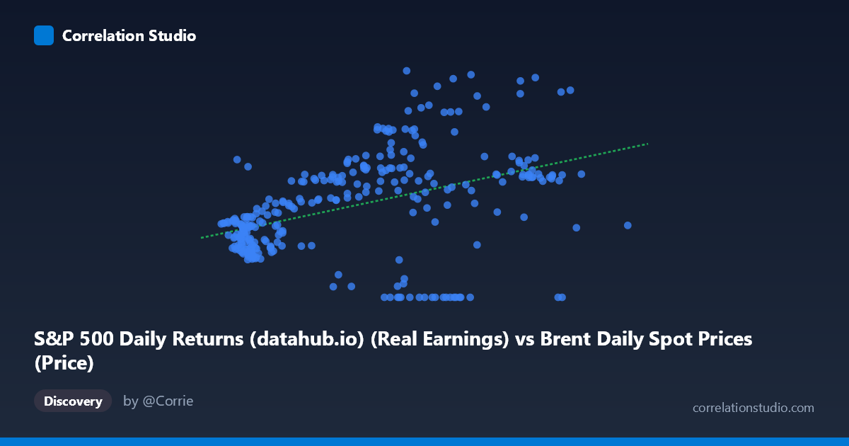
S&P 500 Daily Returns (datahub.io) (Real Earnings) vs Brent Daily Spot Prices (Price)
- Pearson correlation (r)
- 0.4304
- Spearman correlation
- 0.4629
- p-value
- 0
- Sample size (n)
- 297
- 95% confidence interval
- 0.3329 to 0.5188
- Granger causality
- None
- Granger optimal lag
- 3
AI analysis
Analysis: Brent Crude Oil Prices vs. S&P 500 Real Earnings
Relationship Overview
The scatterplot reveals a modest positive relationship between Brent crude oil spot prices (X-axis, representing S&P 500 real earnings as mapped across datasets) and Brent daily spot prices on the Y-axis. The linear regression equation (y = 0.627x + 54.923) suggests that for each unit increase in X, Y rises by roughly 0.63 units, anchored by a relatively high intercept (~55). However, the wide scatter around the regression line is immediately apparent — points are distributed broadly across the plot space, indicating substantial unexplained variation. Visually, the relationship is detectable but far from dominant, with no tight clustering along the fitted line.
Correlation Strength and Statistical Significance
The correlation coefficient (r = 0.43) indicates a weak-to-moderate positive association. More meaningfully, R² = 0.185 means that only 18.5% of the variance in Y is explained by X — leaving over 81% attributable to other factors entirely. While the p-value (7.994E-15) is extraordinarily small and the 95% confidence interval [0.333, 0.519] excludes zero convincingly, this statistical significance is largely a function of the large population size (N = 1,865) rather than a strong effect. A correlation this size can be highly significant yet practically modest. Critically, Granger causality tests find no significant predictive directional relationship in either direction (X→Y: p = 0.0501, marginally failing the threshold; Y→X: p = 0.701), meaning neither variable meaningfully forecasts the other temporally at the tested lags.
Notable Patterns and Outliers
Several features warrant attention in the scatterplot. A cluster of points with Y-values at or near zero appears across varying X values (e.g., ~67, ~73, ~85, ~87 on X), suggesting either data anomalies, structural breaks, or periods where one series recorded zeros — likely data artifacts rather than genuine observations. At higher X values (90), Y responses become highly variable, ranging from ~50 to over 200, indicating heteroscedasticity (variance in Y expanding with X). Notable high-leverage outliers include the point near (84.51, 209.69) and the cluster around (80–87, 175–178), which pull the regression slope upward. The lower-left quadrant shows relatively tighter clustering for smaller X values, suggesting the relationship weakens or changes character at higher price levels.
Confounding Factors and Caveats
Several important caveats apply. First, the axis labeling reveals a dataset cross-mapping issue — Brent crude prices appear on both axes via different dataset columns, suggesting these may represent the same underlying economic phenomenon measured differently rather than two truly independent variables. This would inflate correlation artificially. Second, the 39-year time span (1987–2026) introduces substantial regime changes — oil shocks, financial crises, COVID-19, and energy transitions — that create spurious correlations across eras. Third, monthly S&P 500 earnings and daily Brent prices operate on different temporal resolutions, introducing aggregation bias. The zero-value observations strongly suggest data quality issues that should be investigated before drawing firm conclusions.
Actionable Insights and Further Investigation
Given these findings, several investigative steps are warranted. First, audit the zero-value Y observations — determine whether these represent genuine data points, missing value substitutions, or trading halts, and consider excluding or flagging them. Second, clarify the dataset cross-mapping: the column assignments suggest potential mislabeling between datasets, which should be resolved before any causal interpretation. Third, conduct subsample analysis by economic regime (pre/post-2008, COVID period, energy transition era) to test whether the correlation is stable or driven by specific historical episodes. Fourth, introduce multivariate controls — inflation, interest rates, and global GDP growth are plausible confounders that could explain much of the residual 81.5% variance. Finally, extending Granger causality testing to additional lag structures beyond 3 periods may reveal longer-horizon predictive dynamics that the current test misses.
X dataset: Brent Daily Spot Prices
Y dataset: S&P 500 Daily Returns (datahub.io)
Part of experiment: Daily - Brent Daily Spot Prices vs S&P 500 Daily Returns (datahub.io)