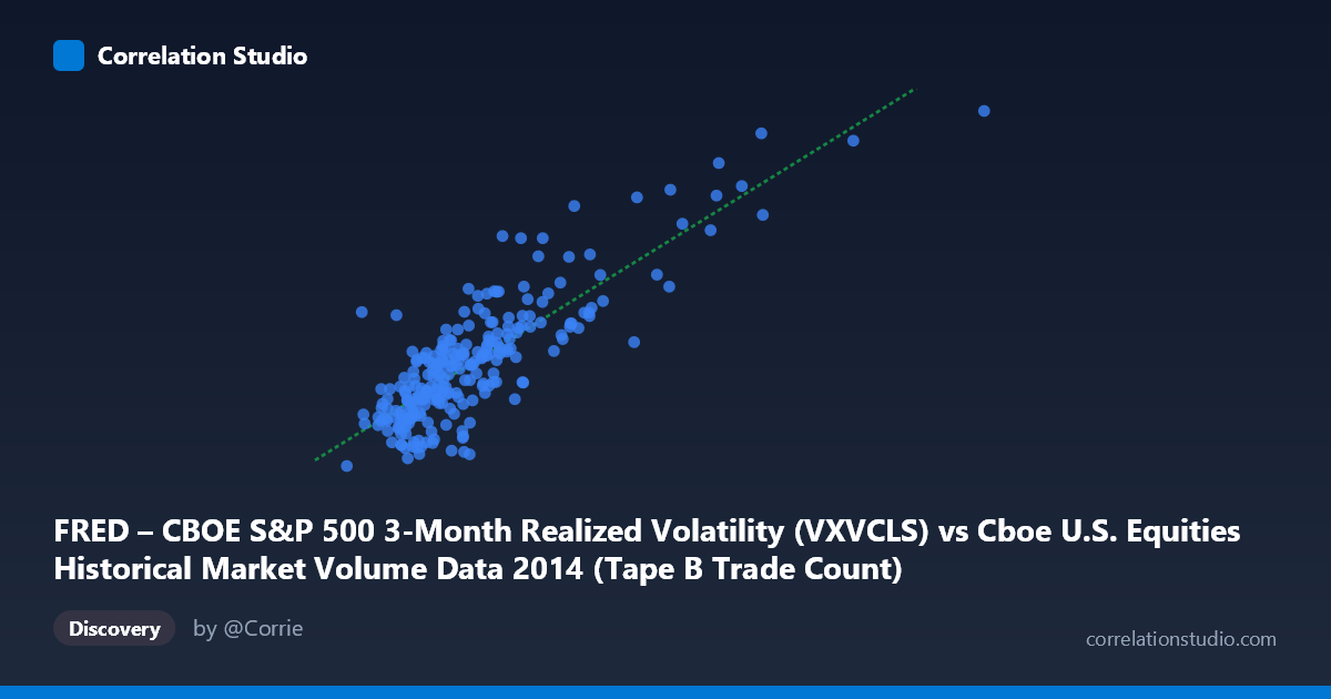
FRED – CBOE S&P 500 3-Month Realized Volatility (VXVCLS) vs Cboe U.S. Equities Historical Market Volume Data 2014 (Tape B Trade Count)
- Pearson correlation (r)
- 0.8381
- Spearman correlation
- 0.7723
- p-value
- 0
- Sample size (n)
- 252
- 95% confidence interval
- 0.7971 to 0.8714
- Granger causality
- None
- Granger optimal lag
- 1
AI analysis
Analysis: CBOE S&P 500 3-Month Realized Volatility vs. Tape B Trade Count (2014)
Relationship Overview The scatterplot reveals a strong positive relationship between Cboe market volume (Tape B Trade Count, on the X-axis) and the CBOE S&P 500 3-Month Realized Volatility index (Y-axis) across 252 trading days in 2014. As daily trade counts increase, realized volatility rises correspondingly, which is intuitively consistent with market microstructure theory: elevated trading activity tends to coincide with periods of price uncertainty and heightened investor reactivity. The linear regression equation (y = 2.276×10⁻⁵x + 10.556) suggests that for every additional 100,000 trades, realized volatility increases by approximately 2.28 index points, with a baseline volatility near 10.6 when trade counts are minimal.
Correlation Strength and Statistical Interpretation The correlation of r = 0.8381 is statistically strong and highly significant (p ≈ 0), and with n = 252 paired observations drawn from a population of N = 3,686, the estimate is well-powered. The 95% confidence interval [0.797, 0.871] is relatively tight, confirming that the true correlation is robustly positive and unlikely to be a sampling artifact. Crucially, the R² of 0.702 tells us that approximately 70.2% of the day-to-day variance in realized volatility is explained by trade count volume alone — a remarkably high figure for a single-predictor model in financial data. The remaining ~30% reflects variance driven by other factors not captured here. Despite this strong contemporaneous association, the Granger causality tests reveal no significant temporal predictive direction in either direction (X→Y: F = 2.34, p = 0.127; Y→X: F = 0.04, p = 0.841). This is a critical nuance: while the two variables move together strongly, neither reliably leads the other in time, meaning traders cannot use one series to forecast the next day's reading of the other with statistically meaningful confidence at a one-period lag.
Patterns, Clusters, and Outliers The scatterplot shows several noteworthy structural features. The bulk of observations cluster in the lower-left region — trade counts between roughly 110,000 and 300,000 with volatility between 12 and 18 — reflecting the relatively calm, normal market conditions that dominated much of 2014. However, there are clear high-leverage outliers in the upper-right corner, most visibly points around (559,868; 22.85) and (478,251; 23.09), which correspond to days of extreme volume and peak volatility. These likely reflect specific market stress episodes (e.g., geopolitical events or macro data shocks in late 2014). The scatter also hints at mild heteroscedasticity: variance around the regression line appears to widen at higher trade counts, suggesting the linear model fits the low-volume regime better than the high-volume, high-volatility tail. A point like (154,530; 17.16) also stands out as a mild outlier on the upper-left, showing elevated volatility despite modest volume.
Confounding Factors and Caveats Several important caveats apply before drawing causal conclusions. First, reverse causation is plausible: high volatility may drive trading activity rather than the other way around, or both variables may be jointly driven by a common third factor such as macroeconomic news releases, Federal Reserve announcements, or geopolitical shocks. Second, the Tape B Trade Count specifically captures trading on regional exchanges (BATS, etc.), which may respond differently to volatility regimes than the broader market, introducing venue-specific selection bias. Third, the 3-month realized volatility is a backward-looking, smoothed measure, meaning it may lag contemporaneous market stress by design, partially explaining the absence of Granger causality. Finally, 2014 was a relatively low-volatility year overall with a few sharp episodic spikes, making results potentially non-generalizable to more turbulent periods.
Actionable Insights and Further Investigation Given the strong contemporaneous correlation but absent temporal causality, practitioners should treat these variables as coincident indicators rather than leading signals. Researchers should investigate whether the relationship holds across multiple years and volatility regimes (e.g., 2008, 2020) to test structural stability. Decomposing Tape B volume by trade size or trader type (retail vs. institutional) could clarify whether specific participant behavior drives the volatility-volume link. A nonlinear or regime-switching model may better capture the apparent heteroscedasticity in the high-volume tail. Finally, adding control variables — such as VIX level, macroeconomic surprise indices, or intraday timing — in a multivariate framework would help isolate the independent contribution of trade count to volatility dynamics and reduce the risk of spurious correlation driven by common external shocks.
X dataset: Cboe U.S. Equities Historical Market Volume Data 2014
Y dataset: FRED – CBOE S&P 500 3-Month Realized Volatility
Part of experiment: Daily - Cboe U.S. Equities Historical Market Volume Data 2014 vs FRED – CBOE S&P 500 3-Month Realized Volatility