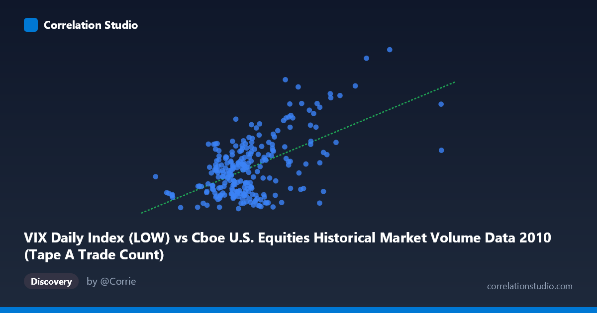
VIX Daily Index (LOW) vs Cboe U.S. Equities Historical Market Volume Data 2010 (Tape A Trade Count)
- Pearson correlation (r)
- 0.557
- Spearman correlation
- 0.3814
- p-value
- 0
- Sample size (n)
- 252
- 95% confidence interval
- 0.4654 to 0.6367
- Granger causality
- Y → X
- Granger optimal lag
- 1
AI analysis
Scatterplot Analysis: VIX Low vs. Tape A Trade Count (2010)
Relationship Overview
The scatterplot reveals a moderate positive relationship between the VIX Daily Index (Low) values on the X-axis and the Cboe U.S. Equities Tape A Trade Count on the Y-axis across 252 trading days in 2010. As the VIX low rises — indicating elevated baseline fear or uncertainty in the market — trade counts tend to increase correspondingly. This is intuitive: periods of heightened volatility typically drive greater market participation, as investors and traders react to changing conditions, rebalance portfolios, or speculate on price movements. The linear regression equation (y = 6.63×10⁻⁶x + 12.95) confirms a positive slope, though the relatively small coefficient reflects that very large changes in VIX are needed to produce meaningful shifts in trade count.
Correlation Strength and Statistical Significance
The Pearson correlation of r = 0.557 indicates a moderate positive association, but the more telling metric is r² = 0.310, meaning VIX Low explains only about 31% of the variance in Tape A trade counts. The remaining ~69% of variability is driven by other factors entirely. The 95% confidence interval of [0.465, 0.637] is reasonably tight given the sample of 252 observations, and the p-value of essentially zero confirms this correlation is not a statistical artifact. Critically, the Granger causality test points unidirectionally: Y Granger-causes X (F = 6.89, p = 0.009), meaning past trade count activity has statistically significant predictive power over future VIX Low values, but not the reverse (F = 2.44, p = 0.120). This is a meaningful finding — it suggests trade volume dynamics may lead volatility signals rather than simply respond to them.
Notable Patterns, Clusters, and Outliers
Several structural features stand out in the data. The bulk of observations cluster in the lower-left region, with VIX Low values roughly between 800,000–1,500,000 and trade counts between 15–25, suggesting a fairly stable "normal" market regime dominated most of 2010. However, there is a visible upper-right cluster of points with VIX Low values exceeding ~1,800,000 and trade counts above 28–38, consistent with the market stress episodes of 2010 (notably the May Flash Crash and its aftermath). A few extreme outliers are conspicuous — particularly points near (2,474,888, 38.95) and (3,216,587, 31.71) — which pull the regression line and inflate the correlation. The point at ~3.2M on the X-axis appears isolated and may represent an anomalous trading session deserving individual scrutiny. The relationship also appears to fan outward (heteroscedastic), with greater variance in trade counts at higher VIX levels.
Confounding Factors and Caveats
Several important caveats apply. First, the axis labeling appears inverted in the metadata — VIX is listed as the X variable but sourced from the market volume dataset, while Tape A Trade Count is on Y but sourced from the VIX dataset — suggesting a possible data joining artifact that warrants verification before drawing firm conclusions. Second, 2010 was an exceptional year containing the May 6 Flash Crash, European sovereign debt fears, and Fed quantitative easing announcements, all of which could independently spike both volatility and volume simultaneously, creating spurious correlation. Third, secular trends in algorithmic trading throughout 2010 may inflate trade counts independently of volatility. Finally, Granger causality does not imply true causation — the predictive relationship from trade counts to VIX Low may be mediated by a third variable such as options market activity or institutional order flow.
Actionable Insights and Further Investigation
The Granger causality finding that trade count predicts future VIX Low — rather than the reverse — is the most practically actionable result here. Traders and risk managers could explore whether spikes in Tape A trade count serve as a leading indicator for volatility regime changes, potentially useful for dynamic hedging strategies or VIX-linked derivatives positioning. Further investigation should include: (1) removing or separately analyzing outlier sessions (especially the Flash Crash period) to assess whether the correlation holds in "normal" conditions; (2) testing non-linear models given the apparent heteroscedasticity and possible threshold effects; (3) extending the analysis to multiple years to assess whether the Granger relationship is stable or specific to 2010's unique conditions; and (4) incorporating options volume and put/call ratios as potential mediating variables to better decompose the causal pathway between trade activity and volatility.
X dataset: Cboe U.S. Equities Historical Market Volume Data 2010
Y dataset: VIX Daily Index
Part of experiment: Daily - Cboe U.S. Equities Historical Market Volume Data 2010 vs VIX Daily Index