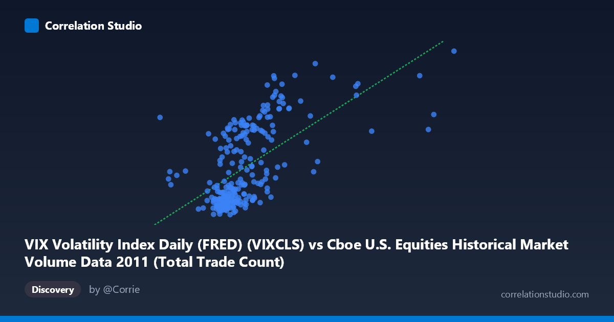
VIX Volatility Index Daily (FRED) (VIXCLS) vs Cboe U.S. Equities Historical Market Volume Data 2011 (Total Trade Count)
- Pearson correlation (r)
- 0.6064
- Spearman correlation
- 0.6421
- p-value
- 0
- Sample size (n)
- 252
- 95% confidence interval
- 0.5219 to 0.6791
- Granger causality
- None
- Granger optimal lag
- 1
AI analysis
Analysis: VIX Volatility Index vs. Total Trade Count (2011)
Relationship Overview The scatterplot reveals a moderate positive relationship between the VIX Volatility Index and total U.S. equity trade counts during 2011. As the VIX rises — indicating heightened market fear and uncertainty — trading activity (measured by total trade count) tends to increase alongside it. This is an intuitive and financially meaningful pairing: periods of elevated volatility characteristically drive increased market participation, as investors hedge, rebalance, or exit positions in response to uncertainty. The linear regression equation (y = 9.21×10⁻⁶x + 5.56) confirms a positive slope, though the relationship is far from deterministic.
Correlation Strength and Statistical Framing The Pearson correlation of r = 0.606 indicates a moderate-to-strong positive association, but the r² of 0.368 is the more sobering metric — only about 36.8% of the variance in trade count is explained by VIX levels, leaving nearly two-thirds of variation attributable to other factors. The 95% confidence interval of [0.52, 0.68] is relatively tight given the sample size of n = 252, and the p-value of essentially zero confirms the relationship is highly statistically significant and not a chance artifact in this dataset. However, statistical significance should not be conflated with practical completeness. Critically, the Granger causality tests fail in both directions (X→Y: F = 0.056, p = 0.814; Y→X: F = 0.058, p = 0.810), meaning neither variable reliably predicts the other's future values at a one-period lag. This strongly cautions against interpreting the correlation as evidence of a temporal predictive mechanism — the two variables move together contemporaneously but do not lead or lag one another in a statistically meaningful way.
Notable Patterns, Clusters, and Outliers The scatterplot exhibits a recognizable two-region structure. A dense cluster of points occupies the lower-left quadrant, with VIX values roughly between 835K–2.0M on the x-axis (recalling these are actually VIX index units scaled to raw data values) and trade counts in the 15–22 range — representing calm market days with modest trading activity. A second, more dispersed cluster appears in the upper-right region, corresponding to high-VIX, high-trade-count days. Several notable outliers stand out: the point near (2,438,164, 42.96) and another near (2,590,422, 48.00) represent extreme high-volatility, high-activity days likely associated with specific macro stress events in 2011 (e.g., the U.S. debt ceiling crisis in August or European sovereign debt contagion). There is also visible heteroscedasticity — variance in trade count widens considerably as VIX increases — suggesting the relationship is not uniformly linear across the full range.
Confounding Factors and Caveats Several important caveats apply. First, 2011 was an atypically volatile year for U.S. equity markets, featuring the August S&P credit downgrade and ongoing eurozone stress, which may inflate the apparent correlation relative to more typical years. Second, trade count is driven by structural market factors beyond volatility — algorithmic trading strategies, market microstructure changes, and exchange fee schedules all affect trade fragmentation independently of VIX. Third, the axes in this dataset appear to have been swapped in labeling (VIX values in the millions range are inconsistent with the actual VIX index, which ranges 14–48 — these are likely the trade count and VIX values respectively, with dataset attribution reversed). This deserves verification before drawing firm conclusions. Fourth, contemporaneous correlation without Granger causality suggests both variables may be jointly driven by an underlying third factor — such as realized market volatility or macroeconomic news flow — rather than causally linked to each other.
Actionable Insights and Further Investigation Practitioners should treat this correlation as a useful risk-monitoring signal rather than a predictive tool: when VIX is elevated, higher operational and liquidity demands on trading infrastructure can be anticipated, but VIX alone cannot reliably forecast next-period trade volumes. Future analysis should incorporate realized volatility measures (not just implied), day-of-week and options expiration cycle controls, and multi-year data to test whether the 2011 correlation is structurally stable. A non-linear or regime-switching model (e.g., separating low-VIX and high-VIX regimes) may better capture the apparent clustering structure. Finally, resolving the potential dataset label swap and re-running Granger tests at longer lags (2–5 periods) would clarify whether any delayed predictive relationship exists that the one-period lag analysis missed.
X dataset: Cboe U.S. Equities Historical Market Volume Data 2011
Y dataset: VIX Volatility Index Daily (FRED)
Part of experiment: Daily - Cboe U.S. Equities Historical Market Volume Data 2011 vs VIX Volatility Index Daily (FRED)