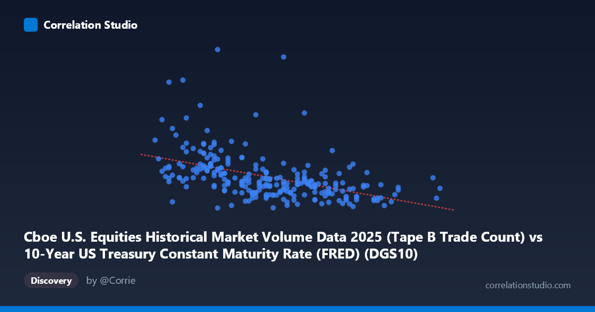
Cboe U.S. Equities Historical Market Volume Data 2025 (Tape B Trade Count) vs 10-Year US Treasury Constant Maturity Rate (FRED) (DGS10)
- Pearson correlation (r)
- -0.472
- Spearman correlation
- -0.5891
- p-value
- 0
- Sample size (n)
- 248
- 95% confidence interval
- -0.5634 to -0.3691
- Granger causality
- None
- Granger optimal lag
- 10
- Time coverage
- 2025-01-02 to 2025-12-31
- Recomputed on refreshed data
- 2026-10-23 (r was -0.472)
AI analysis
Analysis of 10-Year Treasury Yield vs. Cboe Equity Trade Count (2025)
1. What the Visualization Reveals
The scatterplot displays a moderately negative relationship between the 10-Year US Treasury Constant Maturity Rate (x-axis, ranging roughly 3.97–4.79%) and Cboe U.S. Equities Tape B Trade Count (y-axis, ranging from ~407K to ~1.72M trades). As Treasury yields rise, equity trade counts tend to decline, which is broadly consistent with the financial intuition that higher interest rates compress equity market activity — either through reduced risk appetite, capital rotation into fixed income, or dampened speculative trading. The linear regression equation (y = -510,644x + 2,857,290) quantifies this inverse slope, suggesting each 1 percentage point increase in yield is associated with roughly 510,000 fewer trades.
2. Correlation Strength, Direction, and Statistical Framing
The Pearson correlation of r = -0.472 indicates a moderate negative association, but the r² of 0.2228 means only ~22.3% of the variance in trade counts is explained by yield levels — leaving roughly 78% attributable to other factors. The 95% confidence interval of [-0.563, -0.369] is meaningfully narrow and entirely negative, confirming the direction is reliable, and the p-value of 3.55×10⁻¹⁵ makes this statistically unambiguous given n=248. However, statistical significance should not be conflated with practical magnitude here. Critically, Granger causality tests show no significant predictive directionality in either direction (X→Y: p=0.680; Y→X: p=0.692), meaning that past yield values do not help forecast future trade counts (and vice versa) at the optimal 10-period lag. The relationship appears contemporaneous rather than lead-lag in nature.
3. Notable Patterns, Clusters, and Outliers
The data clusters heavily in the 4.10–4.45% yield range, which aligns with the mean of 4.29%, creating a dense central mass in the scatterplot. Several notable outliers are visible at elevated trade counts (e.g., ~1.47M at 4.05%, ~1.05M at 4.12%, ~937K at 4.23%) that appear at lower yield levels, suggesting episodic bursts of trading activity during low-rate periods — possibly tied to specific market events or volatility spikes. At higher yields (4.5%), the distribution compresses noticeably with trade counts clustering below ~600K, indicating more consistent suppression of activity. The note that Spearman ρ exceeds Pearson r is important: it suggests the monotonic relationship is stronger than the linear one, implying a concave or logarithmic decay in trade counts as yields rise rather than a straight-line decline.
4. Confounding Factors and Caveats
Several confounds warrant caution. First, yield levels in 2025 operate within a narrow 82-basis-point band (3.97–4.79%), which limits the generalizability of this relationship across broader rate regimes. Second, equity trade counts are driven by numerous factors independent of rates — VIX levels, earnings seasons, macroeconomic data releases, and ETF rebalancing — none of which are controlled for here. Third, Tape B specifically captures regional exchange activity (NYSE American, Cboe BZX, etc.), which may respond differently to rate environments than overall market volume. Fourth, the time series spans only 2025, introducing potential non-stationarity and regime effects if Fed policy communication shifted materially during the year. The lack of Granger causality also warns against assuming rates "cause" trade count changes in any mechanistic sense.
5. Actionable Insights and Further Investigation
Given the non-linear signal (Spearman Pearson), a logarithmic or polynomial regression should be fitted and compared against the linear model — this could meaningfully improve predictive accuracy. Researchers should consider adding VIX or realized volatility as a control variable, as volatility independently drives trade frequency and likely co-moves with rate changes. It would also be valuable to disaggregate by market regime (e.g., rising vs. falling yield environments) to test whether the relationship is symmetric. Finally, extending the analysis to Tape A and Tape C alongside total notional value (not just trade count) would help determine whether rate sensitivity reflects trade frequency, trade size, or both — a distinction with significant implications for market microstructure research.
X dataset: 10-Year US Treasury Constant Maturity Rate (FRED)
Y dataset: Cboe U.S. Equities Historical Market Volume Data 2025
Part of experiment: Daily - 10-Year US Treasury Constant Maturity Rate (FRED) vs Cboe U.S. Equities Historical Market Volume Data 2025