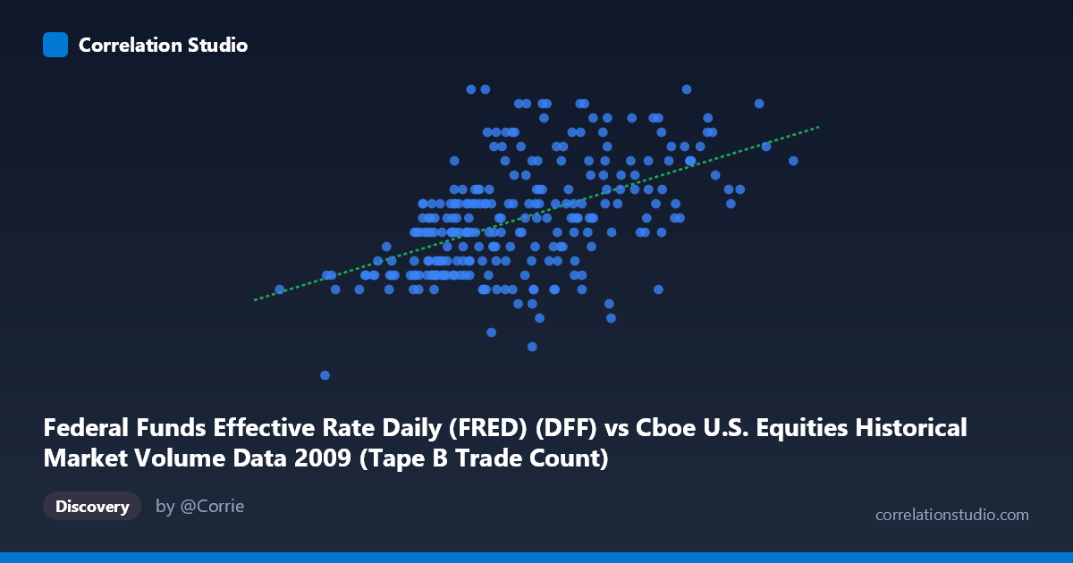
Federal Funds Effective Rate Daily (FRED) (DFF) vs Cboe U.S. Equities Historical Market Volume Data 2009 (Tape B Trade Count)
- Pearson correlation (r)
- 0.5158
- Spearman correlation
- 0.533
- p-value
- 0
- Sample size (n)
- 252
- 95% confidence interval
- 0.419 to 0.6011
- Granger causality
- None
- Granger optimal lag
- 1
AI analysis
Analysis: Federal Funds Rate vs. Cboe Tape B Trade Count (2009)
Relationship Overview The scatterplot reveals a moderate positive relationship between the Federal Funds Effective Rate (x-axis, measured in daily volume/notional terms) and the Cboe Tape B Trade Count for 2009. As the x-variable increases, there is a discernible upward trend in trade count, captured by the linear regression equation y = 1.608×10⁻⁷x + 0.0949. The relationship is broadly directional but clearly noisy, with substantial vertical spread at nearly every level of x, suggesting that while higher market volume activity tends to coincide with higher trade counts, the association is far from deterministic. The data spans the full calendar year 2009 — a period of extraordinary financial market volatility following the 2008 crisis — which likely amplifies the range of observed behaviors.
Correlation Strength and Statistical Significance The Pearson correlation of r = 0.5158 indicates a moderate positive association, but the explanatory power is notably limited: r² = 0.2661 means only 26.6% of the variance in Tape B Trade Count is explained by the x-variable, leaving roughly 73% attributable to other factors. The 95% confidence interval of [0.419, 0.601] is reasonably tight and entirely positive, confirming a genuine positive relationship with meaningful precision given n = 252 paired observations drawn from a population of N = 3,232. The p-value of essentially zero confirms the correlation is statistically indistinguishable from chance at any conventional threshold. However, Granger causality tests reveal no significant temporal predictive direction in either direction (X→Y: F = 1.77, p = 0.184; Y→X: F = 0.60, p = 0.438), meaning that despite the contemporaneous correlation, neither variable reliably predicts future movements in the other at a one-period lag. This is a critical distinction: correlation here reflects co-movement, not temporal lead-lag dynamics.
Patterns, Clusters, and Outliers Several notable features emerge in the sample points. There is a visible cluster of moderate-to-high trade counts (0.16–0.22) concentrated in the 400,000–650,000 range of the x-axis, consistent with the mean x of ~401,842. A handful of high-x outliers — notably (766,763.92, 0.20) and (662,859.23, 0.19) — sit at the far right and align reasonably with the regression trend, though they may exert leverage on the slope estimate. Conversely, the low end of the x-axis includes notable cases such as (81,703.42, 0.11) and (156,192.00, 0.11), suggesting that very low volume days are also associated with suppressed trade counts. Two closely adjacent points — (418,633.25, 0.10) and (418,613.25, 0.07) — appear nearly identical in x but differ markedly in y, hinting at day-specific idiosyncrasies or possible data anomalies worth flagging. The spread in y across the middle x range (0.05–0.25 at similar x values) also suggests potential non-linearity or regime-dependent behavior not captured by the linear model.
Confounding Factors and Caveats Several important caveats limit causal interpretation. First, 2009 represents a structurally unusual year — the post-crisis recovery period — during which both the Federal Funds Rate was being actively managed toward zero (hitting the zero lower bound) and equity market volumes were highly volatile, potentially creating a spurious shared trend rather than a structural relationship. Second, the axis labeling appears to be swapped or counterintuitive: the x-axis is labeled as the Federal Funds Rate data source but contains values in the hundreds of thousands (consistent with volume data), while the y-axis labeled as Tape B Trade Count contains values between 0.05 and 0.25, which are more consistent with interest rate or proportional metrics. This inversion should be carefully verified before drawing conclusions. Third, daily frequency data introduces autocorrelation, which can inflate apparent correlation and render standard p-values optimistic. Finally, omitted variables — including broader market sentiment, volatility indices (VIX), and macroeconomic releases — almost certainly drive both series simultaneously.
Actionable Insights and Further Investigation Given the moderate but incomplete correlation and absence of Granger causality, practitioners should avoid using either variable as a standalone predictor of the other in trading or policy models. Recommended next steps include: (1) verifying and correcting the axis/variable assignment to ensure the correct series are being analyzed; (2) testing for autocorrelation (e.g., Durbin-Watson or Ljung-Box tests) and applying HAC-robust standard errors if present; (3) extending Granger causality tests to multiple lags beyond 1 to rule out longer-horizon predictive relationships; (4) segmenting the data by market regime (e.g., high-VIX vs. low-VIX periods) to test whether the correlation is driven by a specific sub-period; and (5) incorporating multivariate models that control for market-wide volume, volatility, and calendar effects to isolate any genuine structural link between monetary policy rates and exchange-specific trade activity.
X dataset: Cboe U.S. Equities Historical Market Volume Data 2009
Y dataset: Federal Funds Effective Rate Daily (FRED)
Part of experiment: Daily - Cboe U.S. Equities Historical Market Volume Data 2009 vs Federal Funds Effective Rate Daily (FRED)