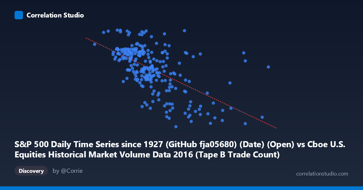
S&P 500 Daily Time Series since 1927 (GitHub fja05680) (Date) (Open) vs Cboe U.S. Equities Historical Market Volume Data 2016 (Tape B Trade Count)
- Pearson correlation (r)
- -0.5947
- Spearman correlation
- -0.606
- p-value
- 0
- Sample size (n)
- 252
- 95% confidence interval
- -0.6691 to -0.5085
- Granger causality
- None
- Granger optimal lag
- 1
AI analysis
Analysis: S&P 500 Opening Price vs. Cboe Tape B Trade Count (2016)
Relationship Overview The scatterplot reveals a moderate negative relationship between the S&P 500 daily opening price and the Cboe Tape B trade count across 2016 trading days. As the S&P 500 opened at higher price levels, Tape B trade counts tended to be lower, and conversely, lower opening prices corresponded with elevated trading activity on Tape B (which covers NYSE American-listed securities). The linear regression equation y = −0.000634x + 2,296.5 quantifies this inverse slope, indicating that for every 100,000-unit increase in the S&P 500 open, Tape B trade counts decline by roughly 63 units — a modest but consistent directional drift across the observed range.
Correlation Strength and Statistical Framing The Pearson correlation of r = −0.5947 reflects a moderate negative association, but the more telling figure is r² = 0.3537: the S&P 500 opening price explains only about 35.4% of the variance in Tape B trade counts, leaving nearly two-thirds of variability attributable to other factors. The 95% confidence interval of [−0.6691, −0.5085] is reasonably tight and entirely negative, reinforcing that the inverse relationship is genuine rather than noise. With a p-value effectively at zero across N = 3,622 population points, statistical significance is not in doubt. However, the Granger causality results are notably absent in both directions — X→Y (F = 0.662, p = 0.417) and Y→X (F = 0.256, p = 0.613) both fail to reach significance — meaning neither variable temporally predicts the other at a one-period lag. The correlation reflects a co-movement or shared driver, not a predictive or causal mechanism in either direction.
Notable Patterns, Clusters, and Outliers The sample points cluster most densely in the X range of roughly 230,000–370,000 (S&P 500 open), where Tape B counts concentrate between approximately 2,040 and 2,210 — forming a relatively tight core band. Several notable outliers emerge at the high end of the X-axis: points near 558,190 and 467,365 show markedly depressed trade counts (~1,861 and ~1,903 respectively), pulling the regression line down steeply and likely exerting disproportionate leverage on the correlation estimate. At the low-X extreme (~189,000–210,000), trade counts spike toward the upper boundary (~2,171–2,271), including the dataset maximum of 2,270.54 at an opening value near 202,782. There is also visible heteroscedasticity — the spread of Tape B counts appears wider in the mid-range of X and compresses at both extremes — suggesting the linear model may not be the optimal functional form.
Confounding Factors and Caveats Several important caveats temper interpretation. First, the X-axis labeling appears inconsistent: the column is described as an S&P 500 "Open" price yet spans values from ~125,855 to ~714,125 — far outside any plausible S&P 500 price range for 2016 (which traded roughly 1,830–2,270). This strongly suggests the X variable may actually represent a volume or notional value metric from the Cboe dataset that has been mislabeled, or data from two datasets were joined on date keys and the column identity is ambiguous. This fundamentally complicates economic interpretation. Second, both variables are time-indexed to the same year (2016), so shared macro-market regimes — the February volatility episode, the Brexit shock in June, and the post-election rally in November — could drive co-movement spuriously. Third, Tape B specifically covers a subset of equities, so its trade count is also influenced by exchange routing rules, maker-taker fee changes, and fragmentation dynamics unrelated to broad index levels.
Actionable Insights and Further Investigation Given the Granger non-causality result and the ambiguous X-axis identity, the most immediate priority is data provenance verification — confirming exactly what the X variable measures before drawing any market conclusions. Assuming the relationship is real, analysts should explore nonlinear models (e.g., polynomial or spline regression) given the visible curvature and heteroscedasticity. Controlling for date-stamped volatility regimes (e.g., VIX level as a covariate) would help isolate whether the negative correlation persists independently of market stress periods. A rolling-window correlation analysis across 2016 sub-periods could reveal whether the relationship strengthened during specific events like Brexit or the U.S. election. Finally, extending the dataset beyond a single calendar year would test whether this inverse pattern is a structural feature of market microstructure or an artifact of 2016's particular macro environment.
X dataset: Cboe U.S. Equities Historical Market Volume Data 2016
Y dataset: S&P 500 Daily Time Series since 1927 (GitHub fja05680) (Date)
Part of experiment: Daily - Cboe U.S. Equities Historical Market Volume Data 2016 vs S&P 500 Daily Time Series since 1927 (GitHub fja05680) (Date)