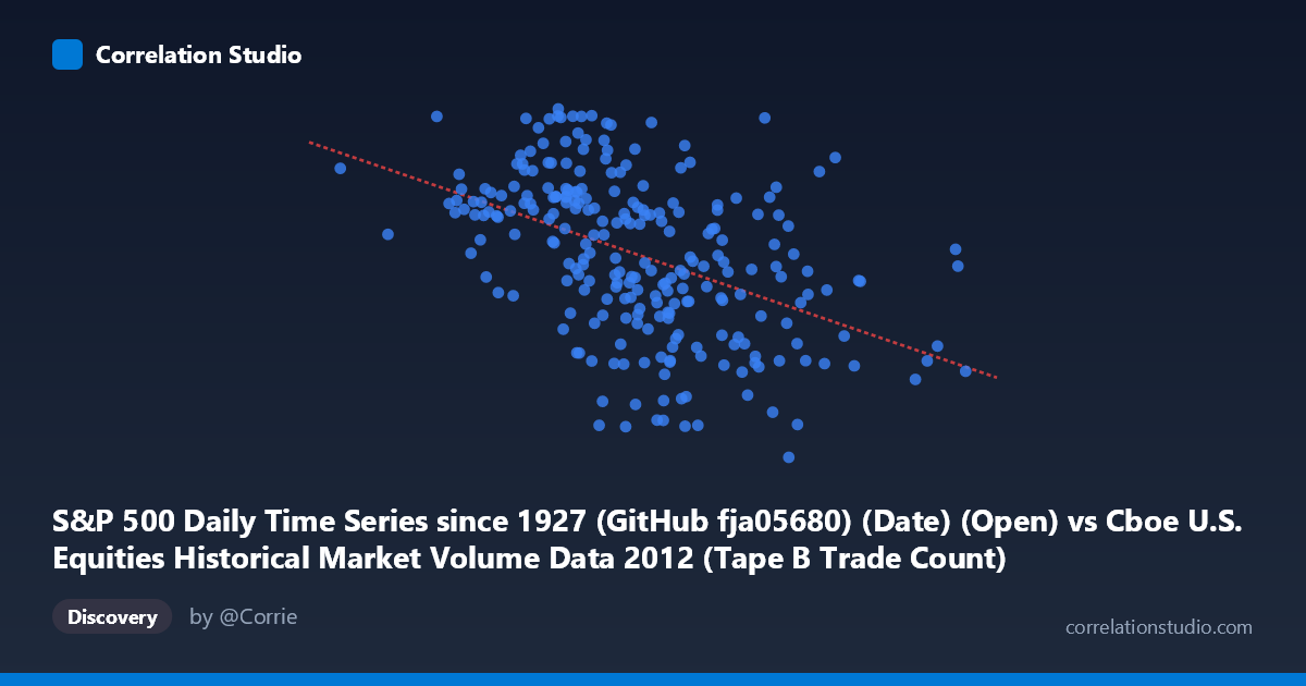
S&P 500 Daily Time Series since 1927 (GitHub fja05680) (Date) (Open) vs Cboe U.S. Equities Historical Market Volume Data 2012 (Tape B Trade Count)
- Pearson correlation (r)
- -0.4588
- Spearman correlation
- -0.512
- p-value
- 0
- Sample size (n)
- 250
- 95% confidence interval
- -0.5515 to -0.355
- Granger causality
- X → Y
- Granger optimal lag
- 1
AI analysis
Scatterplot Analysis: S&P 500 Opening Price vs. Cboe Tape B Trade Count (2012)
Relationship Overview
The scatterplot reveals a moderate negative relationship between the S&P 500 daily opening price and Cboe Tape B trade count during 2012. As the S&P 500 open price increases (ranging from ~63,410 to ~298,005), Tape B trade counts tend to decline, following the linear regression equation y = -0.000541x + 1,473.61. This inverse pattern suggests that on days when equity prices are elevated, trading activity in Tape B securities (primarily NYSE American/regional exchange-listed stocks) tends to be lower — a counterintuitive but statistically meaningful finding. The downward-sloping regression line is visible across the scatter, though considerable dispersion exists throughout the entire X range.
Correlation Strength and Statistical Significance
The Pearson correlation of r = -0.4588 indicates a moderate negative association, but the explained variance figure tells a more sobering story: R² = 0.2105 means only 21.1% of the variance in Tape B trade counts is explained by the S&P 500 opening price, leaving nearly 79% attributable to other factors. The 95% confidence interval of [-0.5515, -0.3550] is entirely negative and does not cross zero, reinforcing directional confidence, and the p-value of 2.02×10⁻¹⁴ confirms this relationship is extraordinarily unlikely to be due to chance alone given n = 250 paired observations. Critically, Granger causality analysis provides directional evidence: X (S&P 500 open price) Granger-causes Y (Tape B trade count) at an optimal lag of 1 period (F = 5.47, p = 0.020), while the reverse direction fails to reach significance (F = 0.93, p = 0.336). This suggests that yesterday's S&P 500 opening level has modest but statistically meaningful predictive power over today's Tape B trading activity, not vice versa.
Notable Patterns, Clusters, and Outliers
Several structural features are visible in the data. The bulk of observations cluster in the X range of ~100,000–230,000 with Y values between approximately 1,300–1,440, forming the densest region of the plot. A handful of high-X outliers (notably around X = 295,000, Y ≈ 1,372) appear at the far right of the distribution — these likely represent specific high-volume price days that fall relatively close to the regression line. On the Y-axis, there are notable extreme trade count values: points near Y = 1,460–1,465 (e.g., the observation at ~222,650, 1,460) and low values approaching Y = 1,258–1,280 (e.g., ~170,460, 1,277 and ~182,225, 1,281) suggest episodic spikes and troughs in Tape B activity that deviate substantially from the trend. The scatter also shows mild heteroscedasticity — variability in Y appears somewhat wider in the mid-X range than at the extremes — which could mildly violate linear regression assumptions.
Confounding Factors and Caveats
Several important caveats complicate causal interpretation. First, the X-axis label warrants scrutiny: the column is described as "Date (Open)" from the S&P 500 dataset mapped to Cboe volume data — it is possible that what appears as a price range in the hundreds of thousands reflects a data encoding issue (e.g., date integers or index values rather than true price levels), which would fundamentally alter the interpretation. Second, 2012 was a single calendar year with specific macro conditions (post-2011 European debt crisis stabilization, U.S. election uncertainty), and results may not generalize beyond this window. Third, Tape B trade count is a narrow market microstructure metric sensitive to exchange routing decisions, maker-taker fee structures, and HFT behavior — factors entirely unrelated to S&P 500 price levels. Fourth, both variables share common time-series dependencies (autocorrelation, trending), which can inflate apparent correlations and Granger causality results even with proper controls.
Actionable Insights and Further Investigation
Practitioners interested in this relationship should first verify the X-axis variable encoding to confirm whether values represent actual S&P 500 prices or some transformed date/index representation, as this is foundational to any practical interpretation. If the relationship is genuine, traders and market microstructure researchers could explore whether elevated index price environments correspond to reduced regional exchange activity due to capital rotation toward large-cap S&P constituents (Tape A/C). The 1-period Granger lag result suggests a next-day predictive signal worth incorporating into intraday volume forecasting models, though its modest R² warrants treating it as one input among many. Future work should extend the time series beyond 2012, control for VIX (volatility), market-wide volume, and macroeconomic announcements, and test non-linear models (e.g., spline regression or random forests) given the visible scatter dispersion that linear models cannot fully capture.
X dataset: Cboe U.S. Equities Historical Market Volume Data 2012
Y dataset: S&P 500 Daily Time Series since 1927 (GitHub fja05680) (Date)
Part of experiment: Daily - Cboe U.S. Equities Historical Market Volume Data 2012 vs S&P 500 Daily Time Series since 1927 (GitHub fja05680) (Date)