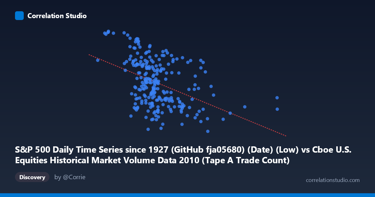
S&P 500 Daily Time Series since 1927 (GitHub fja05680) (Date) (Low) vs Cboe U.S. Equities Historical Market Volume Data 2010 (Tape A Trade Count)
- Pearson correlation (r)
- -0.4339
- Spearman correlation
- -0.425
- p-value
- 0
- Sample size (n)
- 252
- 95% confidence interval
- -0.5291 to -0.3279
- Granger causality
- Y → X
- Granger optimal lag
- 1
AI analysis
Analysis: S&P 500 Daily Low vs. Cboe Tape A Trade Count (2010)
Relationship Overview The scatterplot reveals a moderate negative relationship between the S&P 500 daily low price (X-axis) and the Cboe U.S. Equities Tape A trade count (Y-axis) across 2010. As the S&P 500 low price increases — reflecting rising market valuations — the number of individual trades on Tape A venues tends to decline. This counterintuitive inverse pattern suggests that during periods of lower equity prices (typically associated with higher volatility and uncertainty), market participants fragment their activity into more, smaller trades, while rising prices coincide with consolidation into fewer, larger transactions. The regression line (y = -6.46×10⁻⁵x + 1216.3) captures this downward slope, though the wide scatter around the line is immediately apparent visually.
Correlation Strength and Statistical Significance The Pearson correlation of r = -0.4339 indicates a moderate negative association, but the explanatory power is notably limited: r² = 0.1882 means only 18.8% of the variance in Tape A trade counts is explained by the S&P 500 daily low. The remaining ~81% of variance is driven by factors outside this linear relationship. The 95% confidence interval of [-0.5291, -0.3279] is entirely negative and reasonably tight, confirming directional consistency, while the p-value of 5.4×10⁻¹³ — computed across N = 3,302 observations — renders this correlation highly statistically significant and very unlikely to be a chance artifact. The Granger causality results add a meaningful temporal dimension: Y Granger-causes X (F = 4.97, p = 0.027) with a one-period lag, meaning Tape A trade counts have statistically significant predictive power over next-day S&P 500 low prices. The reverse direction (X→Y: F = 3.18, p = 0.076) falls just short of the conventional 0.05 threshold, making this unidirectional: trading activity leads price behavior, not the other way around.
Notable Patterns, Clusters, and Outliers Several structural features stand out in the chart. There is a visible cluster of high trade-count observations (Y ≈ 1220–1260) concentrated at lower X values (roughly 600,000–1,100,000), consistent with the early-2010 period when post-financial-crisis volatility and lower price levels drove elevated fragmented trading. Conversely, higher X values (1,500,000–3,200,000) are almost exclusively associated with lower trade counts (Y ≈ 1040–1130), reflecting mid-to-late 2010 recovery. A notable outlier exists near X ≈ 3,216,587 with Y ≈ 1,094 — an extreme high-volume day that sits far to the right of the main data cloud, likely representing an unusual market structure event. The sample points also reveal substantial vertical spread at similar X values (e.g., multiple points near X ≈ 1,000,000–1,300,000 spanning Y from ~1,040 to ~1,235), underscoring the weak-to-moderate fit.
Confounding Factors and Interpretive Caveats Several important caveats temper direct interpretation. Both variables are time-indexed to 2010, meaning the apparent correlation may largely reflect a shared temporal trend: the S&P 500 was generally recovering and rising throughout the year while market microstructure (trade counts) evolved alongside regulatory and technological changes (e.g., post-Flash Crash adjustments after May 2010). This shared trend can artificially inflate correlation magnitude. Additionally, Tape A covers only NYSE-listed securities, so trade count reflects a subset of market activity that may respond differently to index-level price movements than the broader market. The Granger result, while statistically significant, operates at a one-day lag on a relatively short annual sample (n = 252), which limits the robustness of causal inference. Algorithmic trading patterns, circuit breakers, and seasonal volume effects are likely unmeasured confounders.
Actionable Insights and Further Investigation The Granger causality finding — that trade counts predict next-day price lows — warrants further investigation as a potential short-horizon signal: elevated Tape A fragmentation (high trade counts at lower prices) may foreshadow continued downward pressure or mean-reversion opportunities in the S&P 500. Practically, analysts should: (1) extend this analysis across multiple years (2008–2015) to test whether the negative correlation is stable or an artifact of 2010's specific recovery trajectory; (2) decompose trade counts by trade size to assess whether the inverse relationship is driven by retail versus institutional behavior; (3) apply rolling-window correlation analysis to identify whether the relationship strengthens during high-volatility regimes; and (4) incorporate the Flash Crash date (May 6, 2010) as a structural break to test whether the correlation is regime-dependent. A non-linear model (e.g., spline regression or quantile regression) may also better capture the apparent threshold behavior visible in the scatterplot.
X dataset: Cboe U.S. Equities Historical Market Volume Data 2010
Y dataset: S&P 500 Daily Time Series since 1927 (GitHub fja05680) (Date)
Part of experiment: Daily - Cboe U.S. Equities Historical Market Volume Data 2010 vs S&P 500 Daily Time Series since 1927 (GitHub fja05680) (Date)