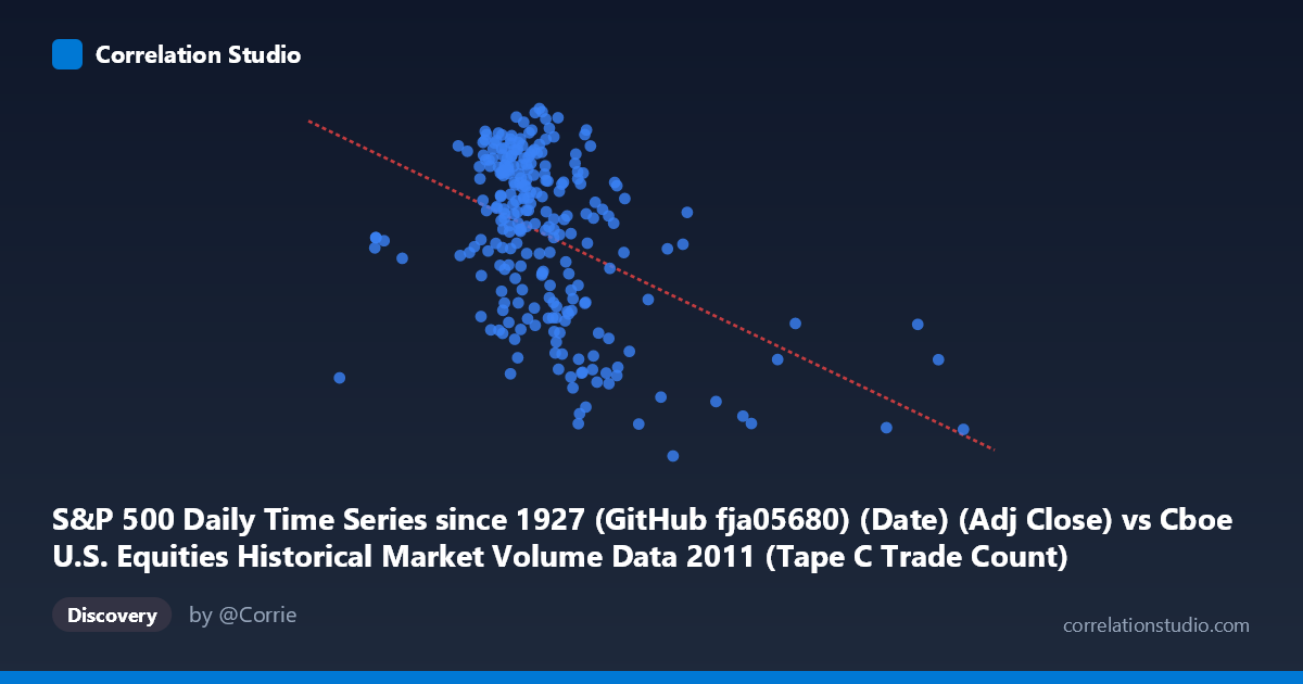
S&P 500 Daily Time Series since 1927 (GitHub fja05680) (Date) (Adj Close) vs Cboe U.S. Equities Historical Market Volume Data 2011 (Tape C Trade Count)
- Pearson correlation (r)
- -0.4396
- Spearman correlation
- -0.3801
- p-value
- 0
- Sample size (n)
- 252
- 95% confidence interval
- -0.5342 to -0.3342
- Granger causality
- None
- Granger optimal lag
- 1
AI analysis
Analysis: S&P 500 Adjusted Close vs. Cboe Tape C Trade Count (2011)
1. Overall Relationship The scatterplot reveals a moderate negative relationship between the S&P 500 daily adjusted closing price (X-axis) and the Cboe Tape C trade count (Y-axis) across 252 trading days in 2011. As the S&P 500 price level rises, Tape C trade counts tend to decline, and conversely, lower price levels are associated with higher trade activity. This inverse pattern is visually apparent as a downward-sloping cloud of points, though with considerable scatter, suggesting the relationship is real but far from deterministic. The regression line (y = -0.000227x + 1,391.9) captures this negative slope, but the wide dispersion around it signals that many other forces are simultaneously driving trade count activity.
2. Correlation Strength, Direction, and Causality The Pearson correlation of r = −0.44 confirms a moderate negative association. However, the coefficient of determination r² = 0.1933 is the more practically important figure: it means that only ~19.3% of the variance in Tape C trade counts is explained by the S&P 500 price level, leaving roughly 80% of variation attributable to other factors. The 95% confidence interval of [−0.534, −0.334] is entirely negative and relatively tight given the sample size of n = 252, lending confidence that the negative direction is genuine and not a sampling artifact. The p-value of 2.476 × 10⁻¹³ confirms the relationship is highly statistically significant, virtually eliminating chance as an explanation. Despite this statistical significance, the Granger causality tests return no significant predictive direction in either direction (X→Y: F = 0.045, p = 0.833; Y→X: F = 0.009, p = 0.926), meaning that neither variable meaningfully predicts the future values of the other at a one-period lag. This is a critical distinction: the correlation is a contemporaneous, structural association — not a temporal lead-lag dynamic that could be exploited for forecasting.
3. Notable Patterns, Clusters, and Outliers Several structural features stand out in the data. The bulk of observations cluster in a core band between roughly X = 450,000–650,000 and Y = 1,250–1,350, suggesting a dominant regime for most of 2011. However, there are notable right-tail outliers at very high X values (e.g., ~921,000 and ~775,000), which coincide with relatively lower Y values (~1,170–1,285), consistent with the negative trend. A second visible cluster appears at the lower-right of the price axis with depressed trade counts (e.g., points near X = 600,000–670,000 with Y ≈ 1,131–1,165), which likely correspond to specific low-volatility or low-liquidity periods. Conversely, points with high trade counts (Y 1,330) concentrate at lower X values (roughly 400,000–530,000), which may reflect periods of market stress or heightened uncertainty in 2011 — consistent with the European sovereign debt crisis and the U.S. debt ceiling standoff that drove elevated retail and institutional activity precisely when prices were under pressure.
4. Confounding Factors and Caveats Several important caveats temper this interpretation. First, 2011 was a highly atypical year — the U.S. credit downgrade in August 2011 and European debt contagion fears created episodic volatility spikes that could artificially inflate the correlation between lower prices and higher activity. The relationship may be largely driven by a handful of stress episodes rather than a stable, structural mechanism. Second, Tape C specifically captures NYSE Arca-listed securities (primarily ETFs and tech stocks), so this is not a market-wide trade count — the negative correlation may reflect ETF-specific arbitrage or hedging behavior rather than broad market dynamics. Third, the S&P 500 Adj Close captures price level, not returns or volatility, and it is well-established that trade volume and counts are more directly tied to volatility and uncertainty than to price levels per se; the negative correlation here may be a proxy for a volatility-volume relationship rather than a price-volume one. Finally, causality cannot be inferred from this correlation — both variables are likely co-driven by macro uncertainty, making the observed association largely spurious in a causal sense.
5. Actionable Insights and Further Investigation Given the moderate but incomplete explanatory power and absent Granger causality, a few avenues merit investigation. First, substituting or adding the VIX (implied volatility index) as a predictor of Tape C trade counts would likely absorb much of the residual variance and test whether the price-count relationship is truly independent or mediated by volatility. Second, segmenting the data by market regime (e.g., pre- and post-August 2011 downgrade) could reveal whether the correlation is stable or driven by a single structural break. Third, exploring nonlinear models or threshold regression may improve fit, as the scatterplot hints at a possible floor in trade counts (~1,100) and ceiling (~1,360) that a linear model cannot capture. Finally, extending the analysis to multiple years would clarify whether this negative price-count relationship is a persistent feature of Tape C microstructure or an artifact of 2011's exceptional market conditions.
X dataset: Cboe U.S. Equities Historical Market Volume Data 2011
Y dataset: S&P 500 Daily Time Series since 1927 (GitHub fja05680) (Date)
Part of experiment: Daily - Cboe U.S. Equities Historical Market Volume Data 2011 vs S&P 500 Daily Time Series since 1927 (GitHub fja05680) (Date)