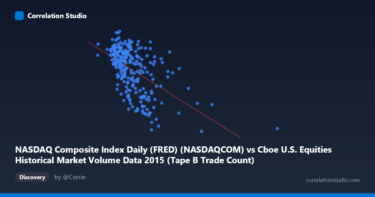
NASDAQ Composite Index Daily (FRED) (NASDAQCOM) vs Cboe U.S. Equities Historical Market Volume Data 2015 (Tape B Trade Count)
- Pearson correlation (r)
- -0.5384
- Spearman correlation
- -0.5257
- p-value
- 0
- Sample size (n)
- 252
- 95% confidence interval
- -0.6207 to -0.4444
- Granger causality
- None
- Granger optimal lag
- 10
AI analysis
Analysis: NASDAQ Composite Index vs. Cboe Tape B Trade Count (2015)
Relationship Overview The scatterplot reveals a moderate negative relationship between the NASDAQ Composite Index level and Cboe Tape B Trade Count across 2015. As the NASDAQ index rose to higher values, Tape B trade counts tended to decline, and conversely, lower index values were associated with higher trade counts. The linear regression equation (y = −0.000909x + 5217.74) captures this downward slope, meaning that for every 100,000-point increase in the NASDAQ index value, the predicted Tape B trade count drops by roughly 91 units. Visually, the bulk of data points cluster in the lower-left region (NASDAQ values between ~130,000–450,000), with a sparser tail extending toward higher index values near 640,000–1,014,000, where trade counts are notably depressed.
Correlation Strength and Statistical Interpretation The Pearson correlation of r = −0.5384 indicates a moderate negative association. The r² of 0.29 means that approximately 29% of the variance in Tape B trade counts is explained by NASDAQ index levels — meaningful but leaving 71% of variation attributable to other factors. The 95% confidence interval of [−0.621, −0.444] is reasonably tight and does not cross zero, and the p-value is effectively zero across a sample of 252 paired observations drawn from a population of 3,302, confirming this relationship is statistically robust and unlikely to be a chance artifact. However, the Granger causality tests provide an important caveat: neither direction (X→Y nor Y→X) achieves significance (F = 1.42, p = 0.17 and F = 0.98, p = 0.47 respectively, even at an optimal lag of 10 periods). This means that while the two variables are correlated contemporaneously, neither demonstrably predicts the future movement of the other in a temporal sense — the relationship is associative, not directionally predictive.
Notable Patterns, Clusters, and Outliers The data exhibits a clear high-density cluster in the X range of roughly 130,000–450,000, where trade counts span widely from ~4,600 to ~5,220. Within this cluster, variability in Y is substantial, suggesting the relationship is noisy even where data is dense. Several potential outliers are visible at very high X values (621,009; 640,679; and values approaching ~1,014,000), where Tape B trade counts drop to near or below 4,510–4,706 — the lowest values in the dataset. These high-X, low-Y points exert leverage on the regression line and may be disproportionately driving the observed negative slope. There also appears to be a ceiling effect around Y ≈ 5,200–5,220, with the highest trade counts concentrated when the NASDAQ index is at its lowest observed levels.
Confounding Factors and Caveats Several important caveats apply. First, the NASDAQ Composite Index encodes both price level and time — it trended generally upward through 2015, meaning higher index values also correspond to later calendar dates. Tape B volume patterns likely have their own seasonal and day-of-week structure, so what appears as an index-volume relationship may partly be a temporal autocorrelation artifact. Second, the Granger causality null result at lag 10 is noteworthy: even though the correlation is strong, any mechanistic story about one driving the other lacks empirical support from this data. Third, extreme outliers at high X values (potentially corresponding to volatile market episodes like the August 2015 correction) could reflect regime-switching behavior rather than a continuous linear relationship. Finally, Tape B specifically covers NYSE MKT, NYSE Arca, and regional exchanges — its behavior may diverge from broader market dynamics for structural reasons unrelated to NASDAQ performance.
Actionable Insights and Further Investigation Given that 71% of Tape B trade count variance remains unexplained, further investigation should incorporate additional predictors such as VIX (volatility index), day-of-week effects, specific market events (e.g., August 2015 flash crash), and trading venue competition metrics. Segmenting the data by month or market-event periods would help determine whether the correlation is uniform across 2015 or driven by specific episodes. A non-linear or piecewise regression may better capture the apparent threshold behavior at the high end of NASDAQ values. Additionally, comparing Tape A and Tape C trade counts alongside Tape B would clarify whether this is a market-wide phenomenon or specific to Tape B-listed securities. The absence of Granger causality suggests against deploying NASDAQ levels as a real-time signal for Tape B volume forecasting without further modeling.
X dataset: Cboe U.S. Equities Historical Market Volume Data 2015
Y dataset: NASDAQ Composite Index Daily (FRED)
Part of experiment: Daily - Cboe U.S. Equities Historical Market Volume Data 2015 vs NASDAQ Composite Index Daily (FRED)