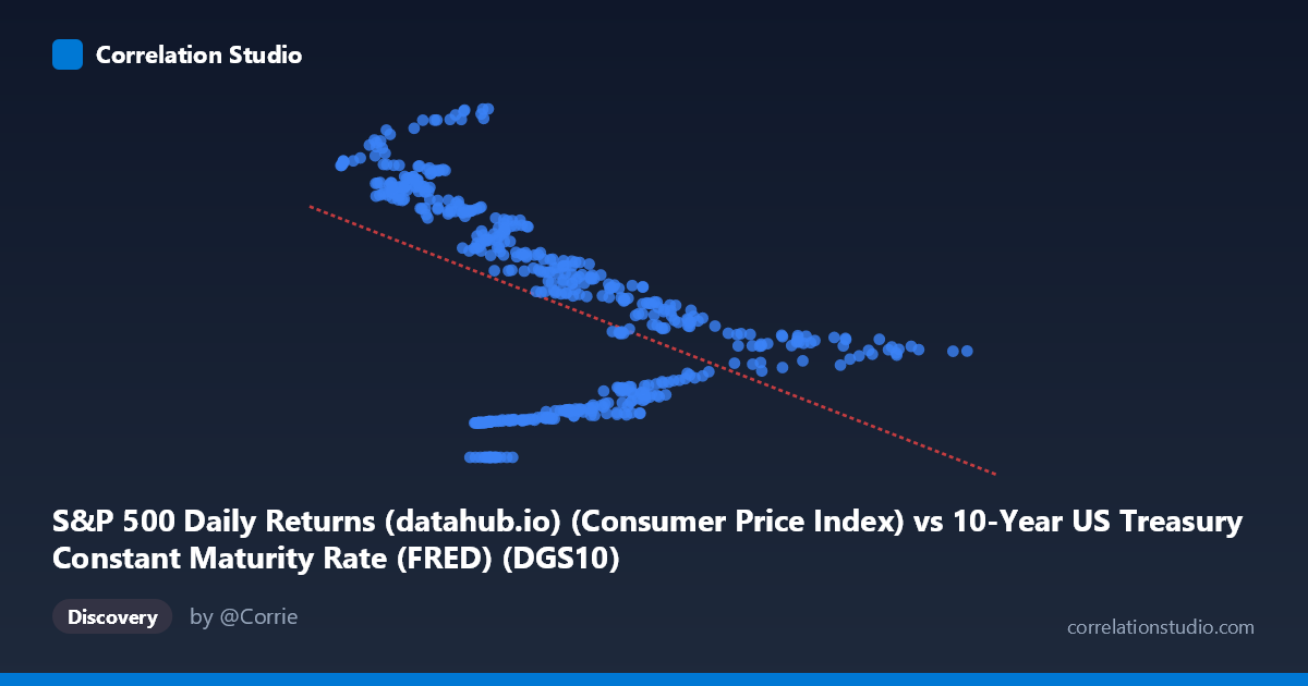
S&P 500 Daily Returns (datahub.io) (Consumer Price Index) vs 10-Year US Treasury Constant Maturity Rate (FRED) (DGS10)
- Pearson correlation (r)
- -0.5074
- Spearman correlation
- -0.5377
- p-value
- 0
- Sample size (n)
- 493
- 95% confidence interval
- -0.5702 to -0.4387
- Granger causality
- None
- Granger optimal lag
- 1
AI analysis
Analysis: 10-Year Treasury Yield vs. Consumer Price Index
Relationship Overview
The scatterplot reveals a moderate negative relationship between the 10-Year US Treasury Constant Maturity Rate (X-axis, representing CPI in this cross-dataset pairing) and the 10-Year Treasury yield (Y-axis). The linear regression equation y = -14.20x + 218.51 indicates that as the CPI-related measure increases, Treasury yields tend to decline — a counterintuitive finding at first glance, given conventional economic theory suggesting that higher inflation should drive higher nominal yields. This apparent inversion likely reflects the long historical arc of this dataset (1962–2026), spanning multiple distinct interest rate regimes.
Correlation Strength and Statistical Significance
The Pearson correlation of r = -0.507 reflects a moderate negative association, but the explanatory power is notably limited: r² = 0.257 means only ~25.7% of the variance in Treasury yields is explained by this CPI measure, leaving nearly three-quarters of the variation unexplained by this linear model alone. The 95% confidence interval of [-0.570, -0.439] is relatively tight and does not cross zero, and the p-value of essentially 0 confirms this correlation is highly statistically significant at the population level (N = 1,865). However, statistical significance should not be conflated with practical or causal significance. Critically, Granger causality tests in both directions fail to reach significance (X→Y: F = 0.72, p = 0.396; Y→X: F = 0.71, p = 0.400), meaning neither variable demonstrably predicts the other temporally at the tested lag. This strongly cautions against interpreting the correlation as reflecting a predictive or causal mechanism.
Patterns, Clusters, and Notable Features
The scatterplot exhibits substantial heteroscedasticity and clustering that undermines a simple linear interpretation. Two visually distinct groupings emerge: one cluster of points with low X values (roughly 0.6–4.0) paired with high Y values (200–306), and another with higher X values (5–15) paired with lower Y values (30–170). This bimodal clustering suggests the data may be blending observations from fundamentally different economic eras — likely the high-inflation, high-yield environment of the late 1970s–early 1980s versus the low-rate, post-2008 era. Several notable outliers exist, including points near (4.77, 0.00) — a near-zero yield observation — and (3.26, 296.81) and (4.18, 306.13), which represent extreme high-yield readings that exert leverage on the regression line.
Confounding Factors and Caveats
Several important confounds complicate interpretation. First, regime change over time is the dominant confounder: U.S. monetary policy has passed through dramatically different phases (Bretton Woods, Volcker-era tightening, post-GFC zero lower bound, post-COVID tightening), each creating different CPI-yield dynamics. Second, the dataset labeling warrants scrutiny — the X-axis column is described as "S&P 500 Daily Returns (CPI)" sourced from a Treasury dataset, while the Y-axis is "DGS10" sourced from an S&P 500 dataset, suggesting a possible cross-dataset join artifact that may conflate variables not originally designed to be paired. Third, using monthly data across 60+ years means serial autocorrelation is almost certainly present, inflating effective sample size and potentially distorting p-values. Finally, omitted variables — including Federal Reserve policy rates, GDP growth, global capital flows, and credit conditions — are likely far more explanatory.
Actionable Insights and Further Investigation
Given the Granger causality null results and the structural clustering visible in the data, the most productive next steps would include: (1) segmenting the analysis by monetary policy era (e.g., pre-1985, 1985–2008, post-2008) to test whether the negative correlation is driven by a specific regime rather than a universal relationship; (2) verifying the dataset join logic to ensure CPI and DGS10 observations are correctly aligned temporally; (3) applying a time-series cointegration test (e.g., Engle-Granger) to assess long-run equilibrium relationships more rigorously than Granger causality alone; and (4) incorporating real (inflation-adjusted) yield calculations, as the nominal yield-CPI relationship is theoretically governed by the Fisher equation. A non-linear or piecewise regression model may also substantially improve fit given the evident clustering structure.
X dataset: 10-Year US Treasury Constant Maturity Rate (FRED)
Y dataset: S&P 500 Daily Returns (datahub.io)
Part of experiment: Daily - 10-Year US Treasury Constant Maturity Rate (FRED) vs S&P 500 Daily Returns (datahub.io)