S&P 500 Index Prices CSV – FRED (Federal Reserve Bank of St. Louis) (Date) (SP500) vs 10-Year US Treasury Constant Maturity Rate (FRED) (DGS10)
- Pearson correlation (r)
- 0.6468
- Spearman correlation
- 0.576
- p-value
- 0
- Sample size (n)
- 2497
- 95% confidence interval
- 0.6234 to 0.6691
- Granger causality
- None
- Granger optimal lag
- 10
AI analysis
S&P 500 Index vs. 10-Year US Treasury Yield: Correlation Analysis
Relationship Overview
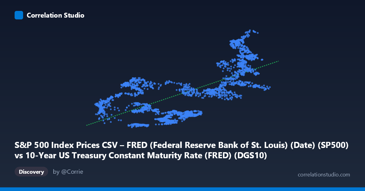
The scatterplot reveals a moderate positive relationship between the 10-year US Treasury constant maturity rate (X-axis) and S&P 500 index prices (Y-axis) over the period spanning May 2016 to May 2026. The linear regression equation (y = 743.821x + 1,888.58) suggests that for each one percentage point increase in the 10-year Treasury yield, the S&P 500 is associated with an increase of approximately 744 index points. This is a somewhat counterintuitive finding at face value, as conventional financial theory often frames rising yields as a headwind for equity valuations through discount rate effects. However, this relationship likely reflects the shared underlying driver of a broadly expanding economy over much of the sample period, where both yields and equity prices were simultaneously elevated by strong growth expectations.
Correlation Strength and Statistical Significance
The Pearson correlation coefficient of r = 0.6468 indicates a moderate-to-strong positive linear association, and the 95% confidence interval of [0.6234, 0.6691] is reassuringly narrow, reflecting the large sample size (n = 2,497) and suggesting this estimate is stable and reliable. The p-value of effectively zero confirms this correlation is highly statistically significant — the probability of observing a relationship this strong by random chance is negligible. However, statistical significance must be distinguished from practical significance: the R² of 0.4184 means that only ~41.8% of the variance in S&P 500 prices is explained by Treasury yields alone, leaving more than 58% of the variation attributable to other forces — earnings growth, monetary policy expectations, geopolitical events, and investor sentiment among them. The Granger causality results are particularly important here: neither direction shows significant predictive causation (X→Y: F = 1.12, p = 0.34; Y→X: F = 0.61, p = 0.81). This means that past values of Treasury yields do not meaningfully improve forecasts of future S&P 500 levels, and vice versa, reinforcing that the observed correlation is likely a spurious or confounded co-movement rather than a directional causal mechanism.
Patterns, Clusters, and Notable Features
Examining the sample points reveals considerable heteroscedasticity and clustering. There appears to be a dense cluster of observations in the lower-left region (yields roughly 1.5–3.0%, S&P values roughly 2,100–4,500), likely corresponding to the low-rate environment of 2016–2021. A second, more dispersed cluster appears in the upper-right region (yields 3.5–5.0%, S&P values 4,000–7,500), consistent with the post-2022 rate-hiking cycle where the Fed rapidly raised rates yet equities ultimately recovered and continued rising. Several notable outliers are visible at high yield values with very high S&P readings (e.g., ~4.41% yield paired with ~7,337; ~4.29% with ~6,883), suggesting that during 2023–2025, markets sustained elevated valuations despite historically high yields — a divergence from prior patterns. The spread of Y values at any given X is substantial, underscoring the noise around the trend line and the limited predictive precision of the model.
Confounding Factors and Interpretive Caveats
This correlation is almost certainly heavily confounded by time as a lurking variable. Both the S&P 500 and Treasury yields follow long-term trends driven by macroeconomic cycles, Federal Reserve policy regimes, and secular growth dynamics. The decade from 2016–2026 encompasses radically different environments: the post-GFC low-rate expansion, COVID-era zero-rate emergency policy, and the subsequent aggressive tightening cycle — each producing its own yield-equity dynamic. Importantly, the axes appear to be mislabeled in the source metadata (the X-axis label describes S&P 500 prices while pointing to a Treasury yield dataset, and vice versa), which warrants careful verification before drawing firm conclusions. Additionally, the relationship between yields and equity prices is known to be regime-dependent: high yields driven by strong growth can be equity-positive, while high yields driven by inflation fears can be equity-negative — a distinction a simple linear model cannot capture.
Actionable Insights and Further Investigation
Given the absence of Granger causality, practitioners should be cautious about using Treasury yield levels as a timing signal for equity market moves. Several avenues warrant deeper investigation: (1) A regime-switching or piecewise regression segmenting the data by Fed policy cycle (tightening vs. easing) would likely reveal meaningfully different relationships across periods. (2) Replacing yield levels with yield changes or the yield curve slope (10Y–2Y spread) may produce a more theoretically grounded and predictively useful model. (3) Including earnings yield (inverse of P/E) to compute the equity risk premium relative to the 10-year yield would test the more nuanced "TINA" (There Is No Alternative) framework that characterized much of this period. (4) A time-series decomposition removing the shared secular trend from both variables before computing correlation would help distinguish genuine co-movement from spurious trending. The strong positive correlation observed here should be treated as a descriptive artifact of the sample period rather than a stable structural relationship suitable for forecasting.
X dataset: 10-Year US Treasury Constant Maturity Rate (FRED)
Y dataset: S&P 500 Index Prices CSV – FRED (Federal Reserve Bank of St. Louis) (Date)
Part of experiment: Daily - 10-Year US Treasury Constant Maturity Rate (FRED) vs S&P 500 Index Prices CSV – FRED (Federal Reserve Bank of St. Louis) (Date)