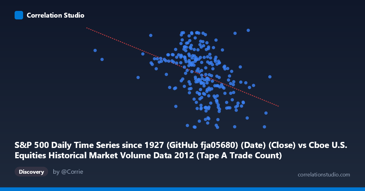
S&P 500 Daily Time Series since 1927 (GitHub fja05680) (Date) (Close) vs Cboe U.S. Equities Historical Market Volume Data 2012 (Tape A Trade Count)
- Pearson correlation (r)
- -0.4035
- Spearman correlation
- -0.4577
- p-value
- 0
- Sample size (n)
- 250
- 95% confidence interval
- -0.5024 to -0.2942
- Granger causality
- None
- Granger optimal lag
- 2
AI analysis
Analysis: S&P 500 Closing Price vs. Cboe Tape A Trade Count (2012)
Relationship Overview The scatterplot reveals a negative relationship between the S&P 500 closing price (X-axis) and Cboe Tape A trade count (Y-axis) across 250 trading days sampled from 2012. As the S&P 500 index level rises, the number of individual trades on Tape A (NYSE-listed securities) tends to decrease. This is a counterintuitive but financially meaningful pattern: during a year when equity markets were generally recovering and trending upward, trading activity was actually declining — consistent with the well-documented post-2008 "low volume rally" phenomenon where rising prices coincided with reduced retail and institutional participation or reduced high-frequency trading churn.
Correlation Strength and Statistical Significance The Pearson correlation of r = -0.40 indicates a moderate negative association, though the explanatory power is modest — R² = 0.163 means only ~16.3% of the variance in Tape A trade counts is explained by the S&P 500 price level. The remaining ~84% is driven by other factors entirely. The 95% confidence interval of [-0.50, -0.29] is meaningfully negative throughout, confirming the direction is reliable, and the p-value of 3.3×10⁻¹¹ is extraordinarily small, making this result statistically unambiguous given n = 250 paired observations from a population of 3,750 trading days. Despite statistical significance, practical significance is limited by the low R². The linear regression equation (y = −0.000129x + 1509.23) implies that a 100,000-point increase in S&P 500 closing value corresponds to roughly a 12.9-unit decline in Tape A trade count — a small but systematic effect. Critically, Granger causality testing finds no significant predictive direction in either direction (X→Y: F = 2.37, p = 0.096; Y→X: F = 0.60, p = 0.550). Neither series reliably predicts the other's future values at conventional significance thresholds, meaning the correlation reflects co-movement rather than a lead-lag causal mechanism.
Patterns, Clusters, and Outliers Several structural features are visible in the data. The bulk of observations cluster in the X range of roughly 900,000–1,200,000 (S&P 500 close values), with trade counts tightly concentrated between approximately 1,300 and 1,440. There is a notable right-tail extension — a sparse group of high-price observations (X 1,200,000) that consistently show below-average trade counts, reinforcing the negative trend. At the lower end, a few points near X = 700,000–800,000 maintain relatively high trade counts (~1,400–1,420), anchoring the negative slope. One potential high-leverage outlier appears near (1,290,000, 1,466), which represents an unusually high trade count at a high price level — this point deviates from the general trend and warrants individual inspection. The vertical spread at any given X value is substantial (~150–180 units), visually confirming the weak-to-moderate explanatory power of the linear fit.
Confounding Factors and Caveats Several important caveats apply. First, 2012 was a structurally unusual year for U.S. equity markets: the JOBS Act was signed, HFT regulatory scrutiny intensified, and market volumes were declining industry-wide following the 2010 Flash Crash aftermath — these secular trends would produce a spurious negative correlation with rising prices regardless of any genuine causal link. Second, the X-axis label appears to reference "Date" encoded as a numeric value (range ~350,000–1,400,000 suggests Unix-style or Excel serial date encoding) rather than a raw price index, which means this may effectively be a time-series correlation in disguise — both variables trending over calendar time — making the correlation potentially a shared time trend artifact rather than a price-volume relationship. Third, Tape A trade count is exchange-specific and may be affected by platform migration, routing changes, or regulatory reporting shifts unrelated to market levels. Finally, with only n = 250 from N = 3,750, sampling every 5th observation preserves temporal autocorrelation structure, which may inflate apparent statistical significance.
Actionable Insights and Further Investigation Given the ambiguity around whether this represents a genuine price-volume relationship or a shared time trend, the most important next step is detrending both series (e.g., using first-differences or residuals from a time regression) before recomputing correlations. If the negative correlation persists after detrending, it would represent a more credible structural relationship. Additionally, decomposing by market regime (high-volatility vs. low-volatility periods using VIX as a control) could clarify whether the relationship is volatility-mediated. Expanding the analysis to multiple years (2010–2015) would test whether 2012's pattern is idiosyncratic or persistent. Finally, since Granger causality is absent, practitioners should not use S&P 500 levels to forecast next-day trade counts or vice versa; any trading strategy or risk model relying on this relationship would need a more robust theoretical foundation than this correlation alone provides.
X dataset: Cboe U.S. Equities Historical Market Volume Data 2012
Y dataset: S&P 500 Daily Time Series since 1927 (GitHub fja05680) (Date)
Part of experiment: Daily - Cboe U.S. Equities Historical Market Volume Data 2012 vs S&P 500 Daily Time Series since 1927 (GitHub fja05680) (Date)