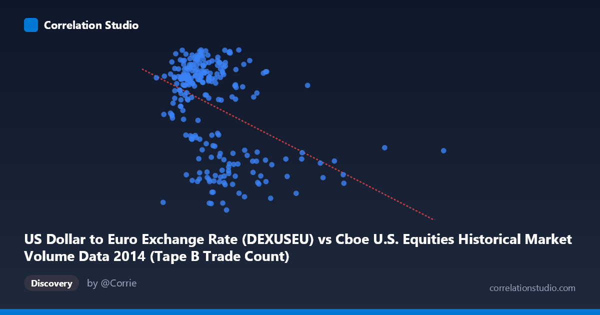
US Dollar to Euro Exchange Rate (DEXUSEU) vs Cboe U.S. Equities Historical Market Volume Data 2014 (Tape B Trade Count)
- Pearson correlation (r)
- -0.4163
- Spearman correlation
- -0.3127
- p-value
- 0
- Sample size (n)
- 249
- 95% confidence interval
- -0.514 to -0.3079
- Granger causality
- None
- Granger optimal lag
- 1
AI analysis
Scatterplot Analysis: USD/EUR Exchange Rate vs. Cboe Tape B Trade Count (2014)
Overview of the Relationship
The scatterplot reveals a modest negative relationship between the US Dollar to Euro exchange rate and Cboe Tape B trade counts across 2014 trading days. As the exchange rate increases (i.e., more dollars required per euro, meaning a weaker dollar), trade counts tend to decrease slightly. The linear regression equation y = -2.998×10⁻⁷x + 1.396 confirms this downward slope, though the relationship is far from deterministic. The data points form a diffuse cloud with considerable vertical spread at any given X value, visually signaling that while a trend exists, it is weak and noisy.
Correlation Strength, Direction, and Statistical Framing
The Pearson correlation of r = -0.4163 indicates a weak-to-moderate negative association. More meaningfully, the R² of 0.1733 reveals that only 17.3% of the variance in trade counts is explained by the exchange rate — leaving over 82% attributable to other factors. The 95% confidence interval for r [-0.514, -0.308] is entirely negative and does not cross zero, lending credibility to the directional finding. With a p-value of 7.44×10⁻¹² and N = 3,686, the correlation is highly statistically significant, though statistical significance here reflects the large population size rather than practical magnitude. Critically, Granger causality tests show no significant predictive direction in either direction (X→Y: F = 0.37, p = 0.55; Y→X: F = 0.19, p = 0.66), meaning that past exchange rate values do not help predict future trade counts, nor vice versa. The relationship is associative, not temporally predictive.
Notable Patterns, Clusters, and Outliers
Several notable features emerge from the data. The bulk of observations cluster in the X range of roughly 150,000–275,000 with Y values concentrated between 1.34 and 1.39, forming a dense central mass. However, there is a visible lower band of points around Y ≈ 1.23–1.25, which appear somewhat systematically separated from the main cluster — suggesting possible regime shifts, specific calendar periods (e.g., summer doldrums or holiday-thinned trading), or structural breaks in market activity. Points at the high end of X (e.g., ~325,000–675,000) are sparse and appear at varied Y levels, representing likely outlier trading days with unusually high volume that may distort the regression slope. The extreme right-tail observations (X 400,000) deserve particular scrutiny as potential high-leverage points.
Confounding Factors and Interpretive Caveats
Several important caveats temper this analysis. First, the dataset axis labels appear inverted in description — the X-axis is labeled as the exchange rate column from a volume dataset, and vice versa, suggesting possible metadata misassignment that warrants verification before drawing firm conclusions. Second, both variables are time-indexed to 2014, meaning shared temporal trends (e.g., seasonal market cycles, macroeconomic events like ECB policy shifts or geopolitical stress in early 2014) could drive spurious correlation rather than any direct causal mechanism. Third, Tape B specifically covers NYSE American and regional exchange activity, a subset of total market volume, which may respond differently to currency fluctuations than broader market metrics. Finally, the 249-day sample reflects a single calendar year, limiting generalizability.
Actionable Insights and Further Investigation
Given the modest explanatory power and absence of Granger causality, practitioners should not use exchange rate levels as a standalone predictor of Tape B trade counts. However, the persistent negative association warrants deeper investigation: researchers should examine whether specific sub-periods (e.g., Q1 2014 Ukraine crisis, ECB rate decisions) drive the correlation, and whether the lower cluster of Y values corresponds to identifiable calendar dates. A multiple regression incorporating VIX, broader market volume, and interest rate differentials would help isolate the exchange rate's marginal contribution. Extending the analysis across multiple years would test whether this 2014 pattern is structural or coincidental, and wavelet or rolling-window correlation analysis could reveal whether the relationship strengthens during specific volatility regimes.
X dataset: Cboe U.S. Equities Historical Market Volume Data 2014
Y dataset: US Dollar to Euro Exchange Rate
Part of experiment: Daily - Cboe U.S. Equities Historical Market Volume Data 2014 vs US Dollar to Euro Exchange Rate