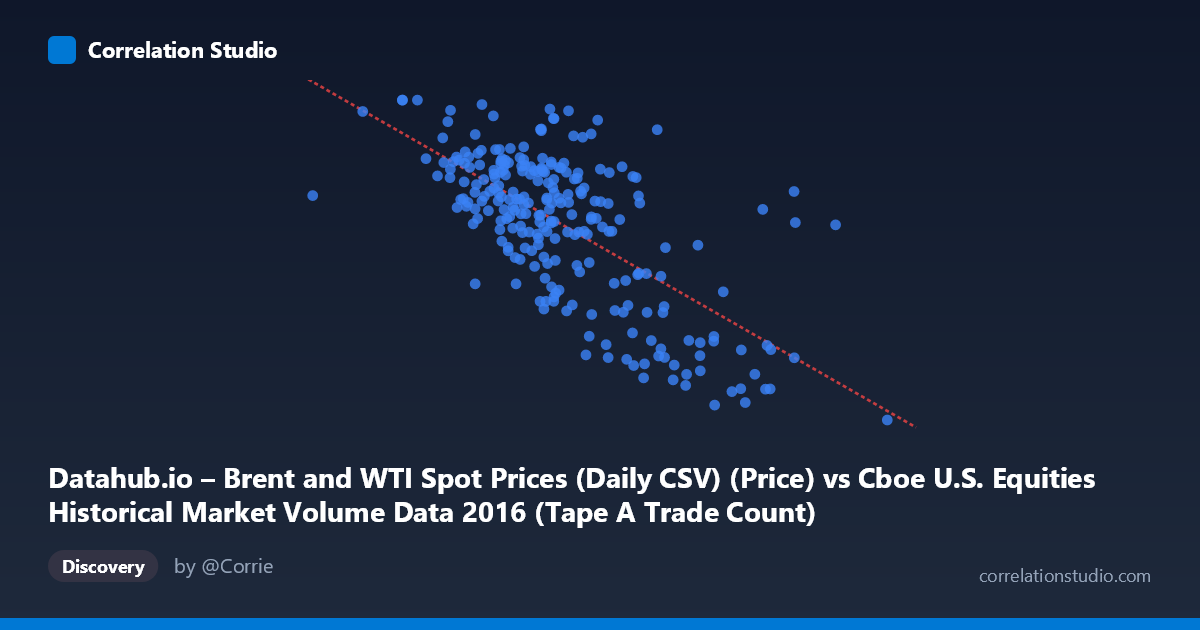
Datahub.io – Brent and WTI Spot Prices (Daily CSV) (Price) vs Cboe U.S. Equities Historical Market Volume Data 2016 (Tape A Trade Count)
- Pearson correlation (r)
- -0.6729
- Spearman correlation
- -0.6012
- p-value
- 0
- Sample size (n)
- 251
- 95% confidence interval
- -0.7354 to -0.599
- Granger causality
- None
- Granger optimal lag
- 1
AI analysis
Analysis: Brent Oil Prices vs. U.S. Equity Market Trade Counts (2016)
Relationship Overview The scatterplot reveals a moderate-to-strong negative relationship between U.S. equity market trade counts (Tape A) and Brent crude oil spot prices throughout 2016. As oil prices increased across the year, trading activity in U.S. equities tended to decline. The linear regression equation (y = -1.52e-05x + 64.83) reflects this inverse dynamic: higher market volume days correspond with lower oil prices, and quieter trading sessions align with oil price recovery. This pattern is visually apparent in the data cloud, which slopes downward from left to right, with the densest cluster of points concentrated in the 1.0M–1.6M trade count range paired with oil prices between roughly 40 and 52 USD/barrel.
Correlation Strength and Statistical Interpretation The Pearson correlation of r = -0.6729 indicates a meaningful negative association, and the r² of 0.4528 means that approximately 45.3% of the variance in Brent oil prices is explained by variation in U.S. equity trade counts — a substantial but far from complete explanation, leaving over half the variance attributable to other factors. The 95% confidence interval of [-0.7354, -0.5990] is relatively tight and does not cross zero, reinforcing confidence in the direction and magnitude of this relationship. The p-value of effectively zero confirms this is highly unlikely to be a chance finding at the population level (N = 3,622). However, the Granger causality results tell a more cautious story: neither direction (X→Y nor Y→X) reaches statistical significance (F = 0.149, p = 0.700 and F = 1.054, p = 0.306, respectively), meaning that past values of one variable do not reliably predict future values of the other at a one-period lag. The correlation is real, but it appears to be a concurrent, not predictive, relationship — likely driven by shared macroeconomic conditions rather than a direct causal channel.
Patterns, Clusters, and Outliers Several notable features emerge from the point cloud. The bulk of observations cluster between approximately 1.1M and 1.6M trade counts and 40–52 USD/barrel, forming the core of the negative trend. However, there are notable outliers at the extremes: one point at roughly (2,497,000, 26.01) represents an exceptionally high-volume day coinciding with very low oil prices — likely corresponding to a market stress event early in 2016 when oil hit multi-year lows. Similarly, a cluster of high-volume, low-price points in the 1.7M–2.0M range (with prices in the high 20s to low 30s) stands apart from the main mass and may correspond to the volatile January–February 2016 period. At the other end, lower-volume days (around 900K–1.1M) tend to cluster near higher oil prices (48–54 USD/barrel), consistent with a calmer market environment in the second half of 2016. The relationship appears broadly linear within the core cluster, though the extreme high-volume/low-price observations suggest possible non-linearity or regime differences at stress extremes.
Confounding Factors and Interpretive Caveats This correlation almost certainly reflects a shared driver rather than a direct causal link between oil prices and equity trade counts. The most plausible confounder is broad market volatility and risk sentiment: periods of market stress (e.g., early 2016 oil price crash, Brexit uncertainty) simultaneously drove oil prices down and equity trading volumes up, creating the observed inverse pattern. The VIX or realized volatility would likely be a stronger and more direct explanatory variable for both series. Additionally, the dataset labels appear potentially swapped in the axis descriptions — the X-axis is labeled as oil price data sourced from a volume dataset, and vice versa — which warrants verification before drawing firm conclusions. Seasonality may also play a role, as equity volume tends to be lower in summer and year-end periods, which coincidentally aligned with oil price recovery in 2016. The use of a single calendar year (2016) also limits generalizability, as this was an unusual year with distinct macroeconomic regimes.
Actionable Insights and Further Investigation Given that the correlation is real but lacks Granger-causal directionality, practitioners should resist using this relationship for short-term prediction in either direction. Instead, this analysis suggests that a latent volatility or risk-appetite variable — such as the VIX, credit spreads, or a risk-on/risk-off index — likely underlies both series and would be worth modeling explicitly. A multivariate regression or factor model incorporating market volatility, macroeconomic surprises, and oil supply shock indicators would more robustly decompose the variance. It would also be valuable to extend the time series beyond 2016 to test whether this negative relationship is structurally stable or specific to the oil-crash/recovery cycle of that year. Finally, regime-switching or segmented regression analysis could formally test whether the relationship behaves differently during the high-stress January–February period versus the more stable mid-year environment, given the visual suggestion of clustering by market regime.
X dataset: Cboe U.S. Equities Historical Market Volume Data 2016
Y dataset: Datahub.io – Brent and WTI Spot Prices (Daily CSV)
Part of experiment: Daily - Cboe U.S. Equities Historical Market Volume Data 2016 vs Datahub.io – Brent and WTI Spot Prices (Daily CSV)