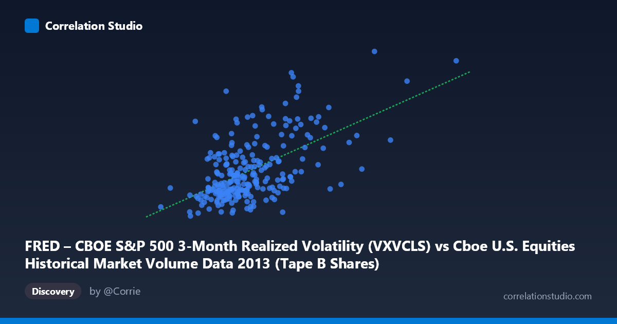
FRED – CBOE S&P 500 3-Month Realized Volatility (VXVCLS) vs Cboe U.S. Equities Historical Market Volume Data 2013 (Tape B Shares)
- Pearson correlation (r)
- 0.568
- Spearman correlation
- 0.4852
- p-value
- 0
- Sample size (n)
- 252
- 95% confidence interval
- 0.478 to 0.6462
- Granger causality
- None
- Granger optimal lag
- 1
AI analysis
Scatterplot Analysis: CBOE S&P 500 3-Month Realized Volatility vs. Tape B Shares Volume (2013)
Relationship Overview The scatterplot reveals a positive relationship between CBOE S&P 500 3-Month Realized Volatility (VXVCLS) on the X-axis and Tape B Shares volume on the Y-axis across 252 trading days in 2013. As realized volatility increases, Tape B share volume tends to rise as well. The linear regression equation (y = 4.11×10⁻⁸x + 12.85) confirms this upward slope, suggesting that for every ~24 million unit increase in the volatility measure, Y increases by approximately 1 unit. The relationship is visually apparent but far from tight — the scatter around the regression line is considerable, indicating meaningful unexplained variation.
Correlation Strength and Statistical Significance The Pearson correlation of r = 0.568 reflects a moderate positive association. However, the r² of 0.323 is the more sobering metric: only about 32.3% of the variance in Tape B Shares volume is explained by realized volatility, meaning roughly two-thirds of Y's variability stems from other sources entirely. The 95% confidence interval of [0.478, 0.646] is reasonably tight given n = 252, and the p-value of effectively zero confirms this is not a chance finding at any conventional significance threshold. That said, the Granger causality results tell a different story temporally: neither direction (X→Y: F=1.09, p=0.298; Y→X: F=1.97, p=0.162) reaches significance at even the 10% level. This means that while the two variables move together contemporaneously, past values of one do not reliably predict future values of the other — the relationship lacks temporal directionality and is likely driven by common underlying factors rather than a lead-lag mechanism.
Notable Patterns, Clusters, and Outliers The sample points reveal several structural features worth noting. There is a visible dense cluster in the lower-left region (volatility roughly 55–75 million, Y values 14–16), consistent with the relatively calm mid-2013 equity environment. A second, more dispersed cluster emerges at higher volatility values (85–105 million), where Y ranges more widely from ~15 to over 19. Several clear outliers are visible in the upper portion of the chart — points such as (89.9M, 19.84), (92.2M, 18.82), and (87.2M, 18.56) sit well above the regression line, suggesting episodic spikes in Tape B volume that coincide with elevated volatility but exceed what the linear model predicts. The upper-right extreme point near (165M, ~17–18) also stands out as a leverage point that could be disproportionately influencing the regression slope.
Confounding Factors and Caveats Several important caveats apply to this analysis. First, axis labeling appears inverted based on the metadata descriptions — VXVCLS (a volatility index) is plotted on the X-axis using raw share volume data, and Tape B Shares is plotted on the Y-axis using the FRED volatility dataset column. This labeling inconsistency warrants verification before drawing firm conclusions. Second, common macro drivers — Federal Reserve tapering announcements, earnings seasons, and geopolitical events in 2013 — likely co-move both volatility and trading volume simultaneously, which would inflate the apparent correlation without implying any causal structure. Third, the relationship may be non-linear: volatility-volume relationships in market microstructure research often follow a convex or threshold pattern, and a linear model may underfit the true dynamics. Fourth, Tape B specifically covers NYSE MKT/regional exchange stocks, which may respond differently to broad market volatility than the full market.
Actionable Insights and Further Investigation Practitioners should not rely on past volatility values to forecast next-day Tape B volume (or vice versa), given the failed Granger causality tests — any trading or risk models assuming predictive lead-lag structure would be misspecified. However, the contemporaneous correlation is strong enough to warrant volatility as a control variable in volume forecasting models rather than a standalone predictor. Further investigation should include: (1) testing non-linear specifications (e.g., log-log or quadratic models) given the apparent curvature in the scatter; (2) segmenting by market regime (pre- vs. post-taper tantrum in May–June 2013) to test whether the correlation is stable or driven by a specific sub-period; (3) incorporating additional covariates such as VIX levels, SPX returns, and bid-ask spreads to better isolate the volume-volatility channel; and (4) verifying axis/dataset alignment to ensure the variable assignments match their intended economic interpretation.
X dataset: Cboe U.S. Equities Historical Market Volume Data 2013
Y dataset: FRED – CBOE S&P 500 3-Month Realized Volatility
Part of experiment: Daily - Cboe U.S. Equities Historical Market Volume Data 2013 vs FRED – CBOE S&P 500 3-Month Realized Volatility