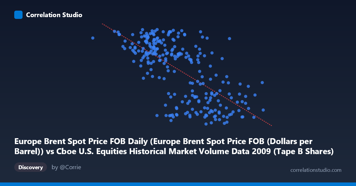
Europe Brent Spot Price FOB Daily (Europe Brent Spot Price FOB (Dollars per Barrel)) vs Cboe U.S. Equities Historical Market Volume Data 2009 (Tape B Shares)
- Pearson correlation (r)
- -0.6659
- Spearman correlation
- -0.6473
- p-value
- 0
- Sample size (n)
- 252
- 95% confidence interval
- -0.7294 to -0.5909
- Granger causality
- None
- Granger optimal lag
- 1
AI analysis
Analysis: Europe Brent Spot Price vs. Cboe Tape B Shares (2009)
Relationship Overview The scatterplot reveals a moderate negative relationship between Europe Brent Spot Price FOB (X-axis) and Cboe Tape B Shares trading volume (Y-axis) across 2009. As oil prices rise, Tape B share volume tends to decline, and vice versa. The linear regression equation (y = -1.92118E-07x + 89.9494) captures this downward trend, though the scatter around the regression line is substantial, indicating meaningful noise and suggesting the relationship is real but far from deterministic. Visually, the data forms a broad, elongated cloud sloping downward from left to right, with no tight clustering around the trend line.
Correlation Strength and Statistical Significance The Pearson correlation of r = -0.6659 indicates a moderate-to-strong negative association. The R² of 0.4434 means that approximately 44.3% of the variance in Tape B share volume is statistically explained by Brent crude price levels — a meaningful but incomplete explanation, leaving roughly 56% of variance attributable to other factors. The 95% confidence interval of [-0.7294, -0.5909] is relatively narrow and does not cross zero, and the p-value of effectively 0 (given N = 3,232) confirms this correlation is highly unlikely to be a chance artifact. However, the Granger causality tests reveal no significant temporal predictive relationship in either direction (X→Y: F = 0.087, p = 0.769; Y→X: F = 0.789, p = 0.375). This is a critical caveat: while the two variables are correlated in level, neither reliably predicts future movements in the other at a one-period lag, suggesting the relationship may be driven by shared underlying dynamics rather than direct causation.
Notable Patterns and Features Several structural features stand out in the data. There appear to be two loosely defined clusters: one at lower oil prices (~$35–$110/barrel) where Tape B volume is broadly elevated and more variable (roughly 60–78 billion shares), and another at higher oil prices (~$150–$255/barrel) where volume is more compressed and lower (roughly 40–57 billion shares). A notable outlier exists at the far left — a data point near $33.8 million on the X-axis (likely a very low oil price day in early 2009) with a Tape B value of ~75, consistent with the negative trend but extreme in its X position. The spread in Y values is notably wider at lower X values, suggesting heteroscedasticity — the relationship may be less stable at low oil price regimes. A handful of high-volume points (~77–78 billion shares) appear across a range of oil prices, potentially reflecting episodic market events rather than oil-price-driven behavior.
Confounding Factors and Caveats Several important caveats apply. 2009 was a highly unusual year — it began in the depths of the Global Financial Crisis (with extreme market volatility and low oil prices) and transitioned into a recovery phase (with rising oil prices and normalizing, then declining, equity volumes). This arc means the negative correlation may largely reflect a time-trend confound: early-year high-volatility/high-volume trading coincided with low oil prices, while mid-to-late year stabilization brought higher oil prices and lower volumes. The axis labels also deserve scrutiny — the X-axis values are in the hundreds of millions range, which appears inconsistent with typical Brent crude dollar-per-barrel prices, suggesting a possible data alignment or unit issue that warrants verification. Additionally, the absence of Granger causality implies the correlation is contemporaneous and likely spurious or confounded, rather than reflecting a genuine economic mechanism between oil prices and Tape B equity volumes.
Actionable Insights and Further Investigation Given these findings, several next steps would strengthen the analysis. First, control for the time trend by detrending both series or including a time variable in a multivariate regression — if the correlation weakens substantially, it confirms the 2009 macro trajectory is the primary driver. Second, investigate the specific economic mechanism: does rising oil price signal risk-off sentiment that reduces equity trading, or is this purely a crisis-recovery artifact? Third, extend the time series beyond 2009 to test whether the relationship persists across different market regimes — a correlation observed in a single anomalous year has limited generalizability. Finally, verify the X-axis scaling to ensure Brent price data is correctly aligned with the volume data, as the magnitude of X values (~33M–255M) is atypical for per-barrel oil prices and may indicate a data joining error that would invalidate the entire analysis.
X dataset: Cboe U.S. Equities Historical Market Volume Data 2009
Y dataset: Europe Brent Spot Price FOB Daily
Part of experiment: Daily - Cboe U.S. Equities Historical Market Volume Data 2009 vs Europe Brent Spot Price FOB Daily