FRED – 10-Year Treasury Constant Maturity Minus 2-Year (Yield Curve Spread) (T10Y2Y) vs Cboe U.S. Equities Historical Market Volume Data 2009 (Total Shares)
- Pearson correlation (r)
- -0.4681
- Spearman correlation
- -0.4794
- p-value
- 0
- Sample size (n)
- 250
- 95% confidence interval
- -0.5596 to -0.3652
- Granger causality
- None
- Granger optimal lag
- 1
AI analysis
Analysis: Yield Curve Spread vs. U.S. Equity Market Volume (2009)
Relationship Overview
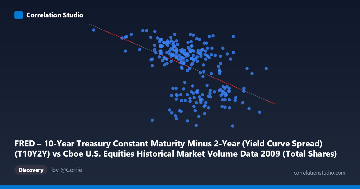
The scatterplot reveals a moderate negative relationship between U.S. equity market total shares traded (X-axis) and the 10-Year minus 2-Year Treasury yield curve spread (Y-axis) across 2009. The linear regression equation (y = -1.00061E⁻⁹x + 3.068) confirms that as daily equity trading volume increases, the yield curve spread tends to narrow. This is an economically intuitive finding for 2009: the year began amid acute financial crisis conditions characterized by both elevated market volatility/volume and a still-recovering yield curve, with the spread gradually steepening as the year progressed and panic-driven trading subsided. The negative slope suggests that the highest-volume trading days — likely associated with crisis-driven fear and uncertainty — coincided with a flatter or narrower spread, while calmer, lower-volume periods aligned with a more steeply positive yield curve.
Correlation Strength and Statistical Significance
The correlation of r = -0.4681 represents a moderate negative association, but the explanatory power deserves careful framing: r² = 0.2191 means only 21.9% of the variance in the yield curve spread is explained by trading volume, leaving roughly 78% attributable to other factors. The 95% confidence interval of [-0.5596, -0.3652] is meaningfully away from zero and relatively tight, indicating reasonable precision in the estimate. The p-value of 5.107×10⁻¹⁵ is extraordinarily small, effectively ruling out chance as an explanation given the sample of 250 paired observations drawn from a population of 3,232 trading days. However, statistical significance should not be conflated with practical or causal significance. Critically, the Granger causality tests show no significant predictive directionality in either direction (X→Y: F=0.784, p=0.377; Y→X: F=0.210, p=0.647). This means neither variable temporally predicts the other at a 1-period lag — the correlation is contemporaneous and likely driven by shared underlying macroeconomic forces rather than one variable leading the other.
Notable Patterns, Clusters, and Outliers
Several features stand out in the sample data. There is a visible cluster of high-volume observations (roughly 700M–900M shares) spanning a wide spread range (1.75–2.65), suggesting considerable noise within that central band. The extreme left tail — notably the point at (192,269,942, 2.82), representing very low trading volume paired with the highest spread value in the dataset — acts as a potential leverage point and may reflect a holiday-adjacent or anomalous low-liquidity day. Conversely, the highest-volume observation (1,212,524,830, 2.29) shows a mid-range spread, consistent with the negative trend. A few low-spread, high-volume outliers around the 950M–1,080M share range (spreads of 1.76–1.98) likely correspond to the most volatile crisis periods of early 2009, where fear-driven volume surged while the yield curve had not yet fully steepened. The distribution appears heteroscedastic, with greater variance in the spread at moderate volume levels and tighter clustering at extremes.
Confounding Factors and Interpretive Caveats
This correlation is almost certainly spuriously driven by the shared temporal trend through 2009 rather than a direct causal mechanism between volume and the yield curve. Both variables were simultaneously influenced by the post-financial-crisis recovery: early 2009 saw extreme volatility, high volumes, and a relatively compressed spread, while as the year progressed, markets stabilized (lower volumes) and the yield curve steepened dramatically as the Federal Reserve held short rates near zero while long rates rose on recovery expectations. This creates a classic omitted variable problem — time itself (or underlying economic stress) is the true driver. Additionally, the axes appear to be swapped in the dataset labels (X contains the volume data labeled as yield curve, and Y contains the spread labeled as volume), which warrants verification before any formal reporting. Finally, the Granger causality failure at lag-1 confirms that any predictive framing of this relationship would be misleading.
Actionable Insights and Further Investigation
Given the limitations, several follow-up analyses are warranted. First, detrending both series (e.g., removing the time trend or analyzing first differences) would test whether the correlation persists beyond the shared 2009 recovery trajectory. Second, introducing the VIX or realized volatility as a covariate would help isolate whether volume's apparent relationship with spreads is fully mediated by market stress. Third, testing multiple Granger lags beyond lag-1 (e.g., 5–20 trading days) could reveal delayed predictive relationships not captured at the daily level. Fourth, extending the analysis across multiple years (2007–2012) would reveal whether this negative relationship is specific to crisis-period dynamics or a more stable structural feature. For practitioners, while this correlation should not be used as a trading signal (given the failed Granger tests), it does reinforce that anomalously high equity volume days in 2009 were systematically associated with a tighter yield curve — a useful contextual flag for regime-identification models.
X dataset: Cboe U.S. Equities Historical Market Volume Data 2009
Y dataset: FRED – 10-Year Treasury Constant Maturity Minus 2-Year (Yield Curve Spread)
Part of experiment: Daily - Cboe U.S. Equities Historical Market Volume Data 2009 vs FRED – 10-Year Treasury Constant Maturity Minus 2-Year (Yield Curve Spread)